Note The given information and examples on this site have an overview character only. Detailed guidelines are available upon request. Whenever you plan to use the co-brand, ask your local brand champion or contact branding@phonak.com about the correct usage.
Together, Phonak and Advanced Bionics can tell a powerful story. Our co-brand is much more than simply a pairing of our two corporate identities.
We can let the world know that no one else provides solutions for as many patients with advanced hearing loss as Phonak and Advanced Bionics do. And that no one else can match our patient-centric approach and our dynamic platform of solutions. This is why we apply the co-brand in well-defined areas and special cases.
The co-brand lockup The co-brand lockup is an elegant, effective mark simply made up of three elements: the logos for Phonak and Advanced Bionics united by a plus character.
All elements of the co-brand lockup have a fixed relationship that should never be changed in any way.
Treat it as an image, not a word.
Always write out the co-brand name when mentioned in copy: Phonak and Advanced Bionics
Always use full-color version, some exceptions apply
Never redraw or modify the co-brand lockup
Don’t use the co-brand lockup as a graphic in a sentence, headline, or a communication title.
Do not alter the approved corporate colors.
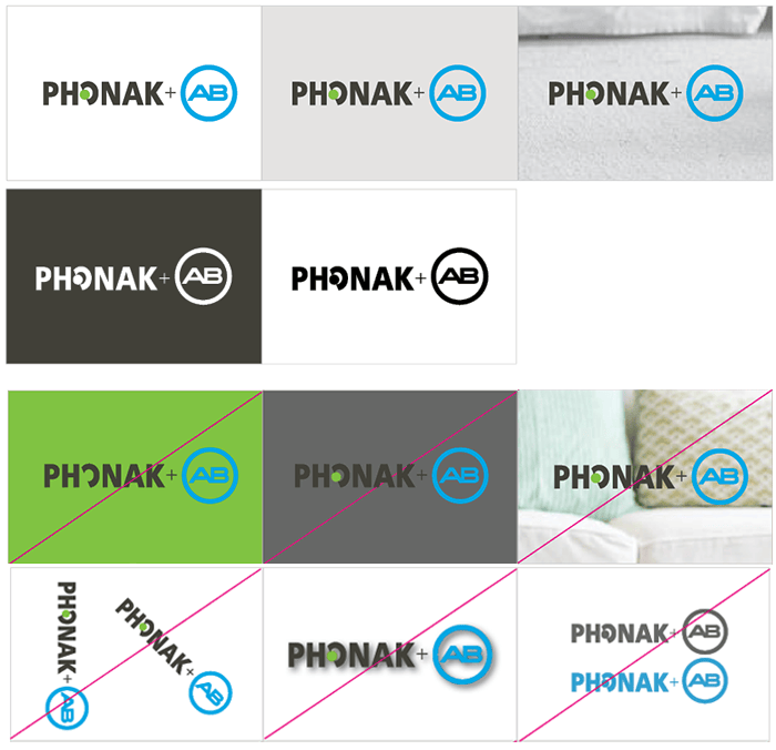
Background usage In presenting the co-brand lockup in print and digital layouts, the usage of a clean, clutter-free and color-appropriate background allows clarity and readability.
It is advised that the full-color co-brand lockup appear on the following types of backgrounds:
white (preferred); Note that there is an exception to present the co-brand lockup in full black or full white format only if there is a production limitation with materials, such as silkscreening or embroidery.
very light color that allows enough visual contrast from both the Advanced Bionics blue and Phonak green;
harmonious, non-contrasting color;
washed out, lightly tinted color or grayscale background.
Do not rotate the co-brand lockup.
Do not add drop-shadows, embossing, etc..
Do not convert the logo to white, black, or any other single solid color, (except for the limited use noted above).
Do not change colors of any of the co-brand lockup elements.
Do not modify sizing of the co-brand lockup elements.
Do not rearrange the co-brand lockup elements.
The co-brand headline ‘Connecting to life’ is our co-brand concept and lead headline. Whenever showcased as a headline, ‘Connecting to life’ should be paired alongside our approved Phonak and Advanced Bionics co-brand lockup.
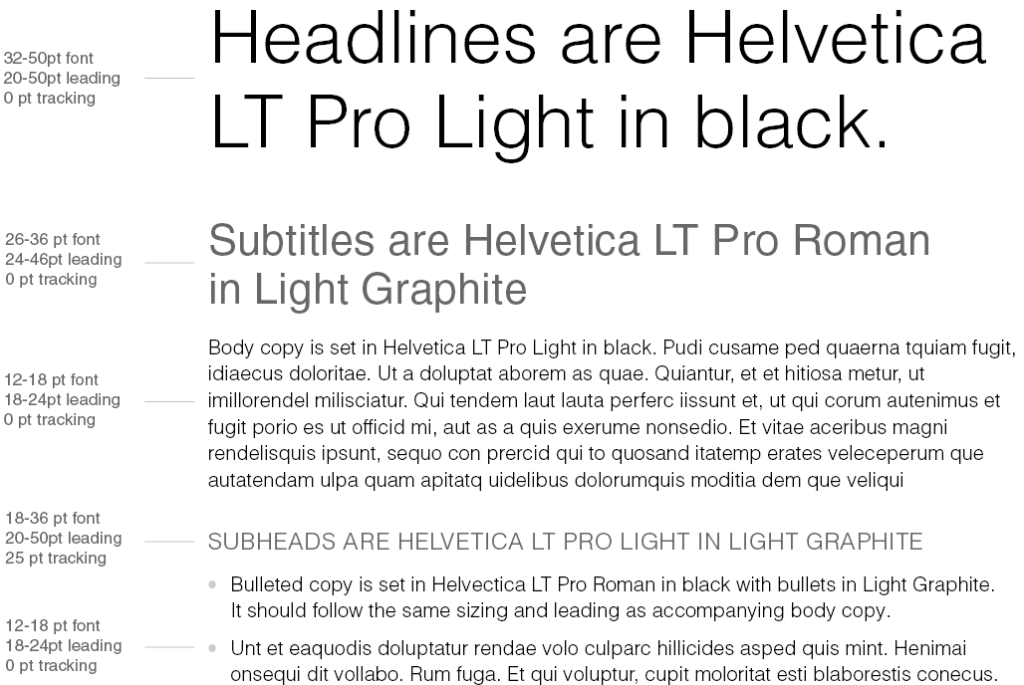
Co-brand font & color palette We have selected Helvetica LT Pro as the only co-brand typeface. The Helvetica LT Pro typeface is extensive with a large number of weights and styles. For all co-branding communications, we have limited the Helvetica LT Pro fonts to the following on the right.
Please, do not download any free fonts from the web or use any other Helvetica font type. You can get the correct and fully licensed font set upon request.
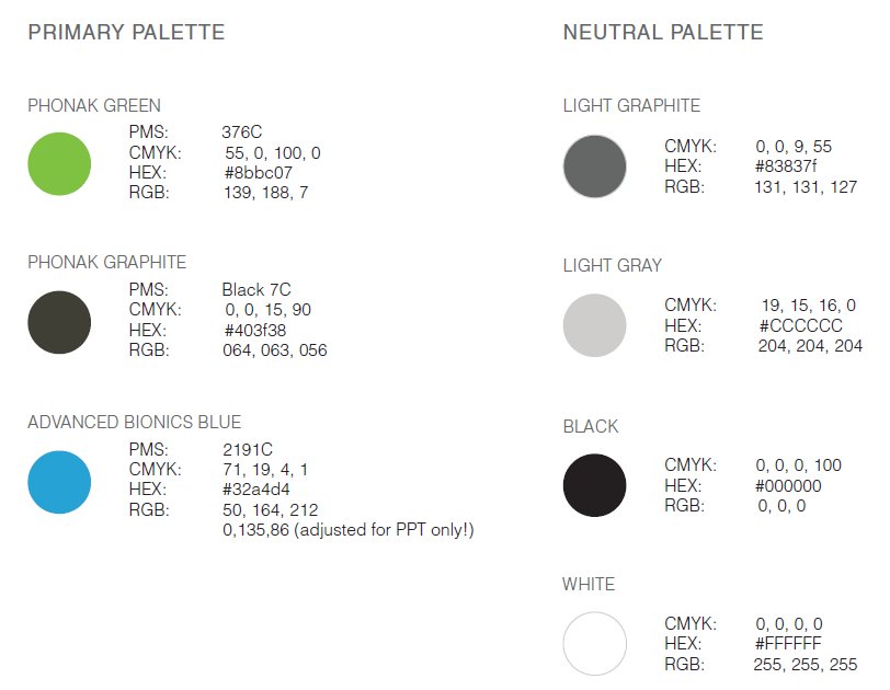
The color palette Use the primary palette as a highlight to define a hierarchy, or to add depth to content as necessary. The palette can be used for typographic accents, illustration fills, charts, graphs, and tables.
The neutral palette is used for text, as well as in charts and tables.
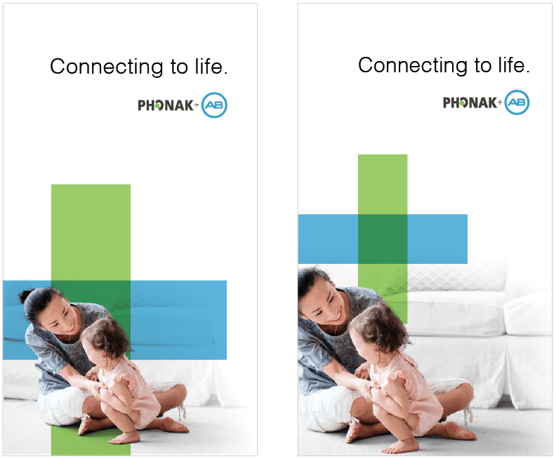
The plus elemente The green square created by the overlapping of the Phonak Green bar and the Advanced Bionics Blue bar represents the integration and partnership of the two technologies.
The combination of the plus element integrated with the photo subjects creates a visual metaphor of how the cochlear implant created by Phonak and Advanced Bionics is melded into the lives of the recipients.
Sizing options The relationship of the size of the plus element to the artboard and the subjects is fluid. There are options to work with a larger size plus element or a smaller size plus element. Both sizes provide for different visual impact.
Larger plus graphic The larger plus element acts as a bold color block background. It is more prominent in the composition, symbolizing its integral role in the life of the recipient.
Smaller plus graphic The smaller sizing of the plus element allows for more white space. The visual metaphor is that the technology, represented by the plus symbol, is a small but significant part of a rich and full life.
Visuals A pre-designed set of visuals are available as tiff-format with layers you can download from here
Use cases and examples Although Phonak and Advanced Bionics will communicate their partnership, we showcase the co-branding on special occasions only:
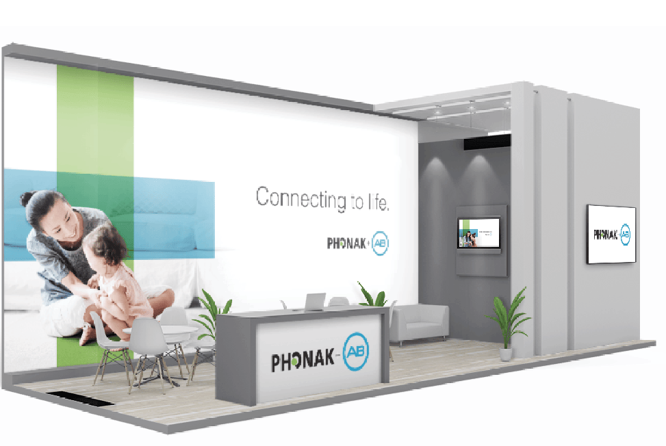
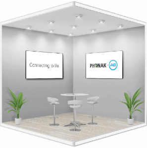
… on exhibitions when we present Phonak and AB-products that are working seamlessly with each other or to present the partnership on strategic collaboration (e. g. EUHA)
… consumer partnerships or symposiums like – AG Bell for kids/teens – HLAA
… co-branded marketplaces
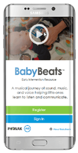
…in strategic partnerships where Phonak and AB are involved (e. g. BabyBeats).
Video example with co-branding elements according to the co-branding guidelines.
Cover of a co-branded brochure according to the co-branding guidelines.
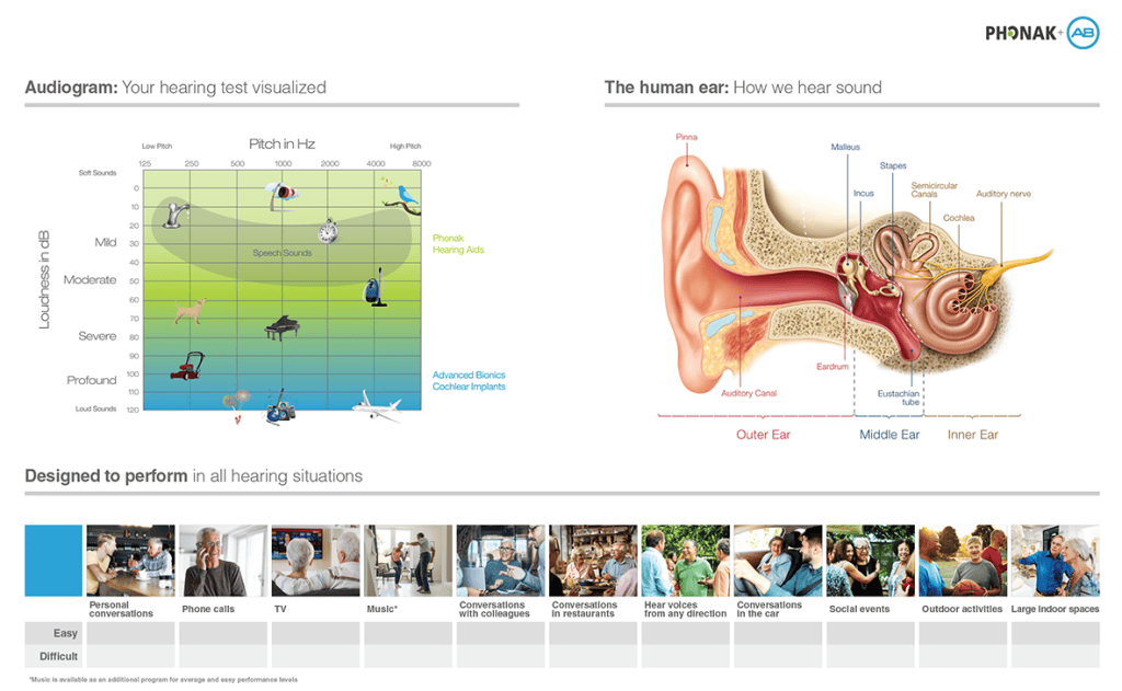
Poster of a spread document with co-branding logo.