Specific topics
Packaging design standards
Premium packaging is a vital element in conveying Phonak’s Swiss heritage of quality and innovation. It engages the senses, enhances visual appeal, and enriches the customer experience, reflecting our commitment to precision and excellence. As a key touchpoint, premium packaging reinforces the perception of Phonak as a leader in advanced technology.
More than just a protective layer, our packaging embodies a sensory experience that communicates the sophistication and reliability associated with Swiss craftsmanship. High-quality materials and meticulous design elevate the perceived value of the product, ensuring that every interaction feels luxurious.
Typically, premium packaging features elegant design elements, including clean lines, quality materials, superior printing and finishes, all of which reflect the essence of Swiss quality and innovation.
Compliance
Adherence to these standards is essential to maintain the integrity and reputation of the Phonak brand. Non-compliance may result in redesign. This directive serves as a comprehensive guide for all teams involved in the design and production of Phonak product packaging.
Design DNA
The essence of the Phonak design language lies in the harmonious balance between human connection and our Swiss cutting-edge technology. This philosophy manifests in a dynamic interplay between softness in shape and form, and high-tech detailing.
Our designs often feature monolithic shapes that exemplify Swiss precision and engineering excellence. This principle is also reflected in our logo icon, reinforcing our commitment to quality and innovation.
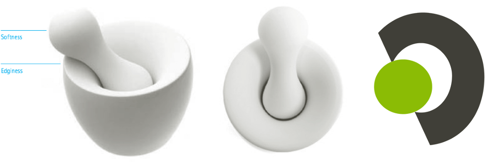
Phonak brand standards for overall packaging
1. Human driven design
Purpose
Prioritize the needs of individuals with hearing loss by creating packaging that reflects understanding and care.
Execution
Use easy-to-open designs, clear labeling, and inclusive visuals to ensure accessibility for all users.
2. Innovation at the core
Purpose
Reinforce Phonak’s position as a leader in cutting edge hearing solutions.
Execution
Incorporate sleek, modern aesthetics and innovative materials, such as sustainable or tactile finishes, to mirror the swiss-engineered technology in the product.
E.g use custom die-cuts in/on packaging to reflect our brand’s identity and create visual interest as well as reflect innovation.
3. Uncompromising quality
Purpose
Showcase the premium nature of Phonak products and our Swiss-engineering with high-quality materials and finishes that also serve the purpose of protecting the product.
Execution
Use for high-quality, durable materials & finishes that feel substantial and of e.g., special finishes, embossing, debossing, details, quality paper) to elevate the perceived quality of your product.
4. Elegant simplicity
Purpose
Embrace a minimalist design that reflects Phonak’s sophisticated technology and premium identity.
Execution
Focus on clean lines, neutral color palettes (e.g., white, gray, natural cardboard and use Phonak’s signature green as element of understated branding.)
5. Sustainability commitment
Purpose
Align with modern consumer values by emphasizing environmental responsibility.
Execution
Opt for eco-friendly materials, recyclable packaging, and minimal waste designs while maintaining a premium feel
6. Seamless user experience
Purpose
Ensure the packaging enhances the overall product journey.
Execution
Create intuitive layouts for inserts, charging cases, or accessories to make the unboxing experience delightful and stress-free.
7. Consistent branding & design
Purpose
Reinforce brand recognition by maintaining visual consistency across all touchpoints.
Execution
Apply Phonak’s logo, typography, Phonak Green signature color consistently, while allowing room for creative flourishes that enhance premium appeal.
Phonak brand standards for premium packaging
Paper type
- Use natural paper with a matte finish.
- Select light grey or natural tones; avoid bleached white paper and gloss finishes.
- Ensure the paper is of high quality to reflect the premium solution inside.
Surface design & finish:
- Utilize embossed or printed patterns to create a high-quality surface finish. Acceptable patterns include: The Phonak Dot / the Phonak Icon / “life is on” wordmark.
- Note: we don’t use UV-Laquer anymore due to sutainability reasons!
Logo presentation:
- The Phonak logo must be prominently displayed and very well readable
- Utilize high-quality techniques such as embossing, debossing, or laser engraving to achieve a premium appearance.
Phonak green:
- Incorporate a green accent as a mandatory design element to align with Phonak’s brand identity.
Seamless user experience:
- Design packaging for a seamless user experience, ensuring it is easy to open and allows for quick access to the product and its components. Consider features such as intuitive openings and organized layouts to enhance usability.
Approval process
All packaging designs and inserts must be submitted for review and approval by the Global Brand Team prior to production!