Phonak clothing represents the brand and is worn externally. It is therefore important to design the garment in such a way that it looks professional and is worn with pleasure. In most cases, less is more. “Keep it simple”
Simplicity: The focus is on a simple, clear design without embellishments. A minimalist approach ensures that the clothing remains timeless and stylish.
Design aspects
Font usage the same typography and hierarchy rules apply as for all tools As less font as possible: Title, small quote, product names.
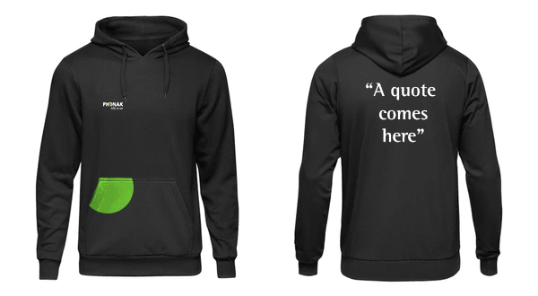
Placement of a design Not on the sleeves or elsewhere, where the Text is not readable. Use the backside side (preferred option) or the front side, for any type of text.
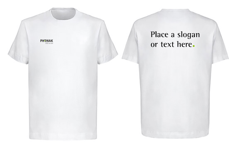
Logo placement The text must be clearly legible. This means: – The logo must always be placed on the front on the left chest. (Size ( W: 5cm / H: 2.6cm) – The white Phonak logo is used on gray and black garments. – On the white garments, the black version of the logo.
Font usage The same typography and hierarchy rules apply as for all tools. Especially, as less test as possible: A short, catchy title, a short quote – if applicable and the product name.
Dos and don’ts
Phonak logo on the front on the right side of the chest (from top, 5 cm / from left 2.6 cm). Backside can be used to place a quote.
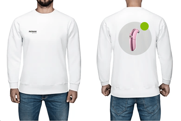
Logo correctly placed, existing dot, simple.
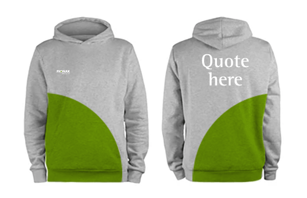
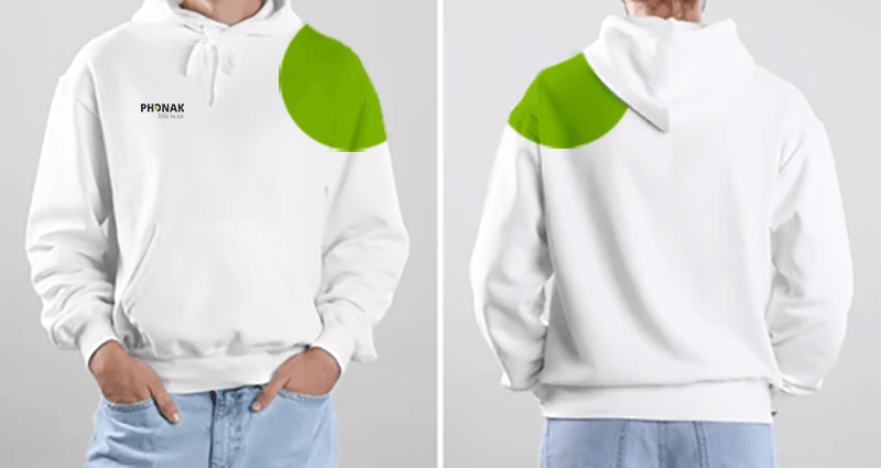
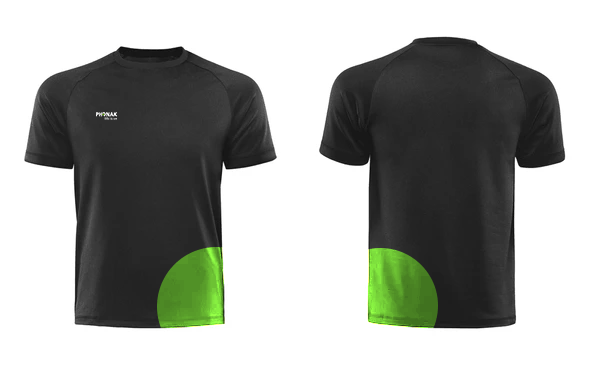
Besides a correct placement, the following “shapes” can be used: Either use the whole, ½ or ¼ of the dot – no intermediate size.
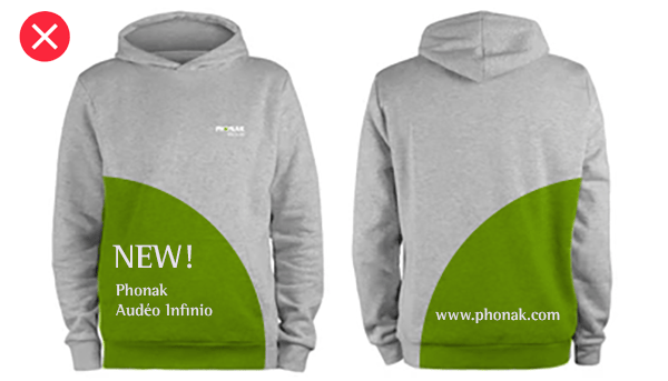
Never put text or any other element into the green dot.
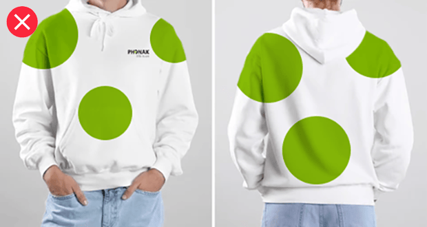
Do not over do it with the dot. It must be used only once per garment.