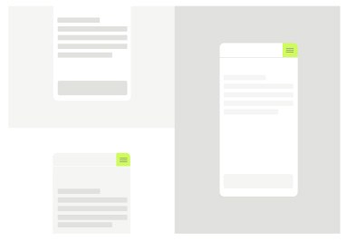
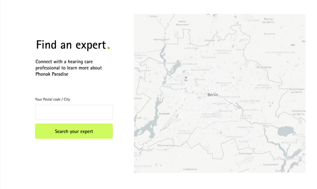
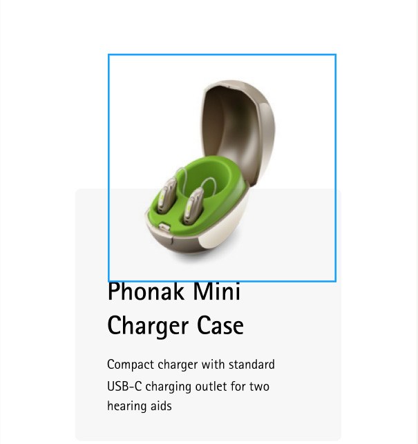
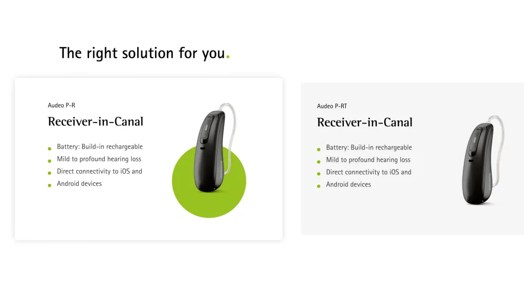
The digital product layout shows the horizontal alignment of elements to ensure a smooth flow of content, material, and information throughout the system.
Determined for consistency
A defined layout structure and a consistent methodic across pages help the user follow the content’s structure and have a logical understanding and scanability of the information.
Predictable for intuitiveness
The user does not need to learn new patterns. The size, spacing, and positioning between elements can help the user guide themselves in the interface’s visual journey, no matter on which page they are.
Adaptable for responsiveness
A flexible layout adapts the hierarchy and the placement of elements across any display size, breakpoints or input the user sets.
Grid Spacings Buttons
Grid
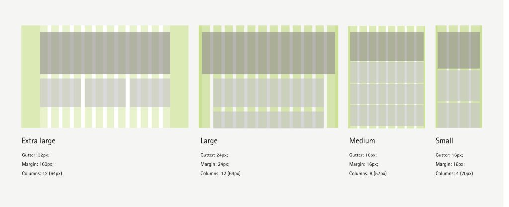
Adaptable grid for responsiveness The layout consists of columns (1), margins (2), and gutters (3). This grid helps maintain the layout structure at different breakpoints, so the layout adjusts to suit the screen size and orientation.
Grid Spacings Buttons
Spacings
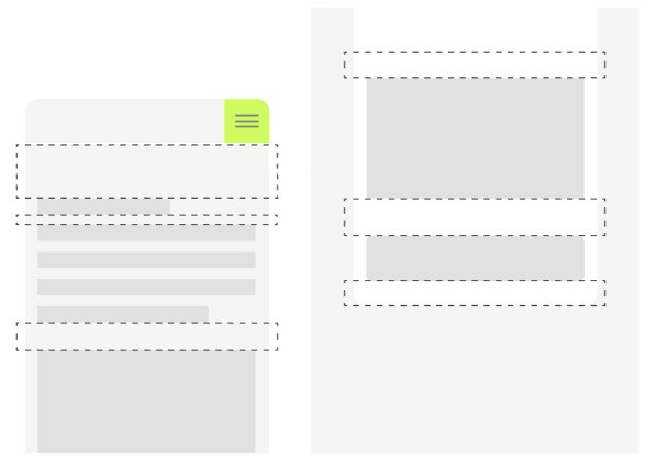
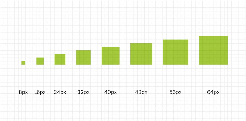
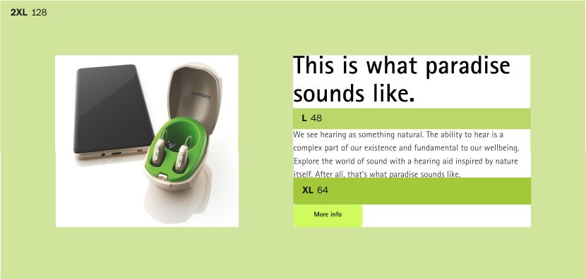
The height and width of UI elements should be measured in increments of the base unit (8px). This keeps designs consistent, more convenient to implement, and reduces the number of decisions a designer has to make.
Grid Spacings Buttons
Buttons
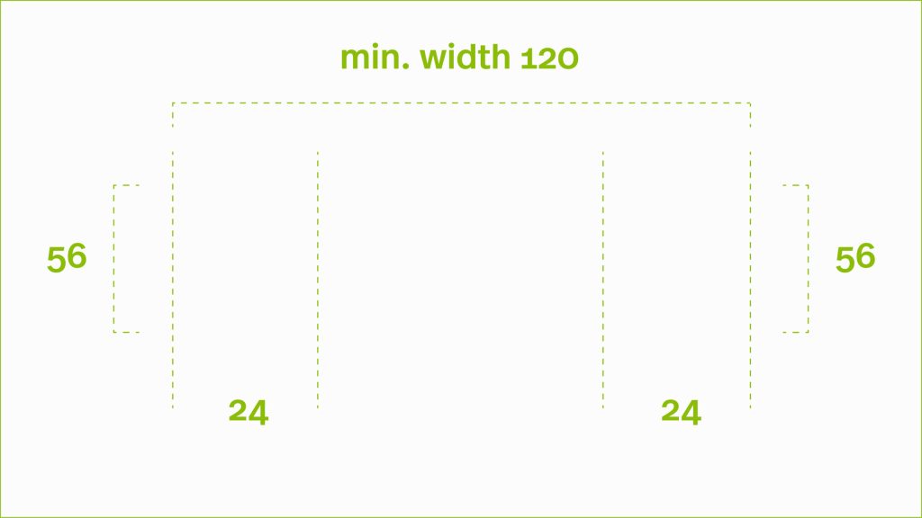
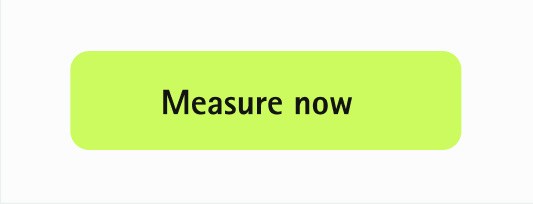
Semi-rounded corners give a more friendly, safe, and approachable look and feel while still keeping it severe and elegant. It is essential for balance in the users’ eyes to keep the same ratio between the text element and the button container (16px).
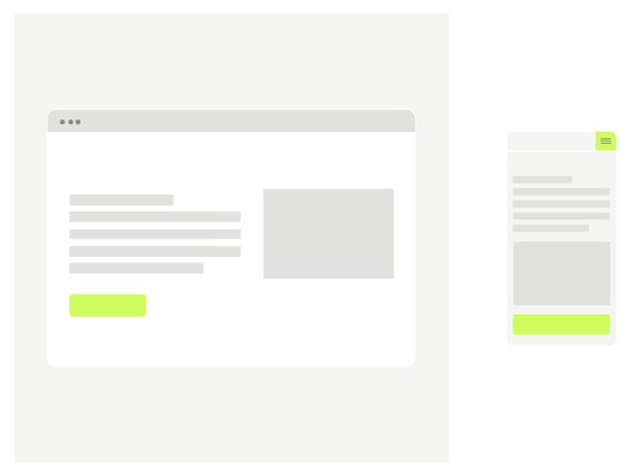
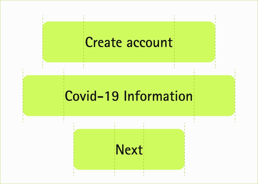
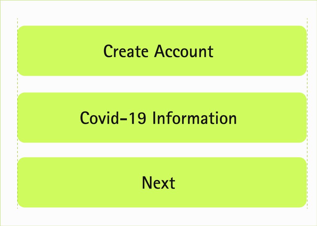
For desktop, buttons are flexible in width based on their inside text, while on mobile, the width stays fixed to the grid. This allows flexibility when longer texts inside buttons are needed, and therefore their layout is not corrupting.
Measure of the buttons here
Buttons on desktop are adaptable to the text element
Mobile buttons
Interaction
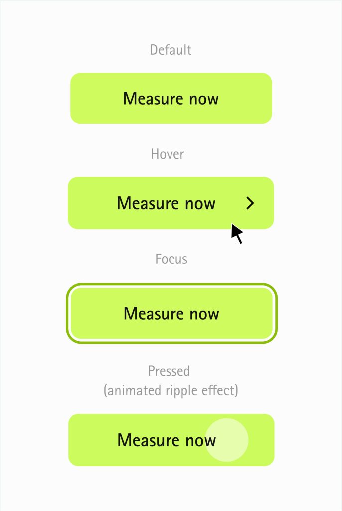
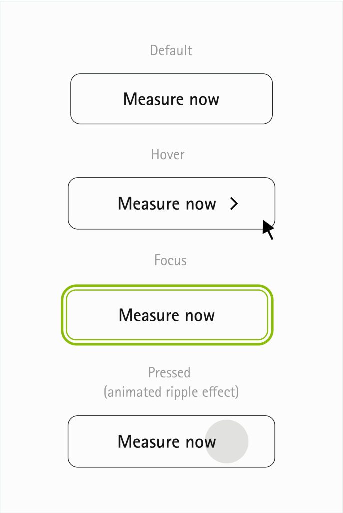
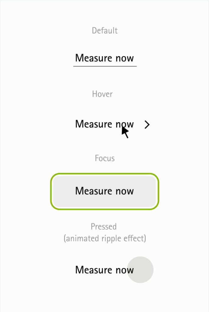
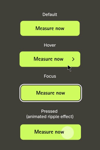
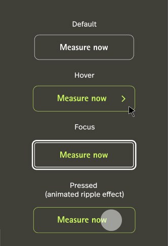
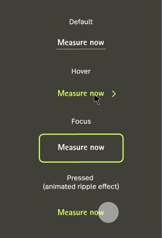
Buttons interaction Catch the users’ eye Buttons are single-click call-to-actions. They should be easy to find, their purpose needs to be clear, and they most importantly need to trigger the need from the user to click or tap on them. Various button types are depending on the emphasis we want to give to their primary action.
Contained button
Outlined button
Text button
Buttons dark mode – High contrast on dark backgrounds When using dark mode it’s important to keep the contrast as higher as possible. Using white as main color for outlined and text buttons keeps the contrast ratio at its higher value. Using the Accent color for hover states makes it more interactive and keeps a very high contrast.
Contained button
Outlined button
Text button
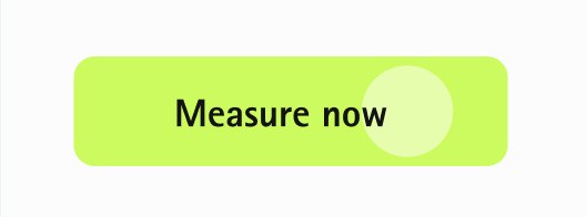
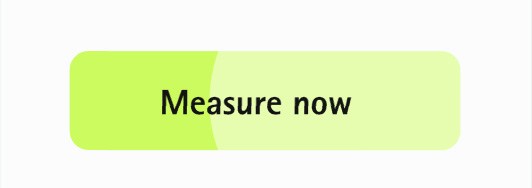
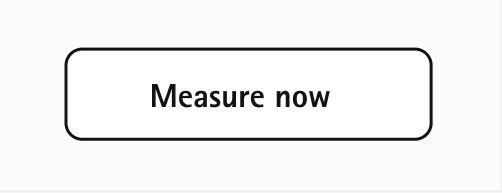
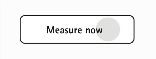
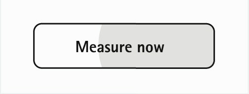
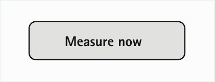
Ripple effect animation for pressed states For pressed states we use an animation called ripple effect to show the user exactly that he pressed a button. Following you find a storyline which explains how this effect will adapt to a button.
On contained button
Default
User clicked the button. At the position the user clicked a circle appears in 15% #fffff and gets bigger.
Circle animations from the center
Circle animations from the center
Back to Default by fading out the circle
On outlined button
Default
User clicked the button. At the position the user clicked a circle appears in Neutral-2 and gets bigger.
Circle animations from the center
Circle animations from the center
Back to Default by fading out the circle
On text button
Default
User clicked the button. At the position the user clicked a circle appears in Neutral-2 and gets bigger.
Circle animations from the center
Circle animations from the center
Back to Default by fading out the circle
Specific buttons – Edge case ccenarios The most prominent way to show a button is in our rectangle form. If not possible or we need to include more dynamics in user-interaction there is the option of including another form: Pills
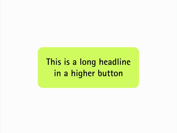
To support other languages a two-lined button is includedc
Two-ined button
Solid button
Outlined pills
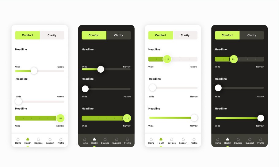
Sliders / Active states -interactive elements Besides the buttons that use our accent color we also have the possibility to play Slider and Active States with our accent color. The same colors will be used for darkmodes.
Best practices
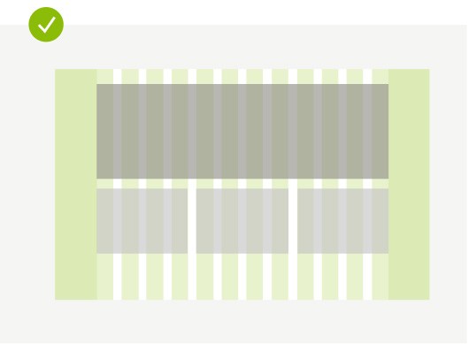
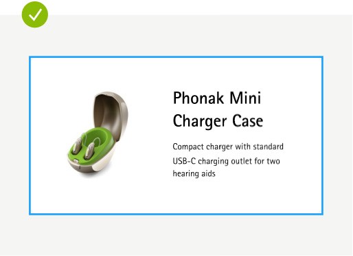
Align to the layout grid, elements should always begin and end on the edge of a column
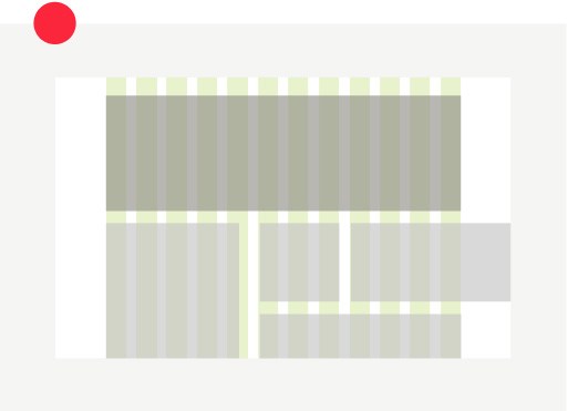
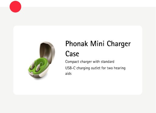
Elements or containers shouldn’t begin and/or end in the gutter; or placed randomly in the layout grid
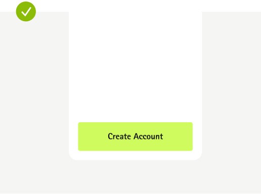
Mobile buttons are long-width no matter the length of the text inside of it
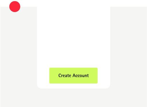
Avoid shortening buttons when the text inside is shorter
Respect the spacing rules for components consisting of different elements
Avoid placing elements with random spacing, which can lead to inconsistency across pages
Applications
Examples for reference, Illustrative purposes only.
Key guidelines
01
Keep layouts uncluttered with horizontal content blocks
02
Use the 8px Grid (and 4px for smaller modules)
03
Applications define the handling of the layout: e.g. buttons are full-width on mobile