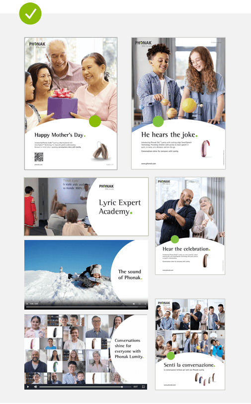
We want to leverage the brand expression by using Phonak’s most characteristic shape: the dot. The dot is our main character, which is why we have to use it in a very considered and targeted way.
It’s all about the brand essence. Brand communication can look very different: from single digital banners to analog multiple page brochures, from slide decks on screens to big billboards in the city, from Instagram to LinkedIn. The Phonak brand expression is adaptable enough to serve those diverse requirements.
Dot principles Pediatrics Positioning Image formats Corner behaviour Logo placement
The dot in the headline
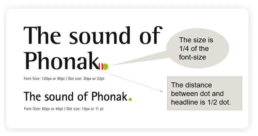
Main-Headlines can have the dot as an element included. The Size is 1/4 of the font-size. The distance between dot and headline is 1/2 dot.
The dot principles
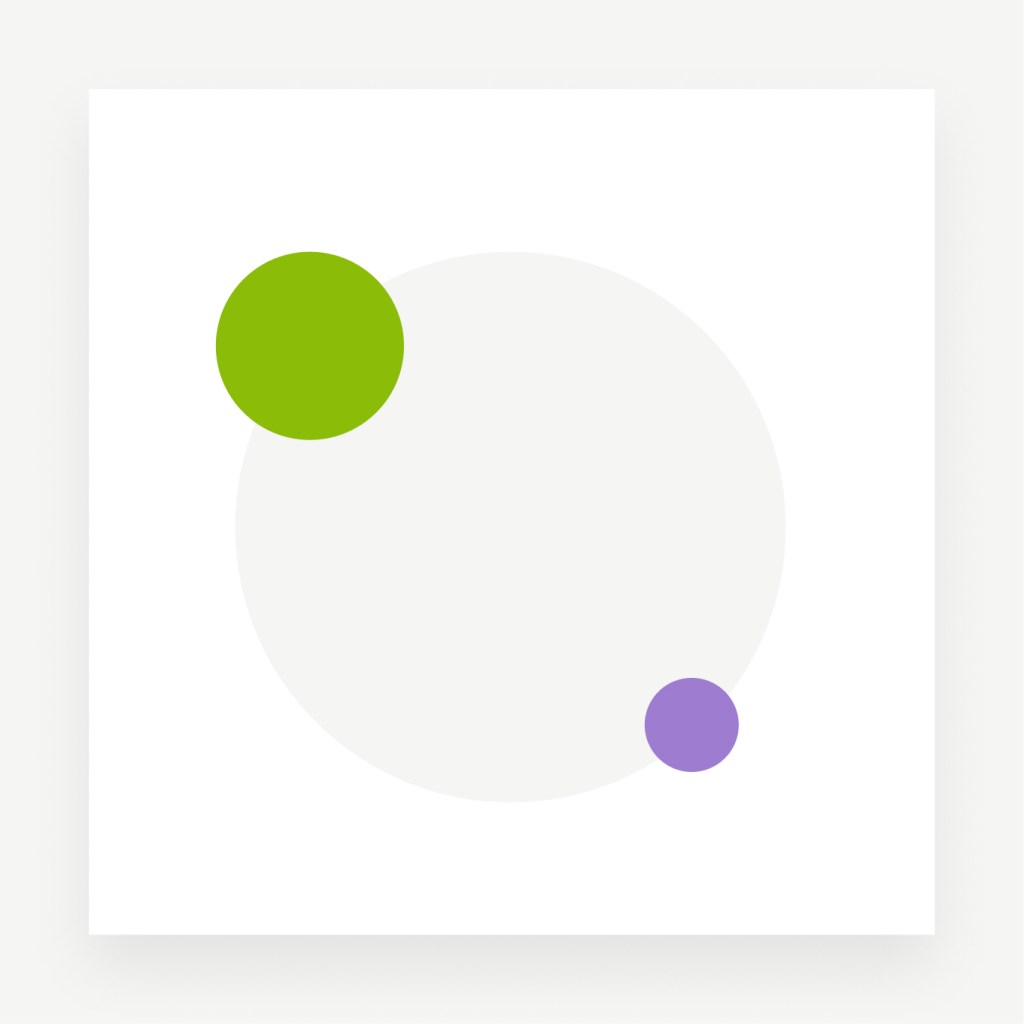
Layers for focus
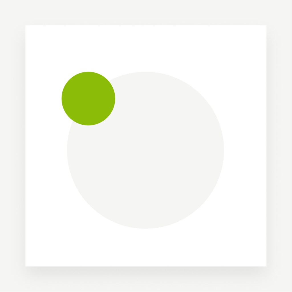
Used to put products or images in the center of attention. The grey dot serves as background element or as mask for images.
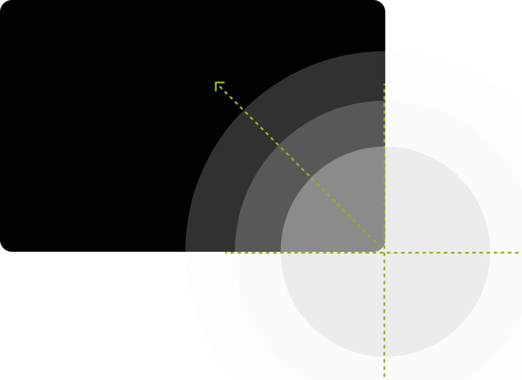
Crop for emphasis
Used to create full layouts such as ads, slides or single web components.
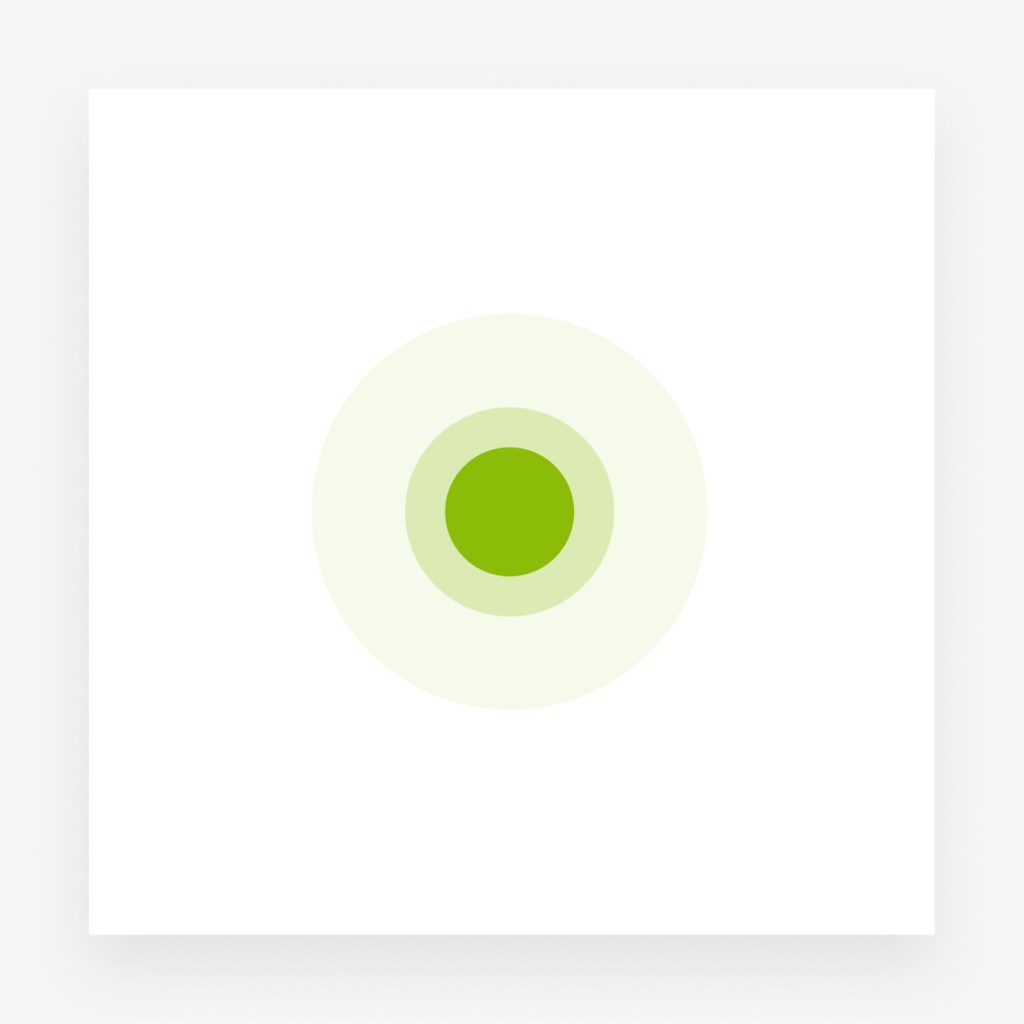
Pulse for activity
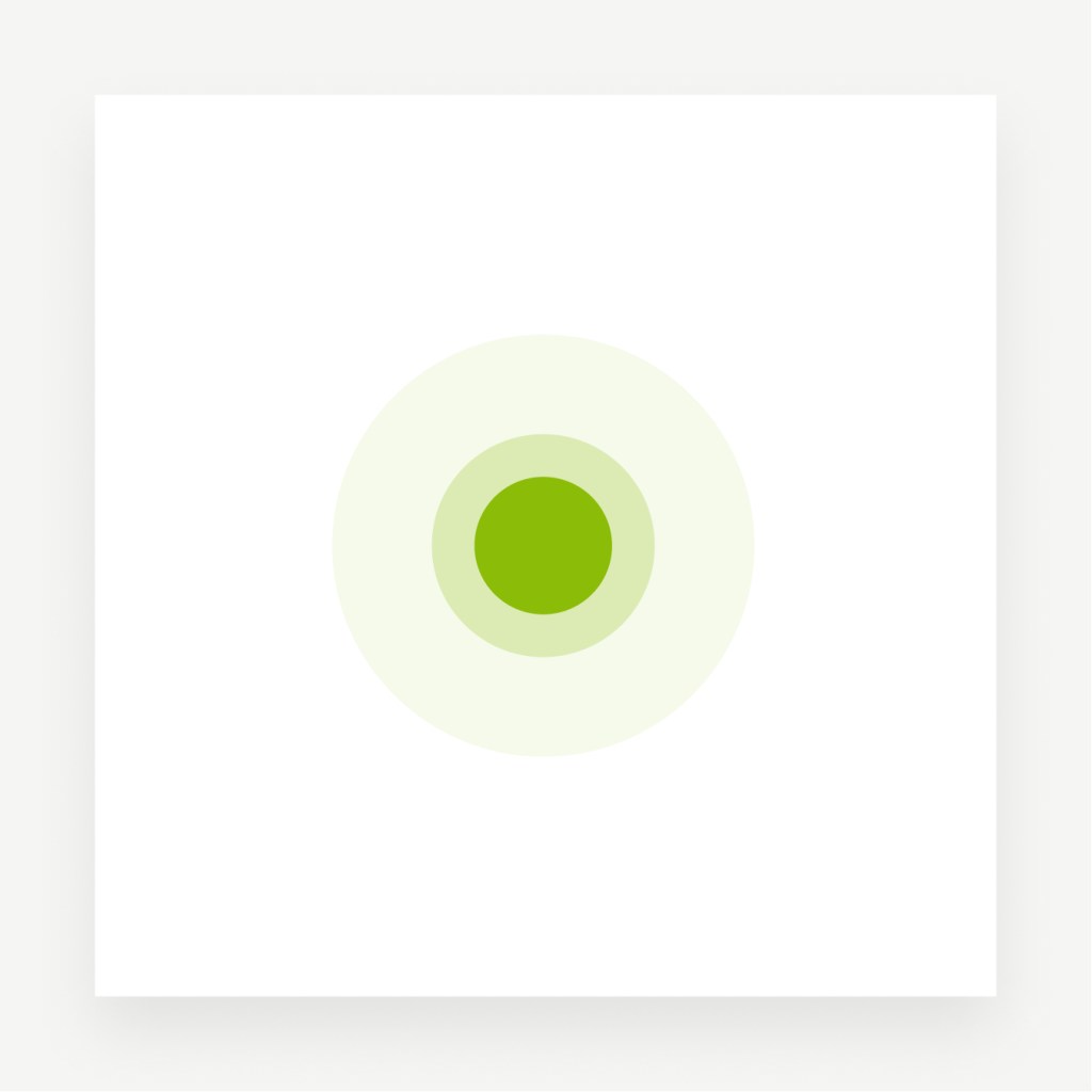
Used to communicate interactivity between humans, products and devices.
Masking for images
Used to highlight photography.
Dot as background element
Used to divide content visually.
Dot principles Pediatrics Positioning Image formats Corner behaviour Logo placement
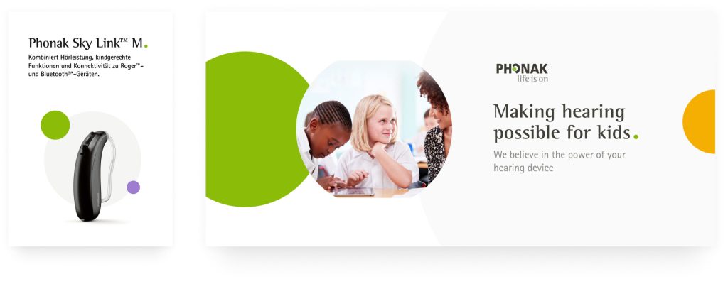
Brand expression for pediatrics
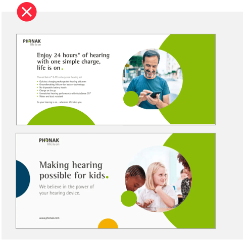
The main principle for pediatrics is the support of the green Phonak dot by a smaller/less dominant dot using the secondary colors. The basic brand expression remains in place but is extended by the colored dot principles for pediatrics. The green Phonak dot always needs to be the prevailing design element.
Layers for focus
Used to put products or images in the center of attention. The grey dot serves as background element or as mask for images.
Crop for emphasis
Used to create full layouts such as ads, slides or single web components.
Pulse for activity
Used to communicate interactivity between humans, products and devices.
Dot positioning
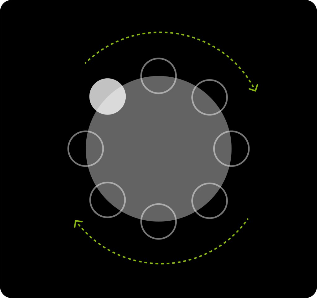
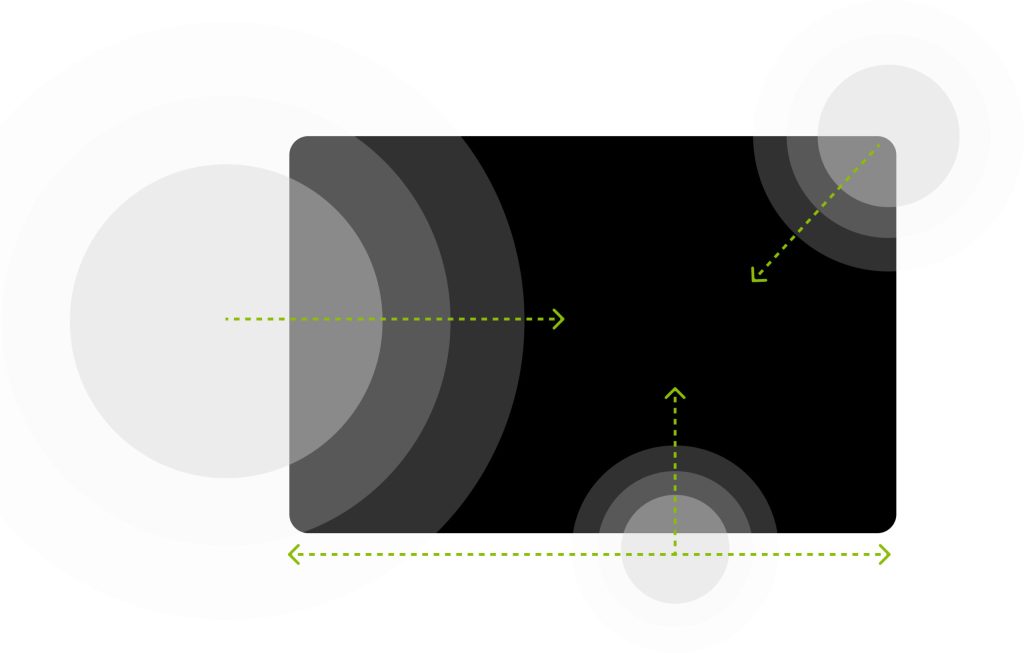
In order to be flexible enough to react to different situations, the dot can be positioned in various ways when using the principles.
Layer Positioning
Horizontal positioning
Vertical positioning
Diagonal positioning
Pediatrics positioning
Dot principles Pediatrics Positioning Image formats Corner behaviour Logo placement
Image formats
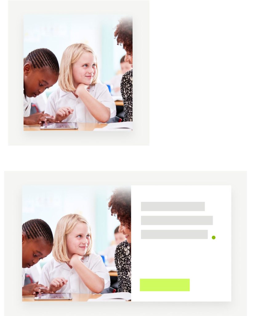
The image world of Phonak needs to be used in very different types of media, which requires several options to ensure the right image treatment at the right time and place. While there is no specific hierarchy among the formats or a clear rule which image format is the prevailing one, the three format variations should not be mixed within one area.
Circles
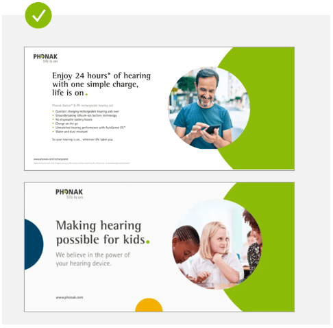
We use circles to highlight images and make them the center of attention. Circled images can be cropped and arranged freely on the given tool. There should never be more than one circled image visible at once.
Rectangles and squares
These image formats are the most flexible ones as they can be used in very different surroundings.
Full bleed
Usage of full bleed images is helpful for story telling purposes, visual highlights and for specific usage such as social media.
Dot principles Pediatrics Positioning Image formats Corner behaviour Logo placement
Behaviour of corners
Images have no rounded corners. However, circle shaped images are okay to use.
Behavior of corners for graphical elements
Graphical elements, like cards, graphs or text boxes should have straight corners.
Exception for eLearnings: For reasons of consistency, the use of rounded corners (text boxes and graphic elements) is permitted in eLearnings.
Dot principles Pediatrics Positioning Image formats Corner behaviour Logo placement
Logo placement
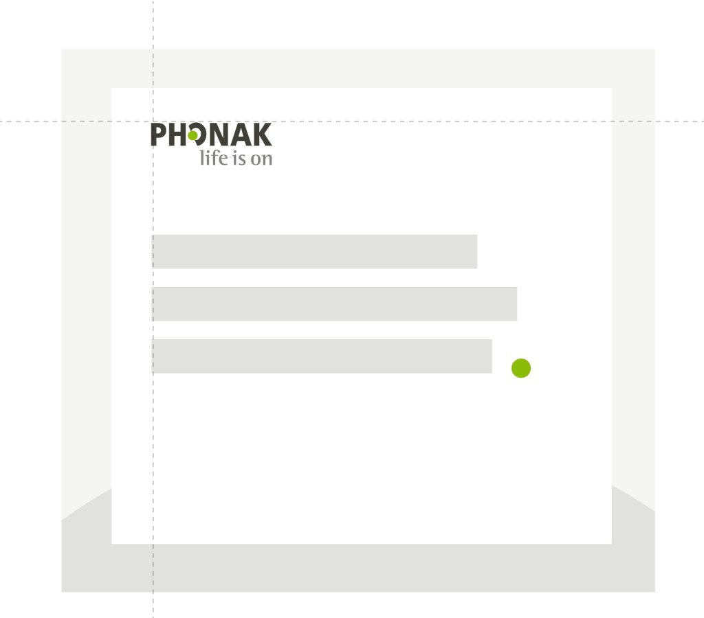
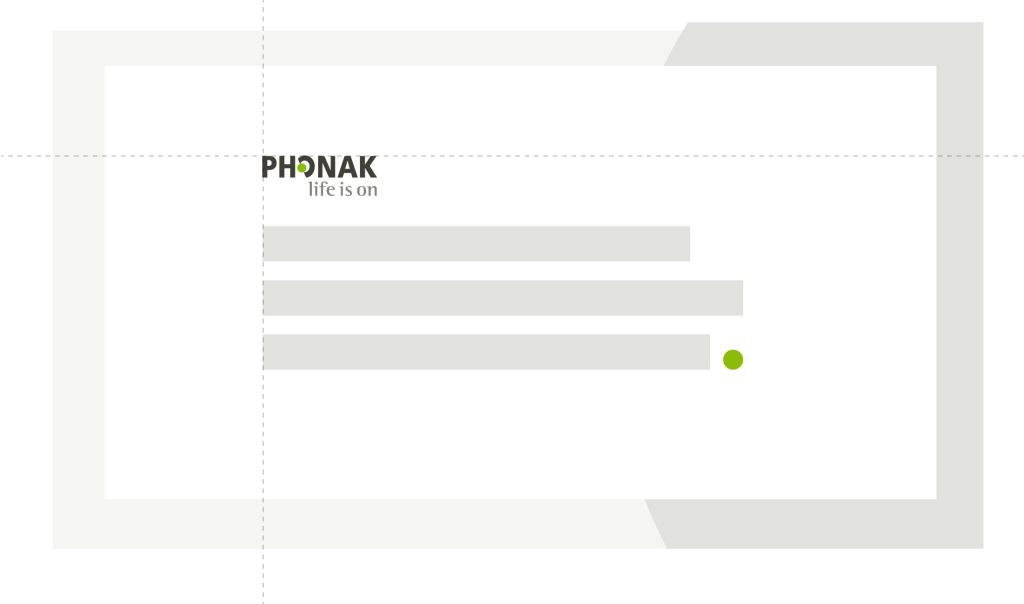
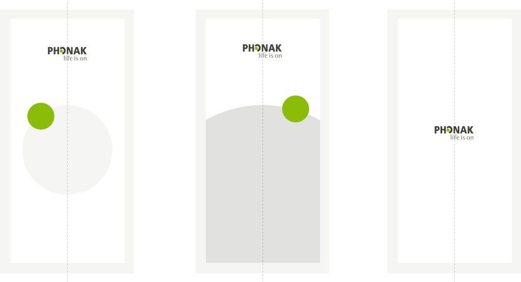
The Phonak logo can be positioned in two different ways, always as a first element in the content.
Top left corner
Top left corner, aligned with text
Exception
In extreme portrait formats, when a product or image is at the center of attention or has no content except the logo, the logo can be placed at the center. E.g. instagram stories or app splash screens.
Best practises
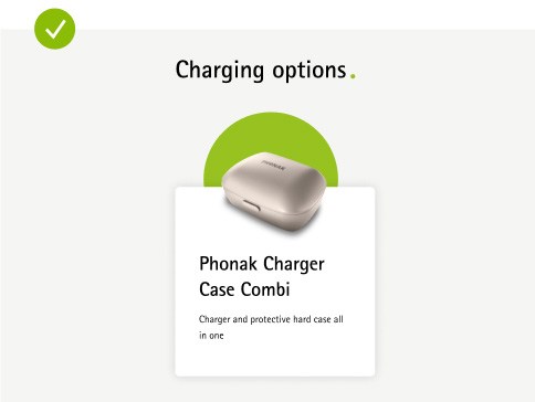
Use the circle for images together with the dot
The Phonak green is not overused, in this case only as a subtle dot for the hover state
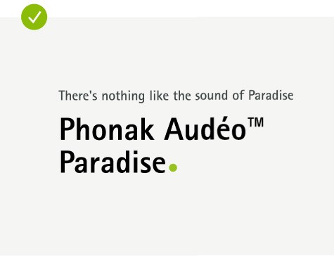
The Phonak dot provides brand expressions to main headlines
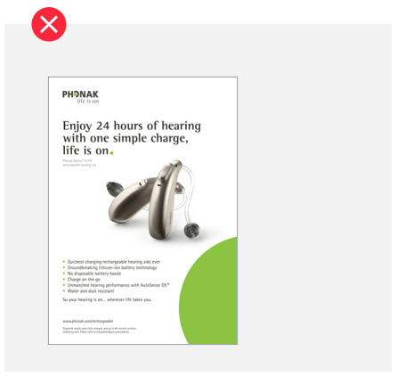
Avoid mixing different shapes for the image underneath the Phonak dot
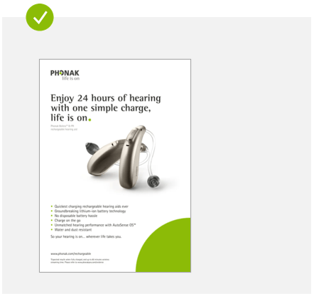
Keep details at a minimum and highlight the hearing aid when is present
Avoid using headlines with the Phonak green to give a brand expression
Five rules how to apply the dot correctly
1. Never write any text into the green dot. It always needs to remain empty.
2. Do not use the dot as a design element (to create for instance a «logo»).
3. Use only one green dot per design plus you can add an additional one in grey (exception: Peds can add more secondary colors, but not more than two additional).
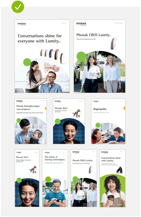
4. When the green dot is cropped, use either a quarter or half of a dot – no odd shapes.
5. When the circle silhouette is used the following rule applies: For multiple page documents i. e. brochures, pamphlets, leaflets, dot silhouette runs out of the image (pushes copy away) …
… for single page documents/assets i. e. ads, posters, social media posts and movies, the dot silhouette runs into of the content (pushes the image away).