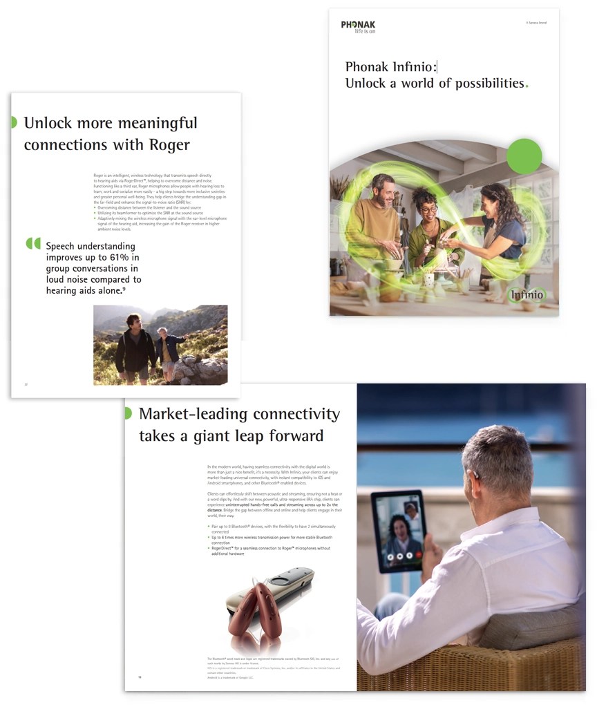
The digital brand guidelines can be adapted to analog media as well. Brochures are being equipped with a layout system and grid that allows us bring brand expression to life in content heavy, multiple page formats.
Layout system Cover variations Content pages Pamphlet
Used to put products or images in the center of attention. The grey dot serves as background element or as mask for images.
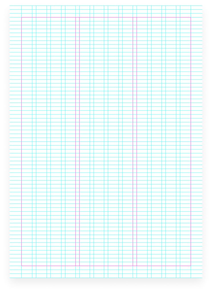
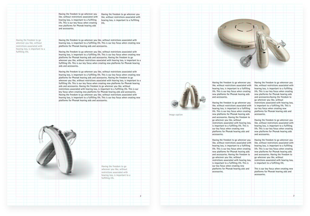
Template grid
*Grid provided on the InDesign Brochure templates.
Doted lines only for reference to show the content placement within the grid.
Dot positioning
In order to be flexible enough to react to different situations, the dot can be positioned in various ways when using the principles.
Layout system Cover variations Content pages Pamphlet
Cover variations
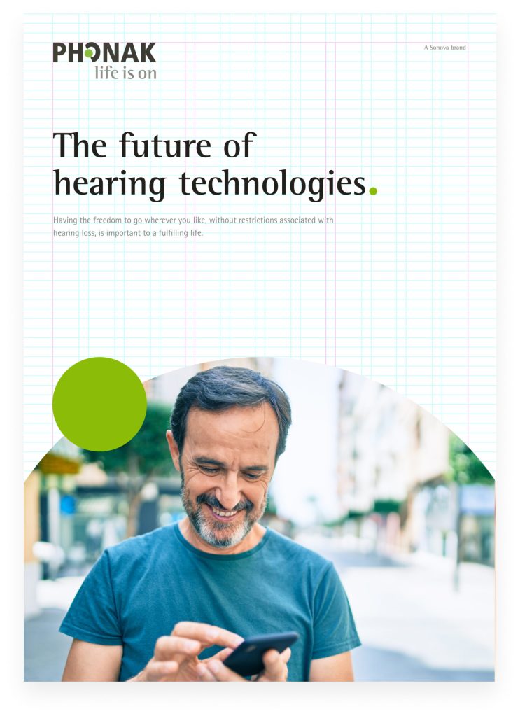
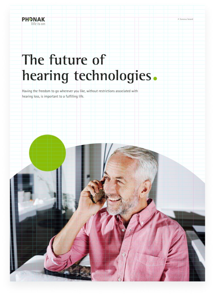
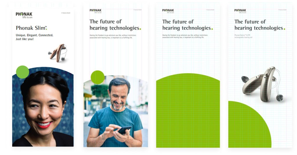
Maintaining a similar layout across several publications, the Phonak brand will always be recognizable regardless of the content and topics communicated in the specific brochure. Especially for brochure covers we want to stay within similar compositions to ensure consistency throught the various issues.
The green dot will always be used for brochure cover titles. A second dot (one or two more for pediatrics) can be added to the composition as illustrated in the examples below.
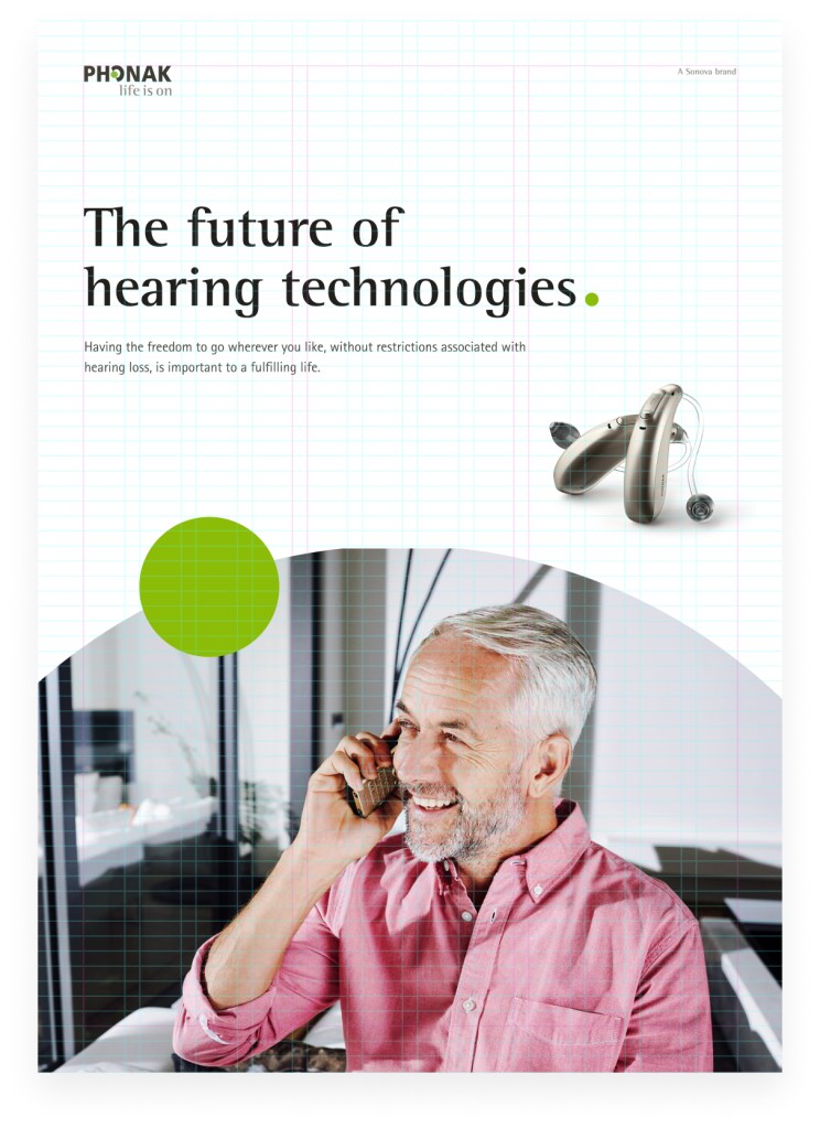
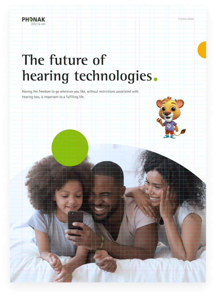
Cover variation with photography
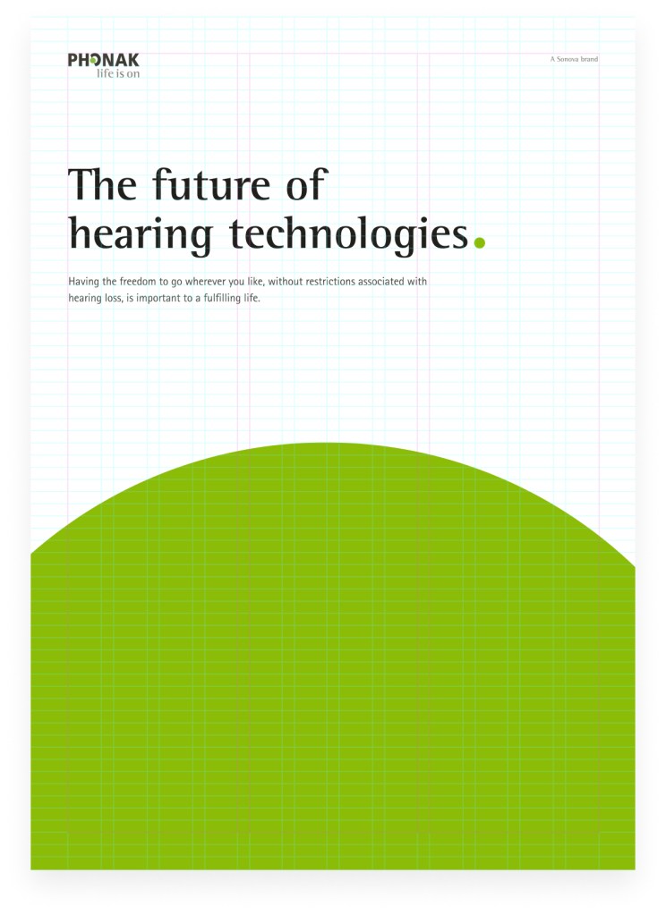
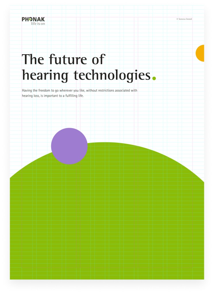
Cover variation without photography
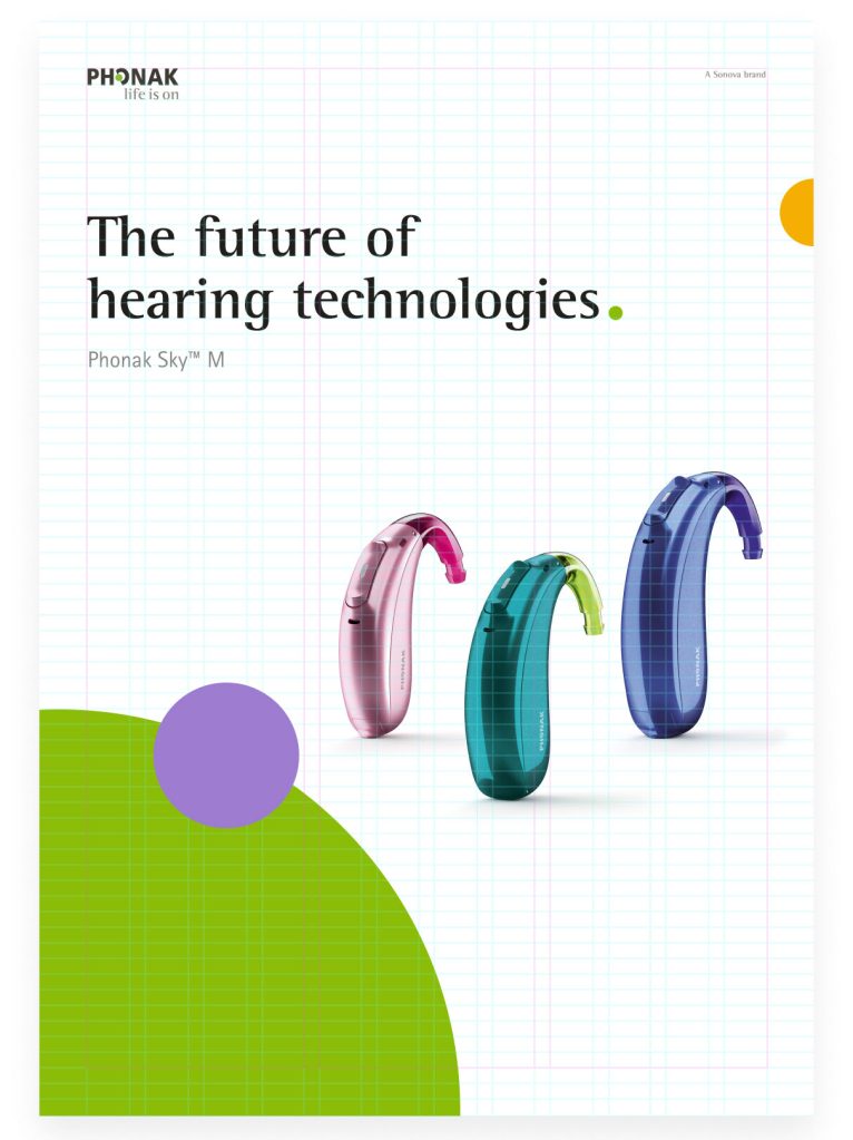
Cover variation with additional element (e.g. product)
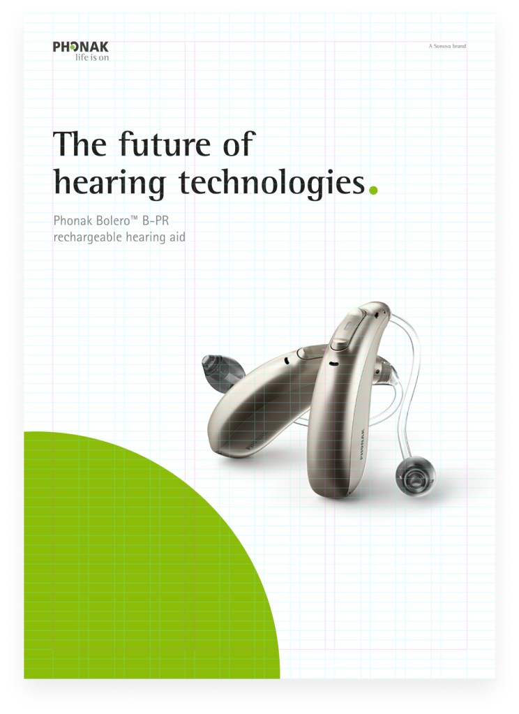
Cover variation with product
Pediatrics
Layout system Cover variations Content pages Pamphlet
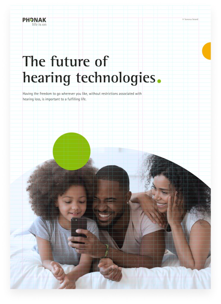
Cover variation for pediatrics with photography
Cover variation for pediatrics without photography
Cover variation with pediatric products
Cover variation for pediatrics with additional element
Layout system Cover variations Content pages Pamphlet
Content pages
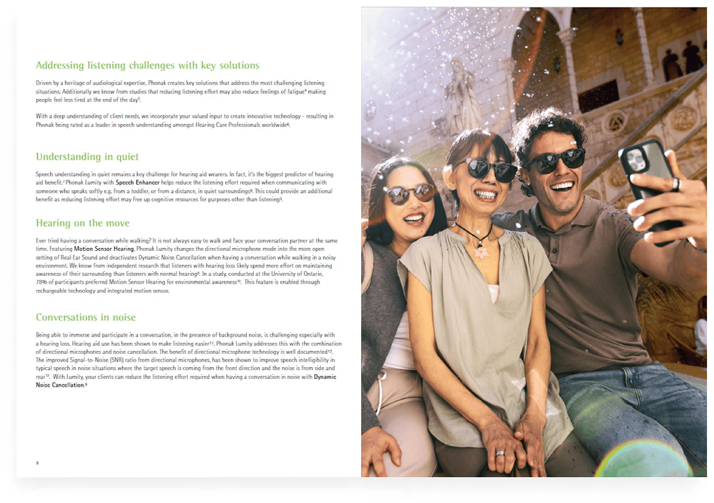
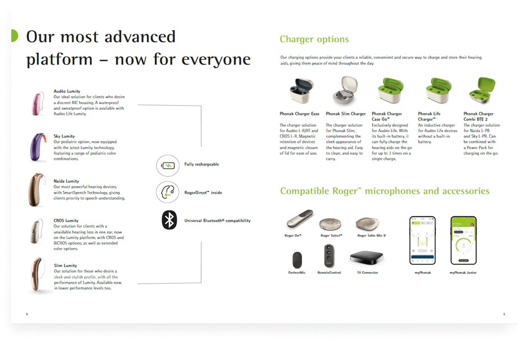
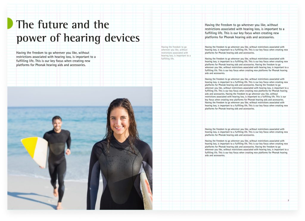
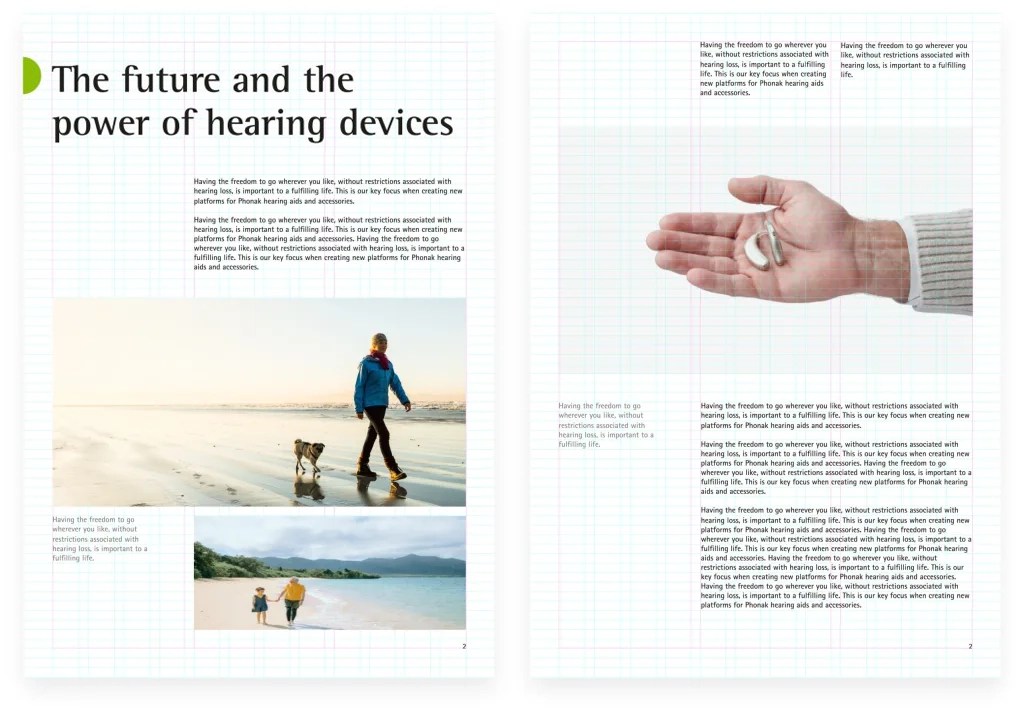
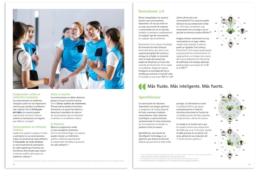
The brochure content can vary from text or image heavy layouts to text only. A balanced composition can be reached by combining short text with big images and vice versa. While doing so, the elements should always stay inside the grid.
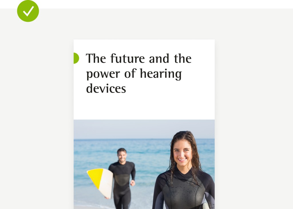
Inside the brochure, the green dot mainly serves as a visual anchor to place and highlight headlines.
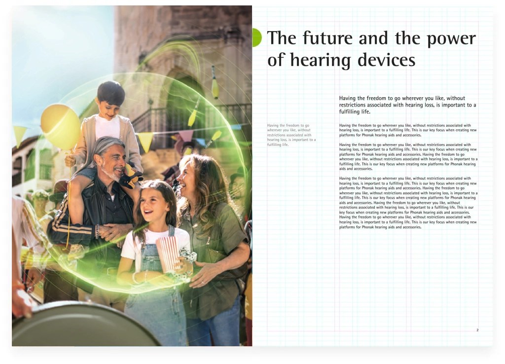
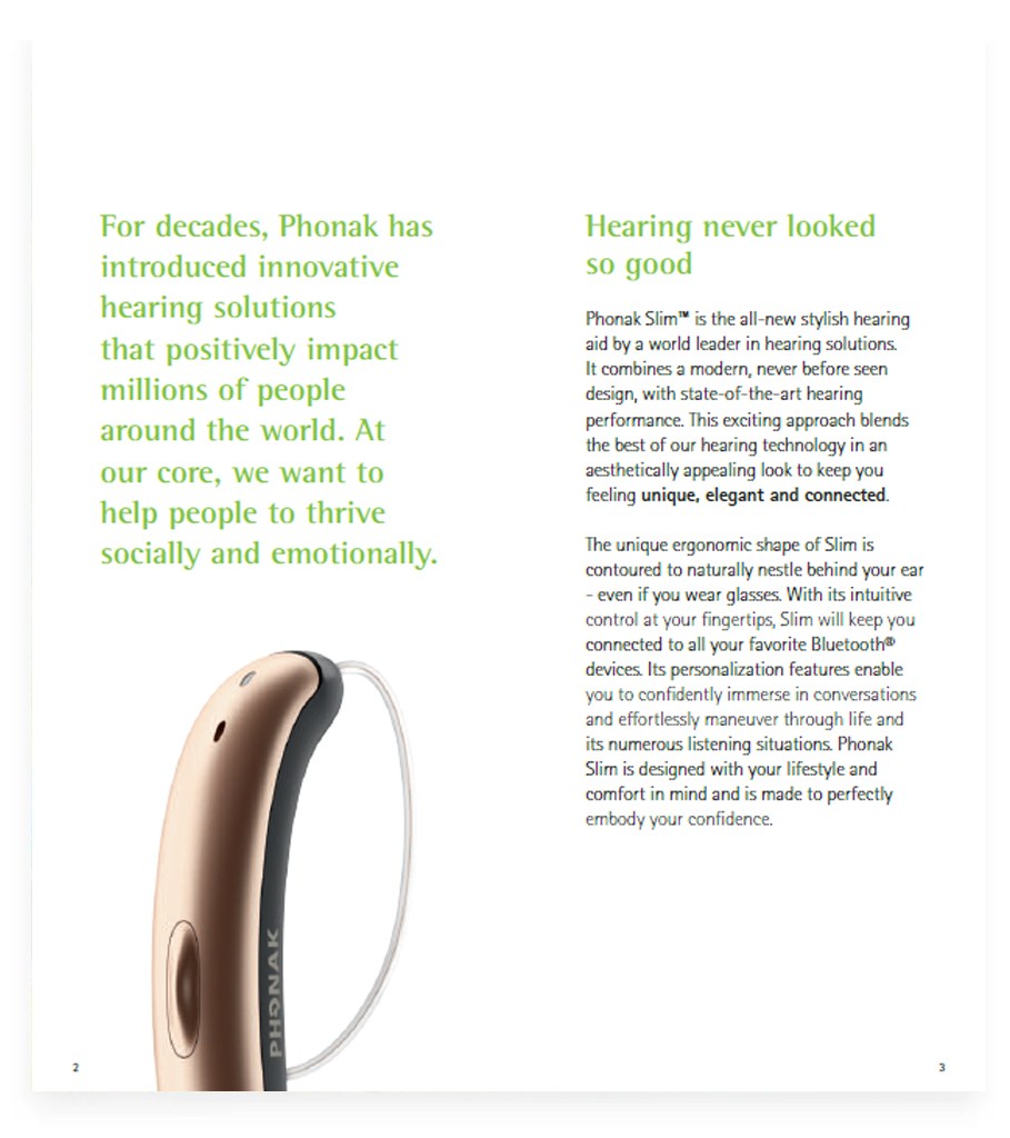
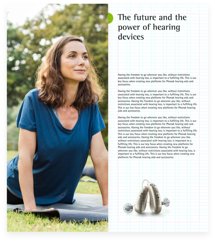
Combining full bleed images & text – headline, subline, bodytext. So called »marginalia« can be used to give additional information regarding specific topics, or to quickly summarize a paragraph.
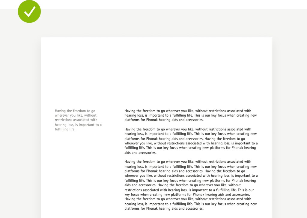
Combining full bleed image & text – subtitles, one column bodytext. Text heavy content can be split in several paragraphs to improve readability.
Example how to add the green dot to a spread.
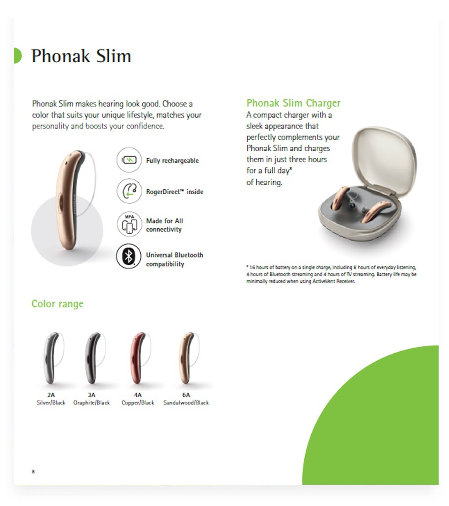
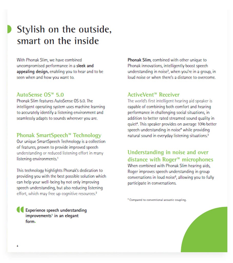
Combining smaller images with text and text only pages
Layout system Cover variations Content pages Pamphlet
Pamphlets (& Leaflets)
The brochure layout system can be adapted to other formats such as the Phonak pamphlets and leaflets.
Best practices
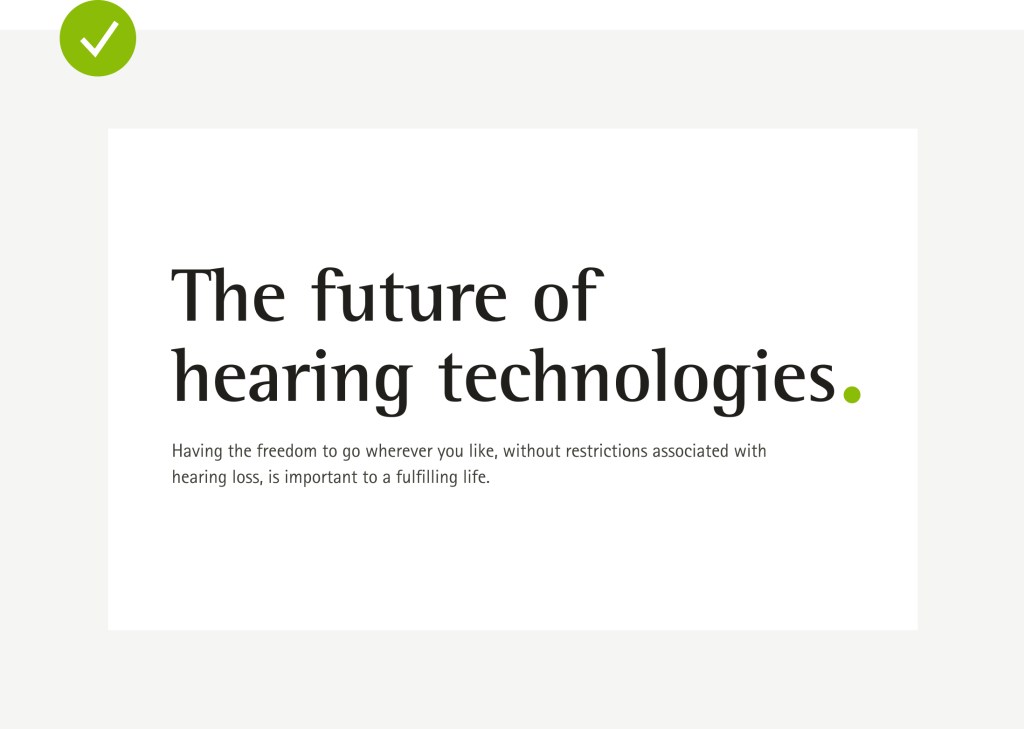
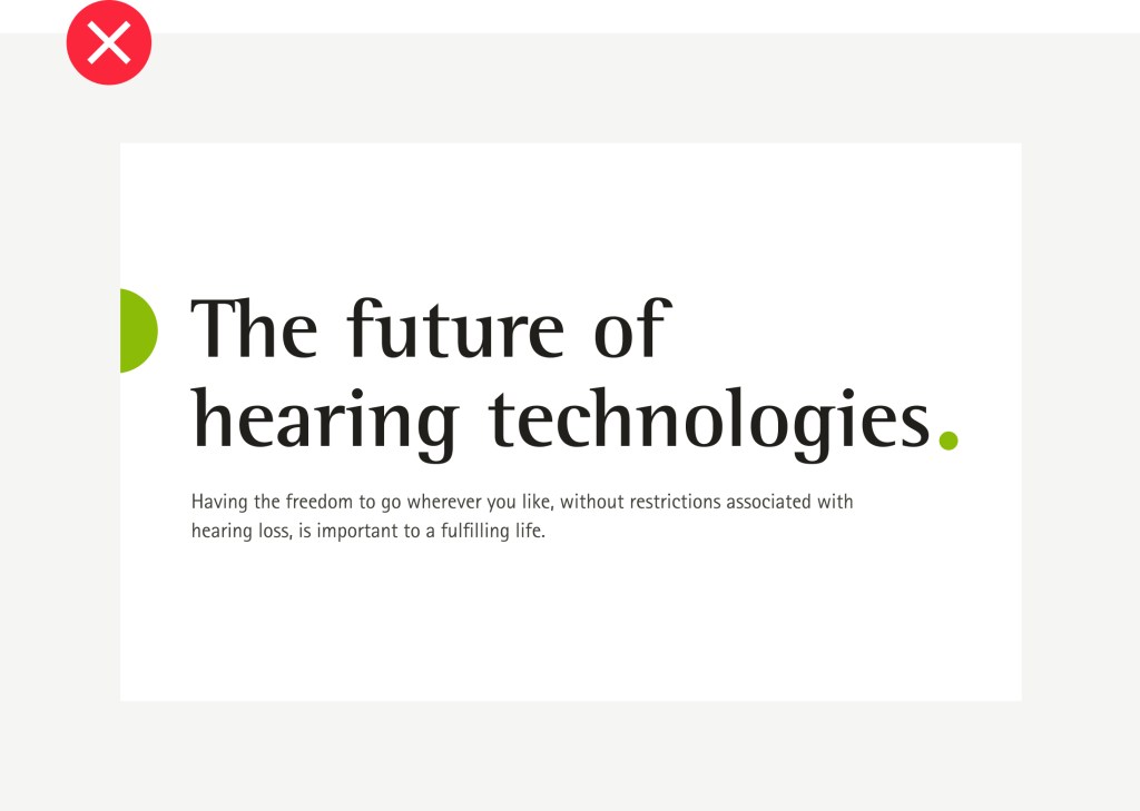
Use the green dot at the end of a headline only for brochure tiltes.
Use the green dot sparsely – it doesn’t need to be visible on all pages.
Use the imagery according to the defined formats and within the grid.
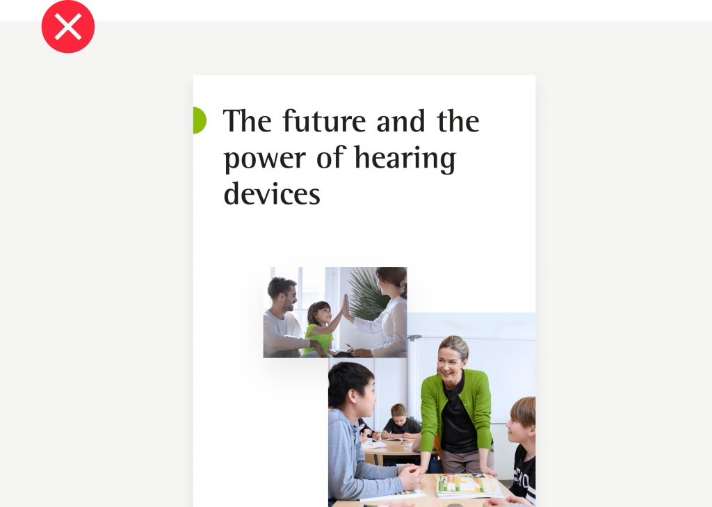
Don’t mix the brand dot at the end of headlines with the dot used for headlines inside the brochure.
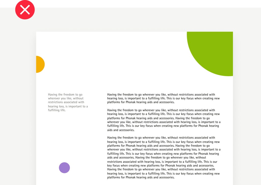
Avoid excessive usage of the dot to prevent the layout from getting too playful or outweighing the content.
Avoid cutting images off the layout or layering images.