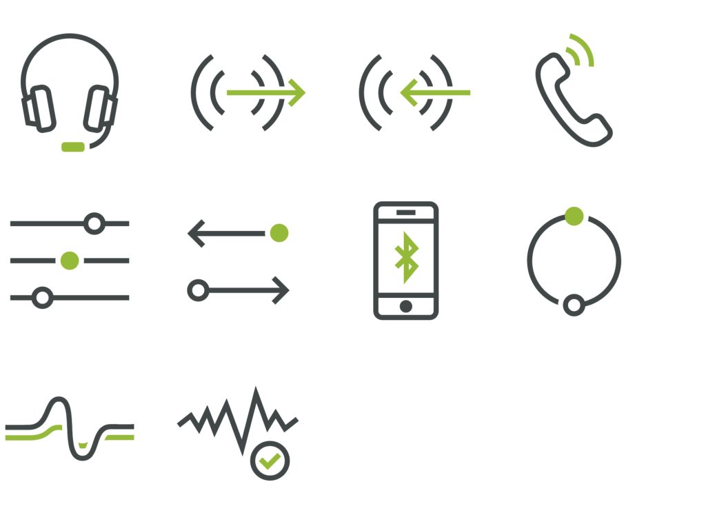
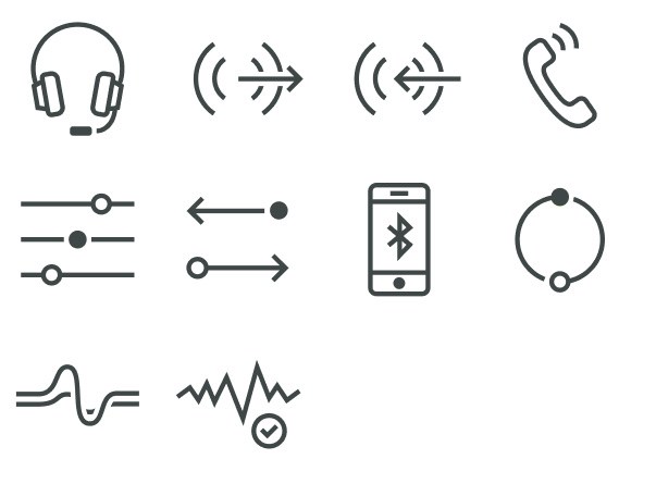
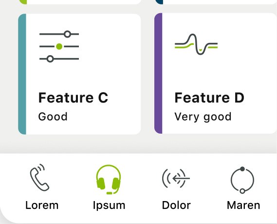
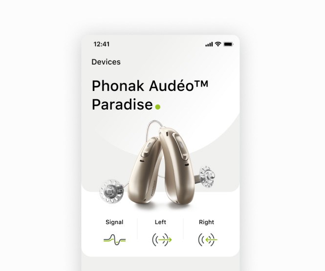
The icons’ purpose is to explain a concept quickly, by providing a visualisation that can be understood by its own or with supporting text, while improving the user interface’s readability and scannability.
Principles
Concise and standarized for clarity
Icons should support the users’ understanding of the content and communicate its concept promptly—globally established symbols and familiar metaphors that are understood and recognized internationally are used for shared knowledge and intuitive interaction.
Simple for readability
Too many details increase cognitive load. The right amount of details with a limited amount of thick enough strokes and sufficient space between multiple filled shapes makes it easier to read and strengthen its purpose.
Characteristic for personality
The roundness and complexity of an icon give its unique flavor while conveying the tone of the brand. Maintaining the same stylistic rules and visual weight (fills, strokes’ thickness, corners, and shapes) gains consistency in the icon set.
Overview Grid Anatomy App Icons
Overview
The icons communicate an idea or concept in a simple and friendly way, caracterized by bold 2 px strokes. Each icon is visually different, but they belong to a set, all unified in their structure and design for a Phonak personality.
For bigger size usage, with PH Green highlight.
For smaller size usage, without the PH Green highlight.
Overview Grid Anatomy App Icons
Grid
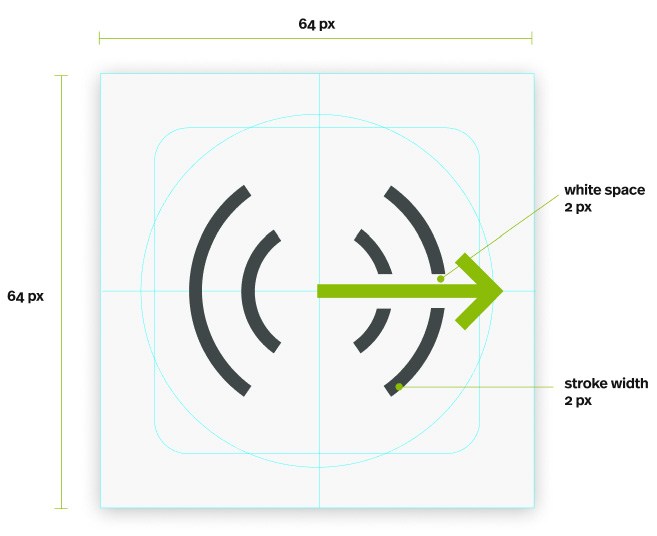
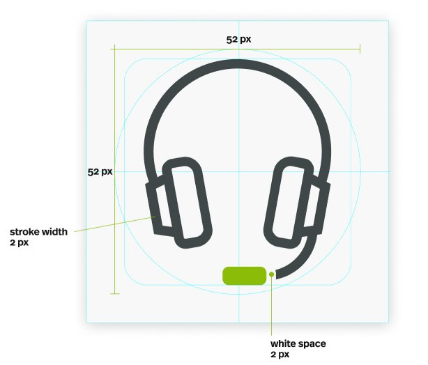
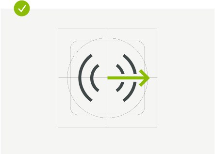
The icon grid establishes clear rules for the consistent, but flexible, positioning of graphic elements. The content area (core shapes as guidelines) help maintain consistent visual proportions across all icons.
Overview Grid Anatomy App Icons
Anatomy
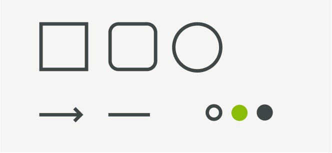
Basic Shape These are the basic shapes on which the icons are built and they can be used as a base or as the main elements of the icons.
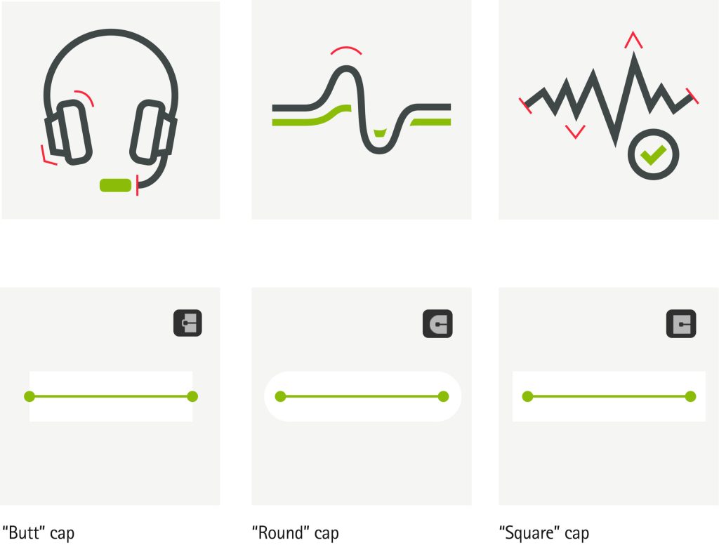
Shape Principle Icons are shaped with a combination of sharp corners together with rounded corners. The strokes width are always of 2px with butt caps in the end of the stroke as visualised on the image below.
Only use the PH green as accent color to either highlight an element in the icon or a specific function.
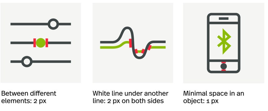
White Space Icons are shaped with a combination of sharp corners together with rounded corners. The strokes width are always of 2px with butt caps in the end of the stroke as visualised on the image below.
Overview Grid Anatomy App Icons
App Icons
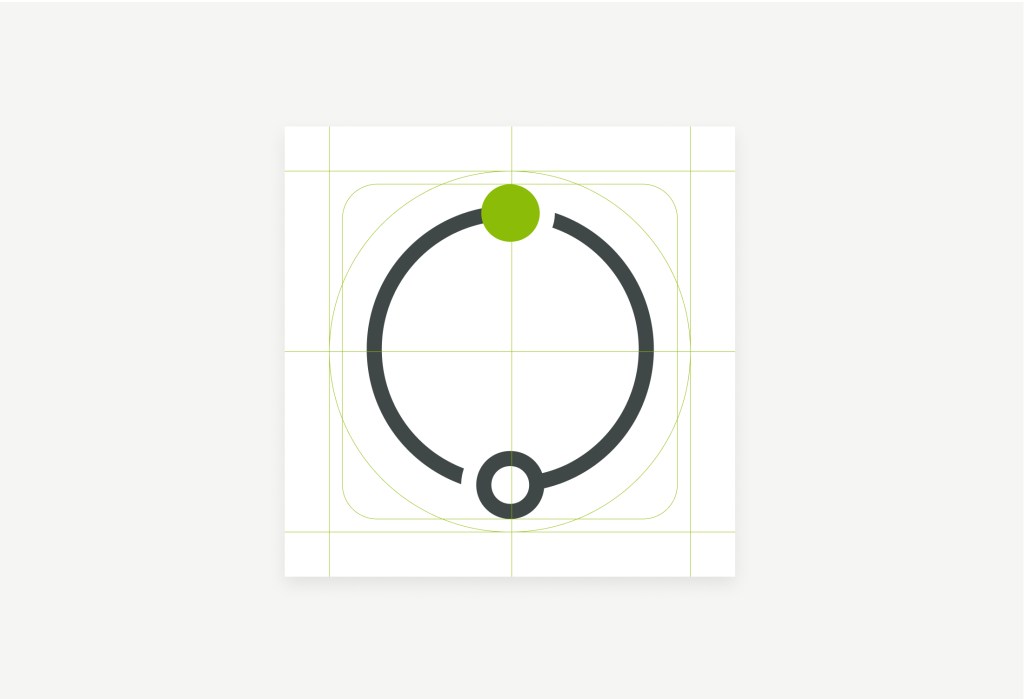
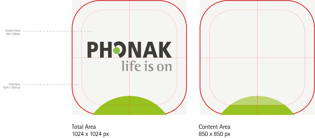
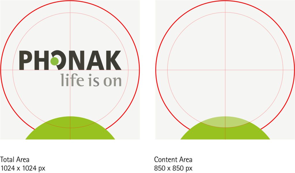
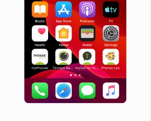
App icons are the visual expression of a brand’s products, services, and tools. Following the same total and content area allows consistency on all the products, while visualising the brand with the PH Green dot on the bottom.
iOS
Android
Best Practices
Keep always the same stroke weights that shape the icon
Keep the icon elements on the content area
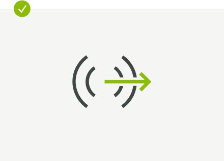
Use consistent strokes and always end with butt caps
Avoid mixing different strokes weights
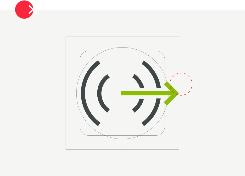
Avoid enlarging the icon to the total area
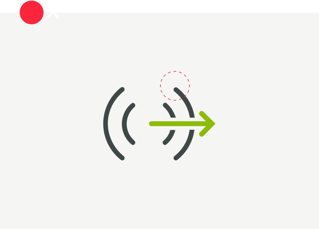
Avoid applying round caps to the strokes
Application
Examples for reference
Overview iOS App Icons
Overview Android App Icon
Overview Android App Icons
Icon in active state
Overview icons on home screen
Key Guidelines
01
Use the grid to maintain the visual proportions
02
Keep the same stroke weight throughout the icon set