Newsletters are a useful tool to communicate a variety of topics and news from the Phonak world to their subscribers. They need to grab the reader’s attention with significant quality and limited content to enable the reader to scan, easily comprehend and improve subscriber clickthrough rates.
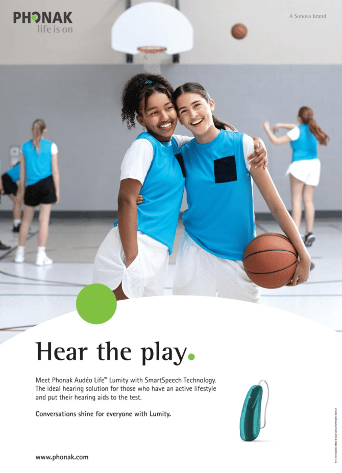
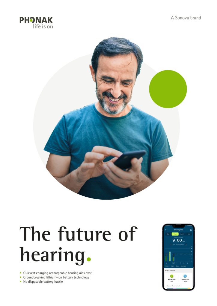
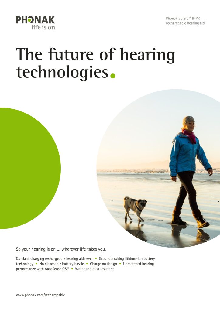
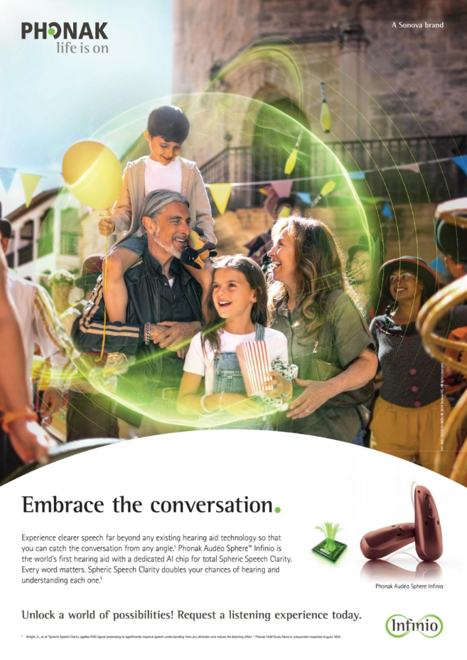
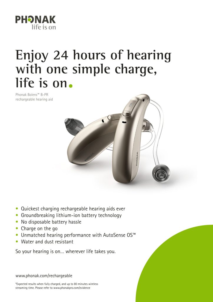
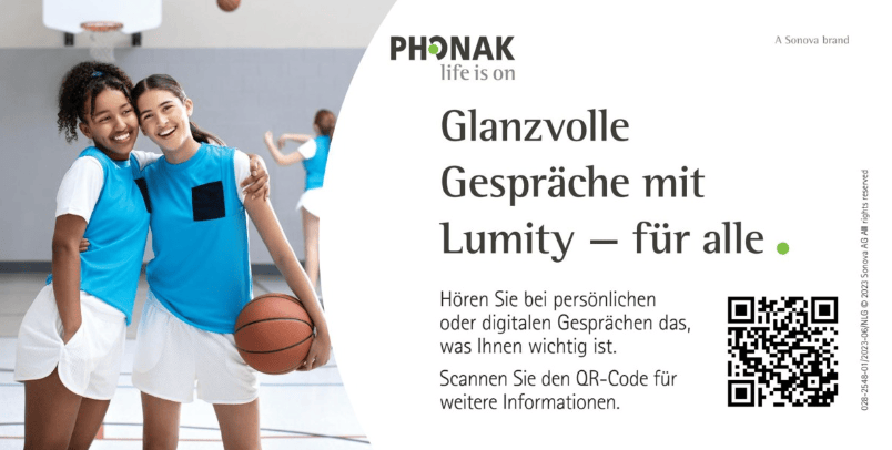
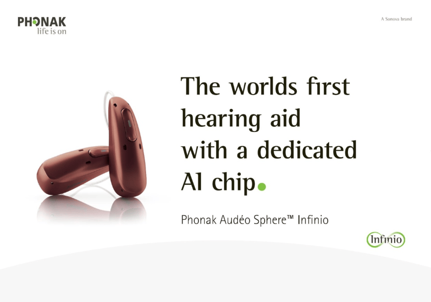
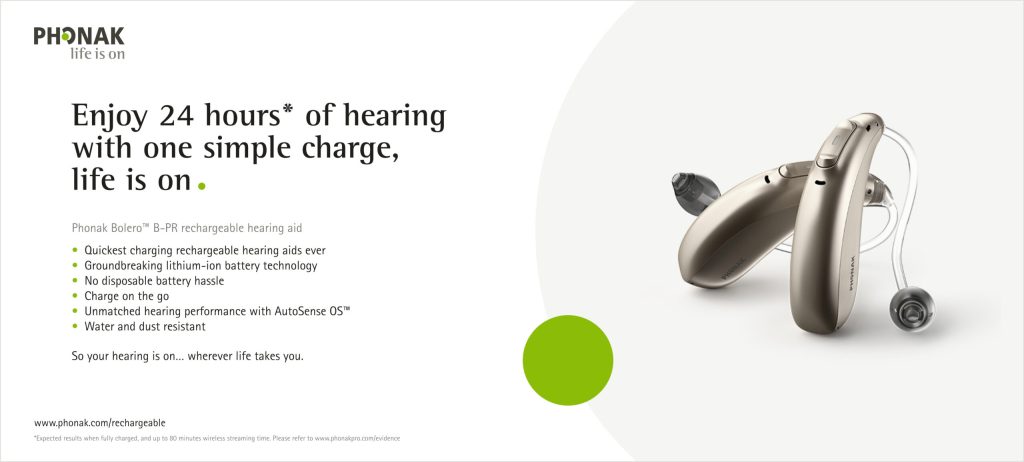
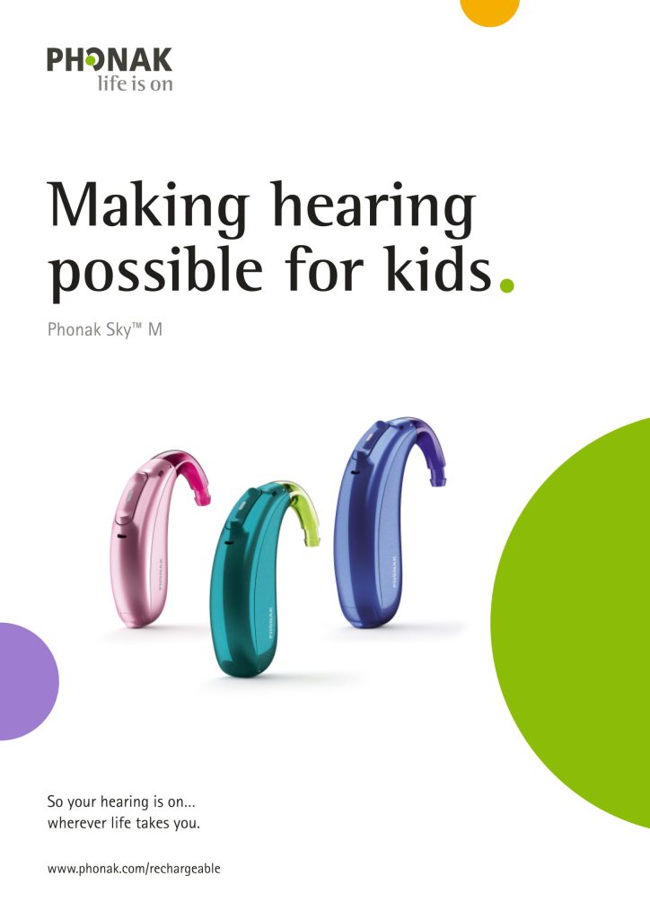
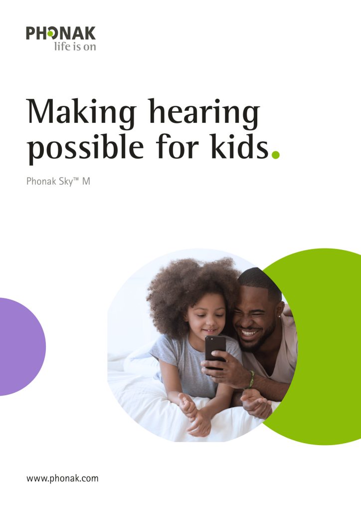
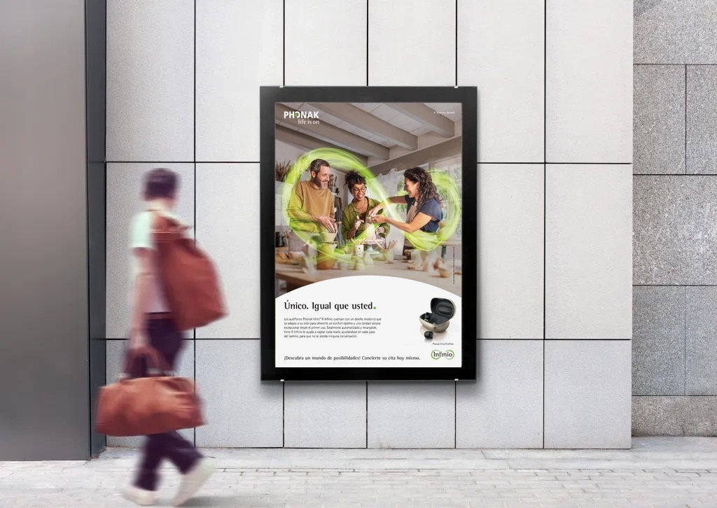
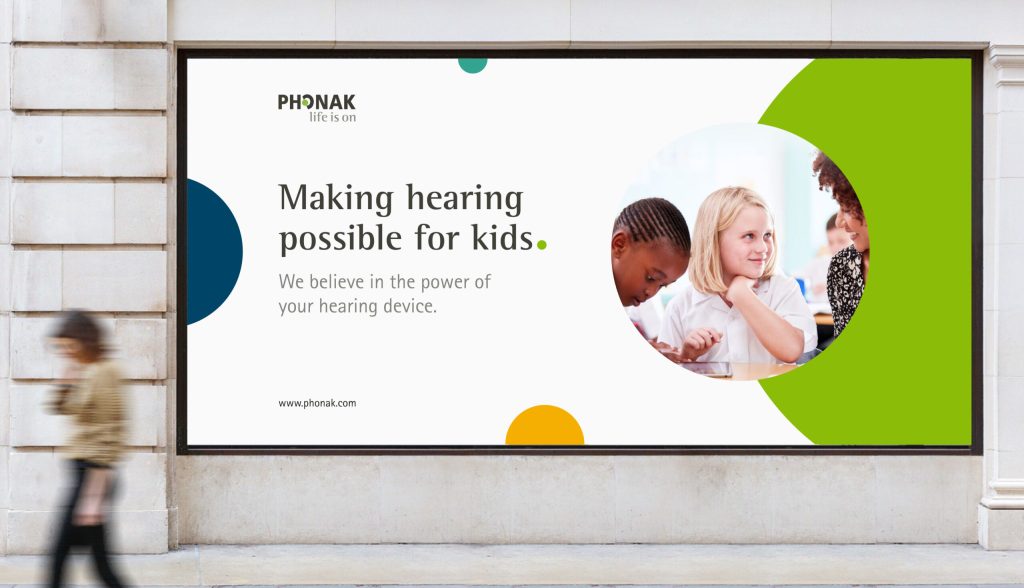
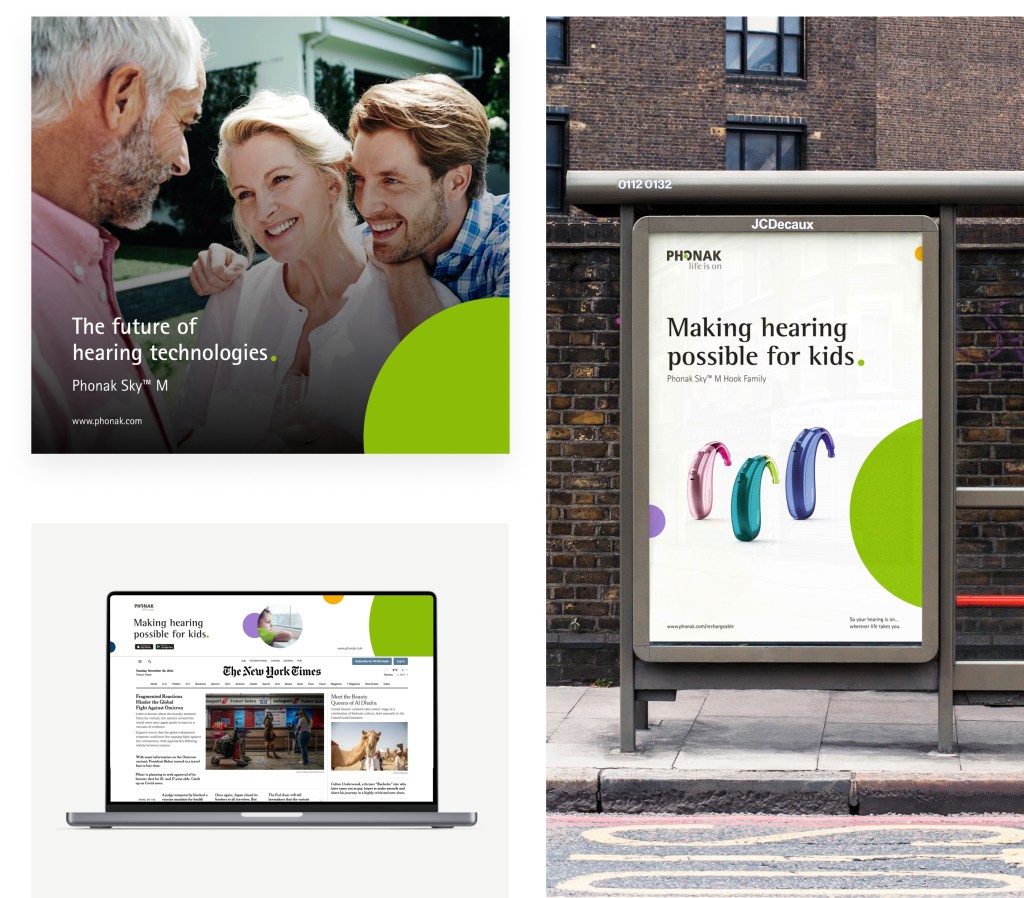
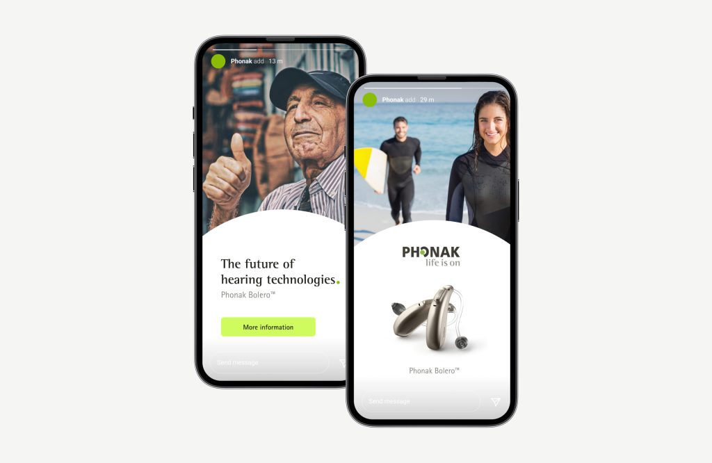
Ads are impactful and engaging across all different touchpoints: digital components, banners, social media, printed posters, etc. The content follows a visual and reading hierarchy maintaining consistency and structure across media.
Ads, as well as all other layout components, are scalable and flexible on applications for different print formats, viewports and devices. Small copy text is usefull in many situations but is optional.
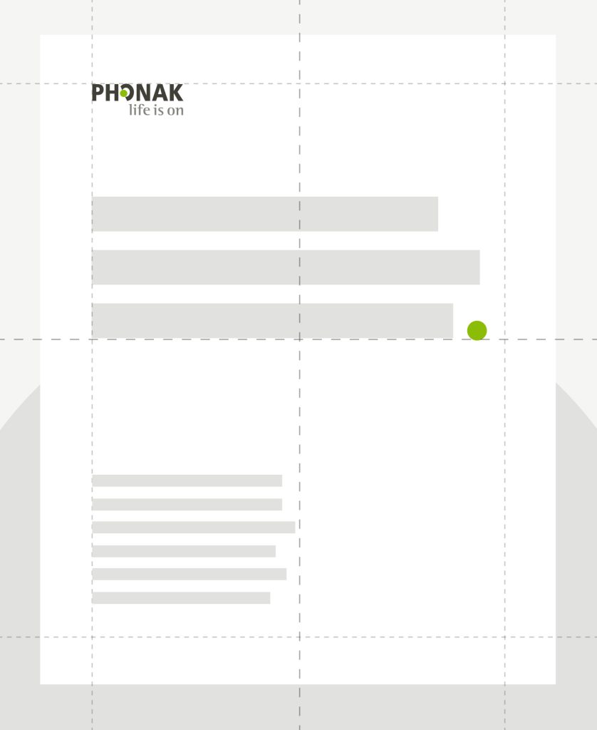
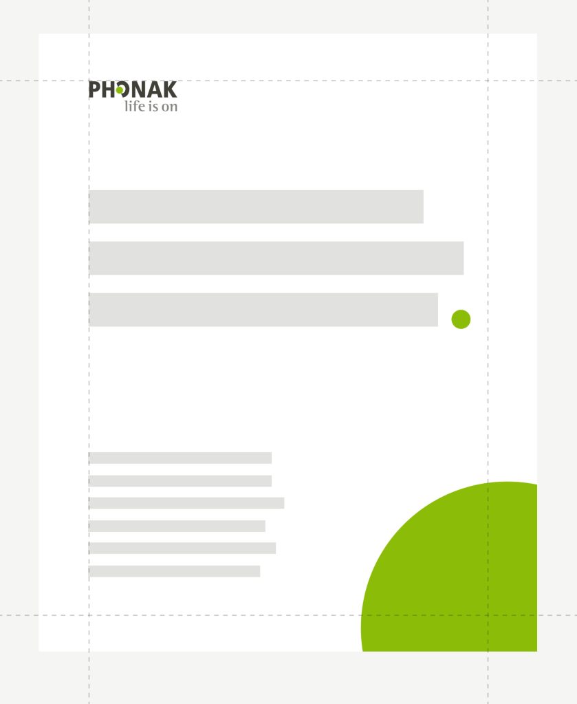
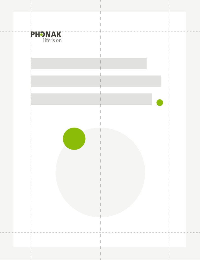
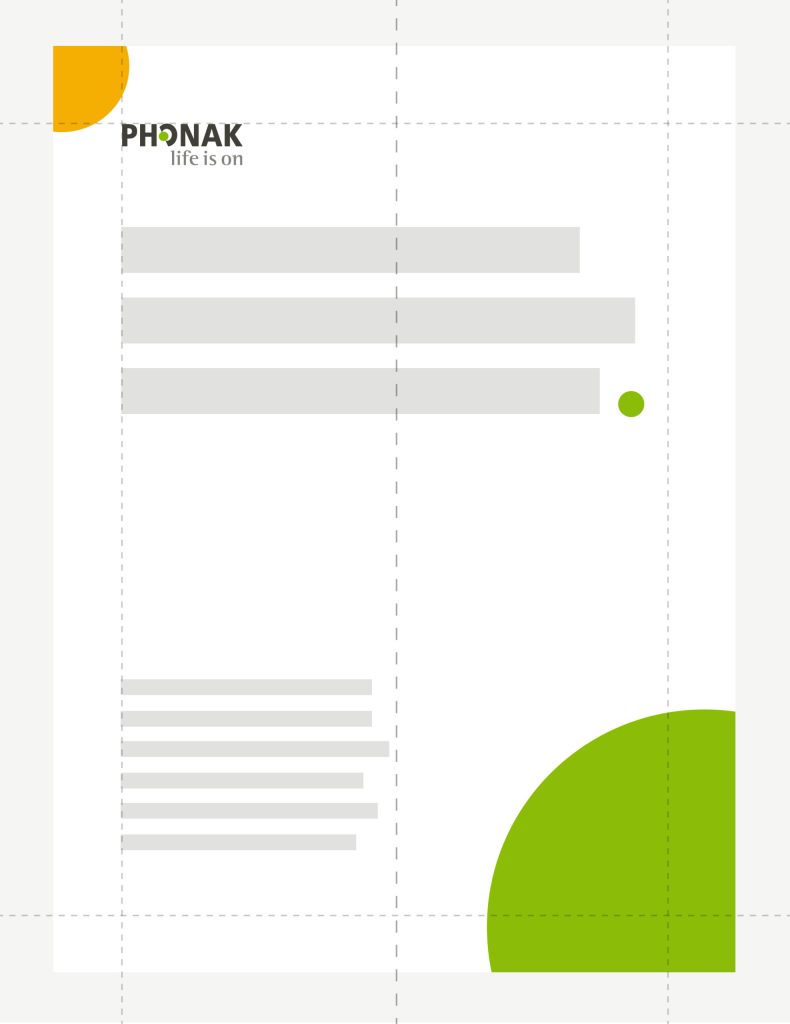
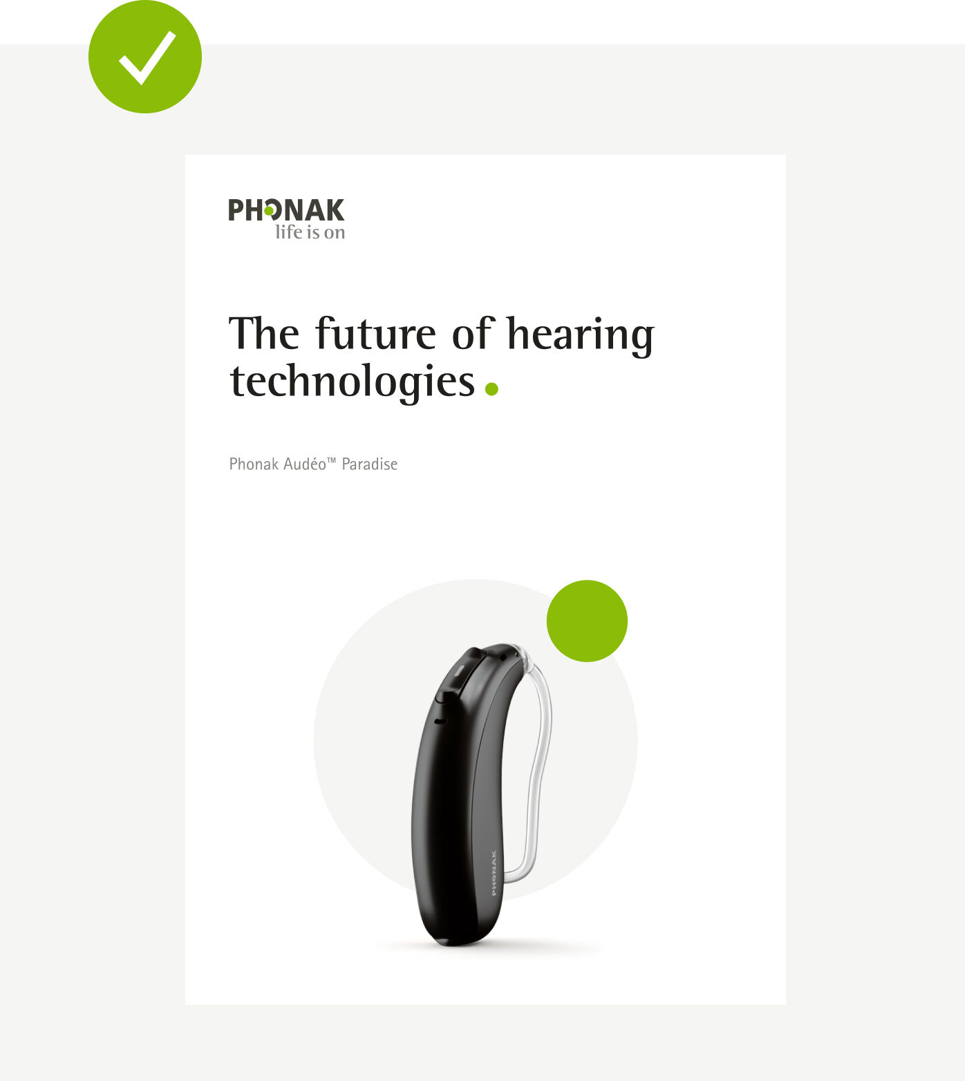
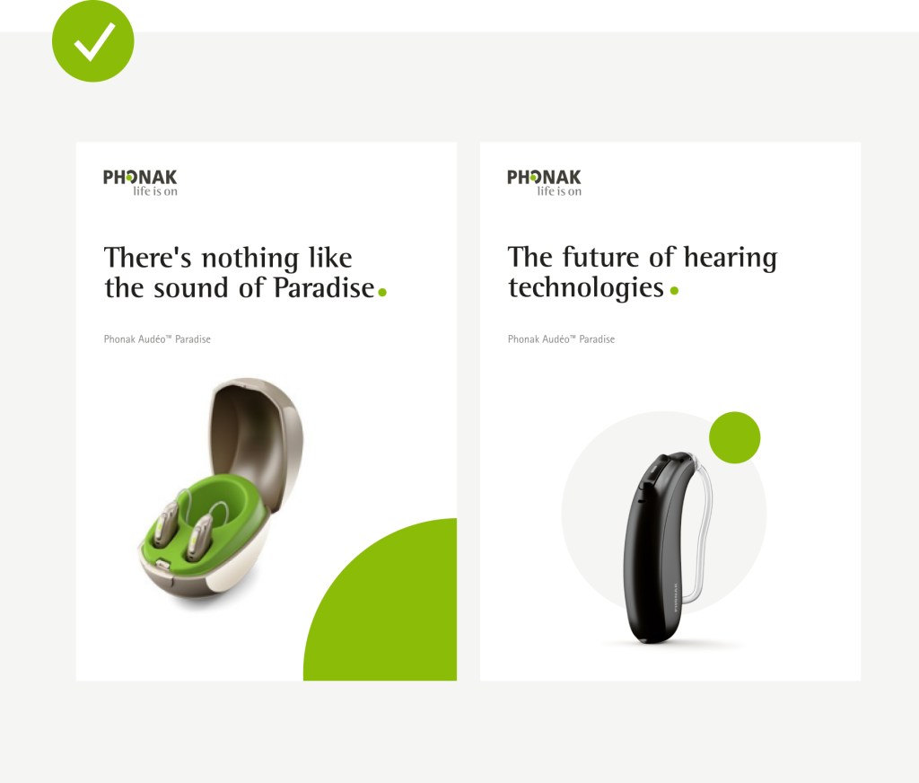
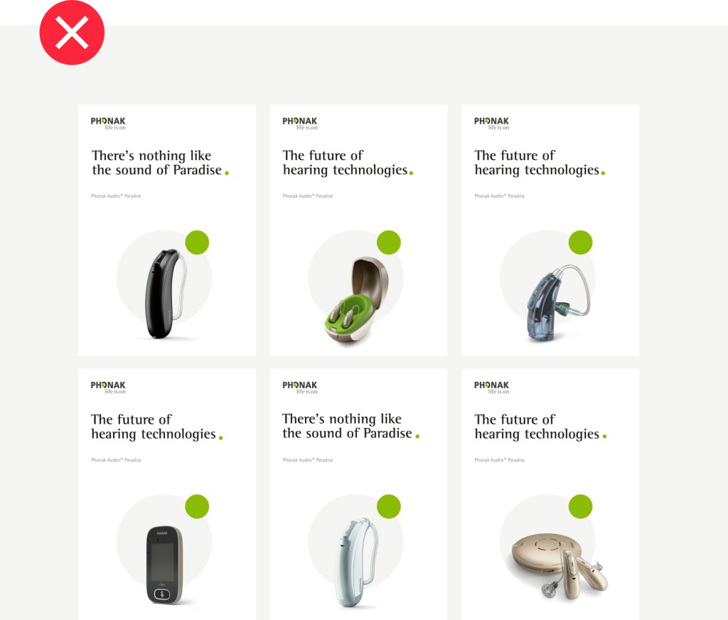
Vertical layouts
Dot as background element
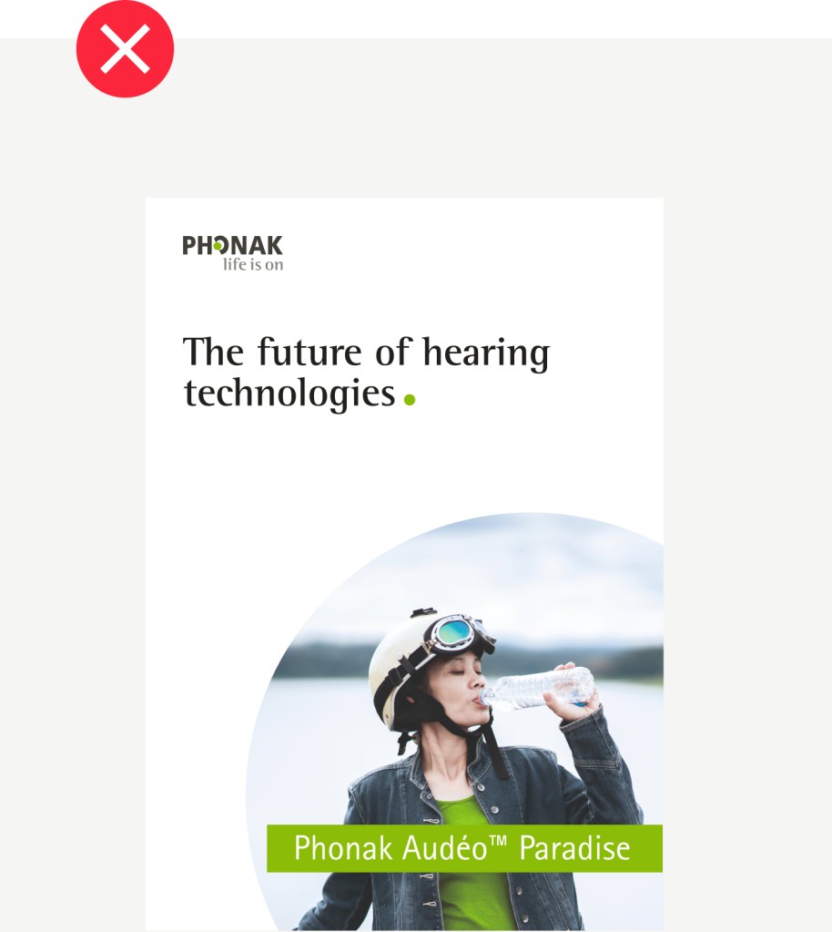
Corner dot cropping
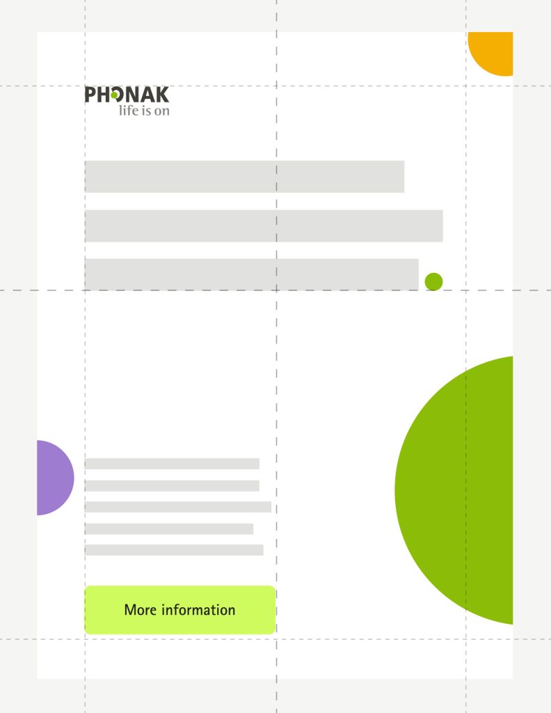
Dot as product focus
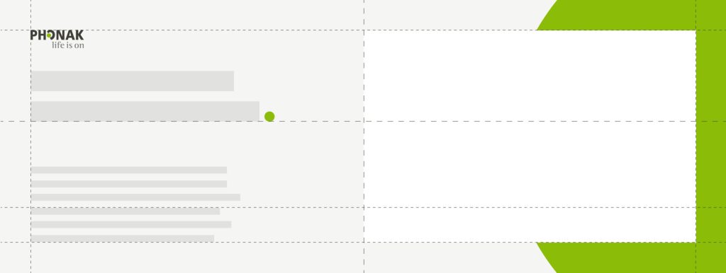
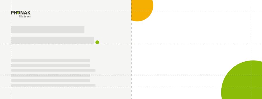
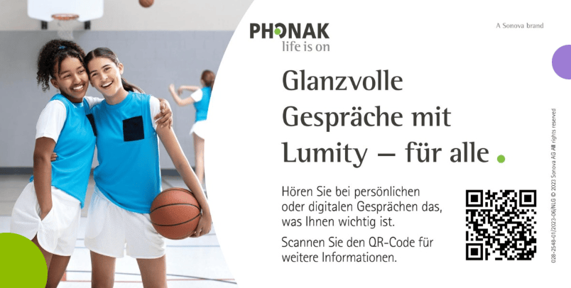
Horizontal layouts
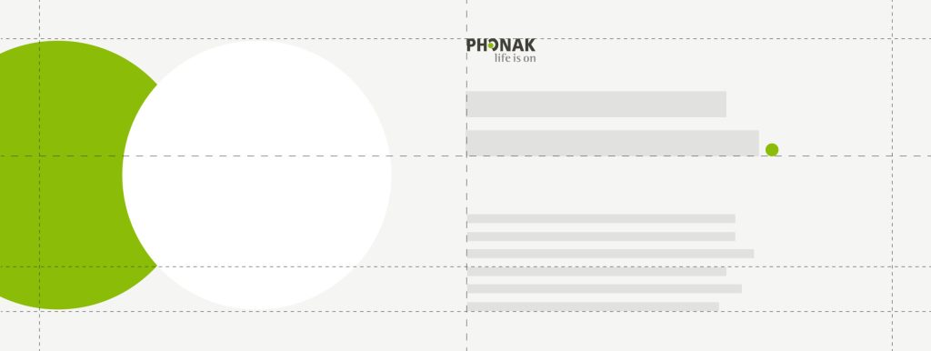
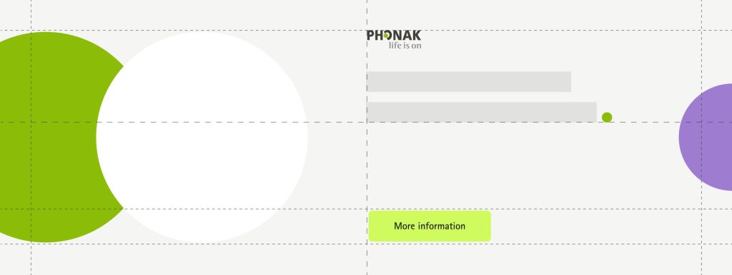
Layout system as landscape version. An image or a visual element (e.g., phone screen) can be placed on top of the background dot.
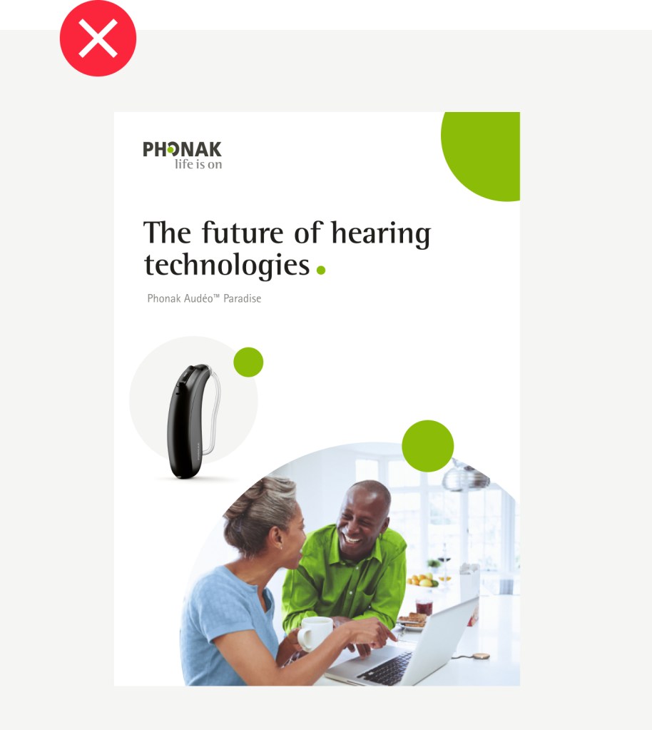
Overlapping of dot elements. Logo and text elements can move freely through the grid to keep the vertical alignment.
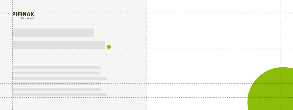
Corners with cropped dot.
Digital layouts
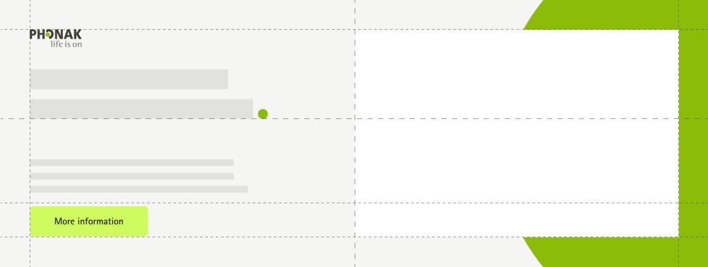
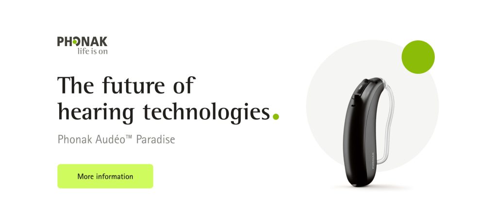
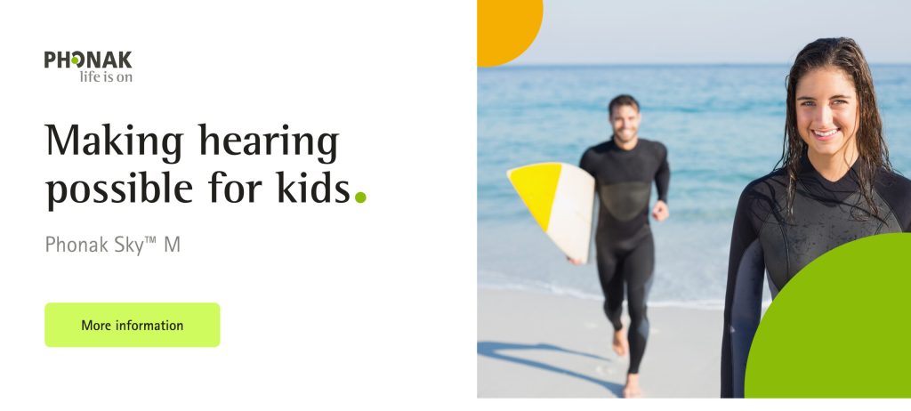
Digital ads and banners follow the same principles as ads for print. They often need to be extended by a call to action which can be placed prominently in the layout.
Layout system as landscape version. An image or a visual element (e.g., phone screen) can be placed on top of the background dot.
Corners with cropped dot.
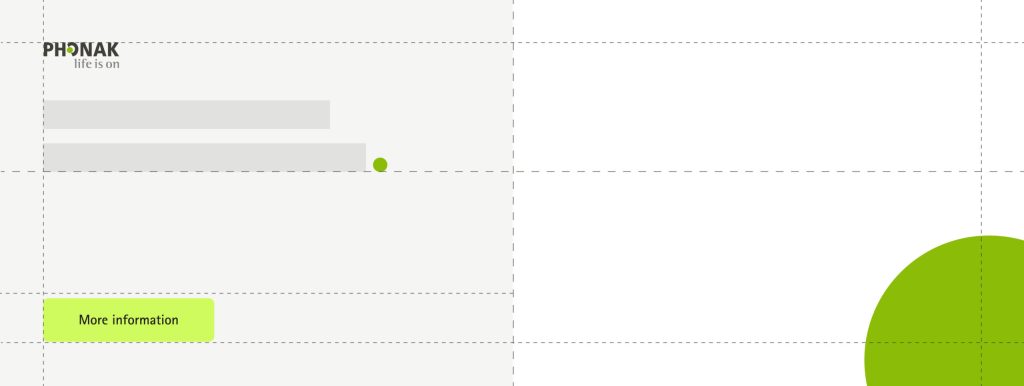
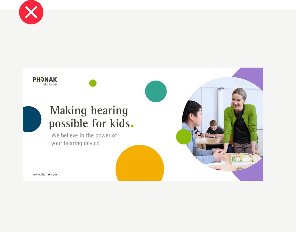
For less prominent digital ads with reduced space: the layout adapts horizontally.
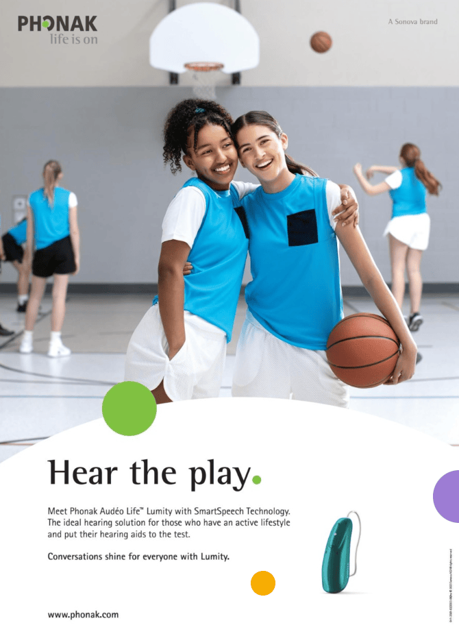
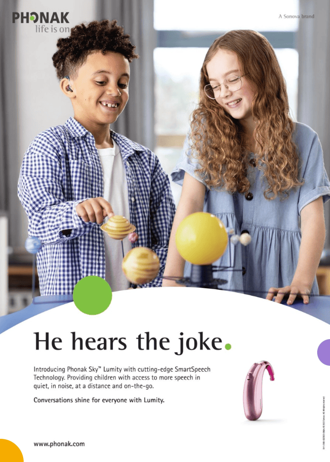
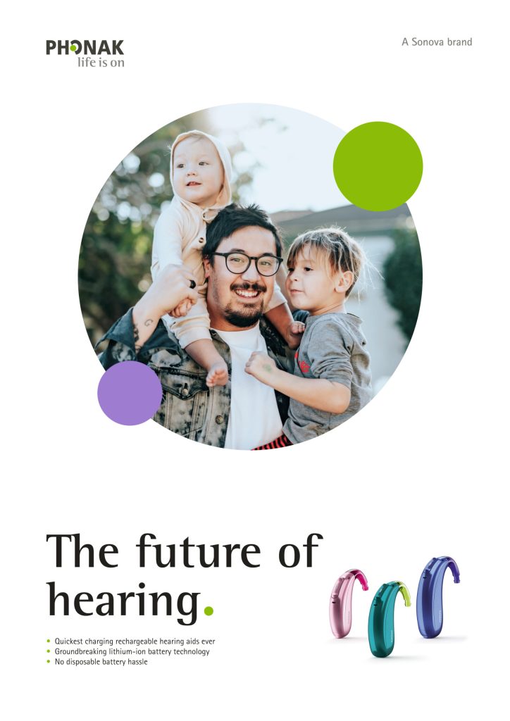
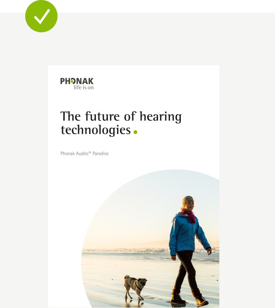
These are examples of applying the above principles and layout structures with actual content, images, and products. There is enough flexibility to adapt the layout based on the content we want to communicate.
These are examples of applying the above principles and layout structures with actual content, images, and products. There is enough flexibility to adapt the layout based on the content we want to communicate.