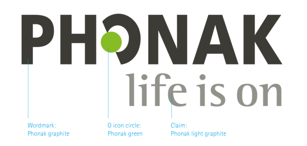
The logo is a unique identification of the brand Phonak. It forms the basis of our brand design and enjoys worldwide protection. It consists of two elements: The wordmark and our claim “life is on”. The icon symbolizes the ear. It is the only logo in our industry that links to the business we are in – hearing!
The Phonak logo Logo spacing Logo placement Logo size
The Phonak logo Logo spacing Logo placement Logo size
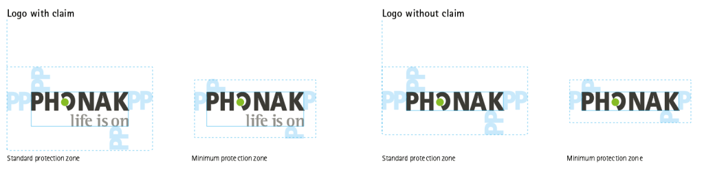
Logo spacing
On items where no predefined layout grid is available (e.g. POS displays, products etc.), apply the standard logo protection zone below as a rule of thumb.
The Phonak logo Logo spacing Logo placement Logo size
Logo placement
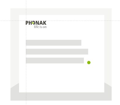
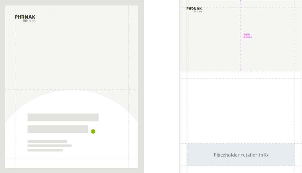
The Phonak logo can be positioned in two different ways, always as a first element in the content..
Top left corner
Top left corner, aligned with text
Functional use cases
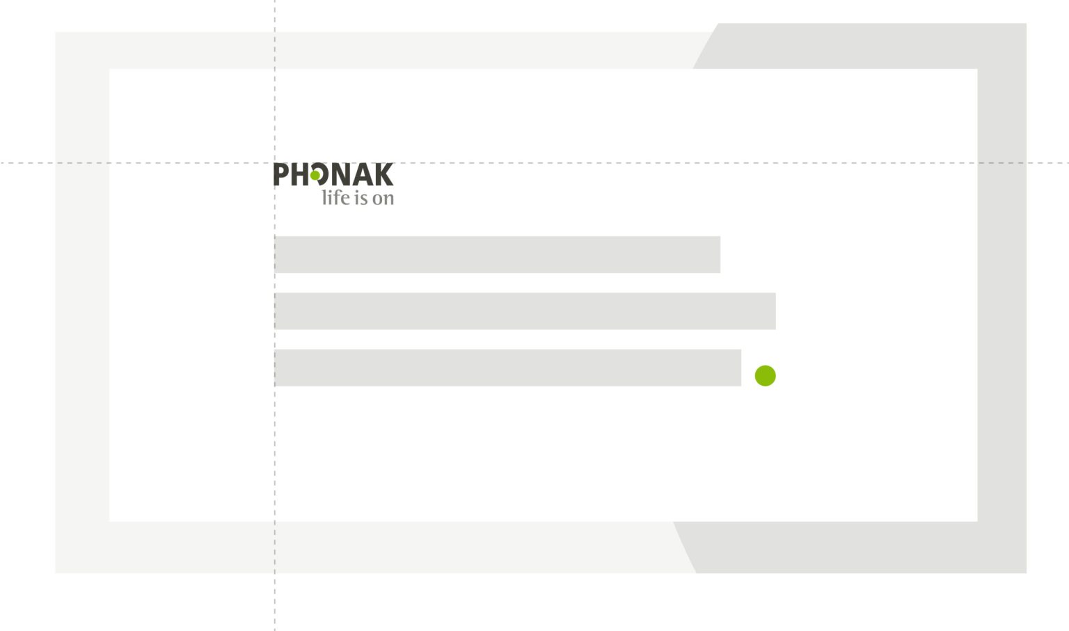
In these two specific formats: Powerpoint presentations and technical and scientific documents, the logo can be placed at a differently according to the following rules.
Presentations (PPT)
Top right, left aligned with text below
Technical and scientific documents
Bottom right corner
Logo usage in full-bleed ads and co-op marketing tools.
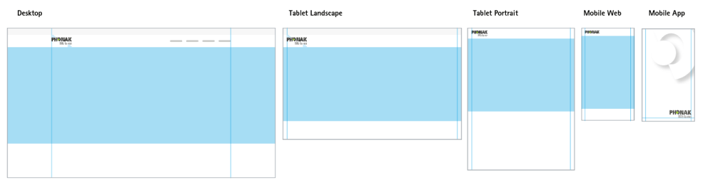
Logo usage on Webpages and Apps
Exception
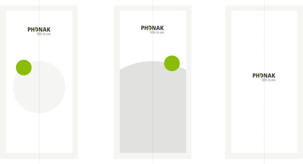
In extreme portrait formats, when a product or image is at the center of attention or has no content except the logo, the logo can be placed at the center. E.g. instagram stories, app splash screens.
Top right, left aligned with text below
Logo versions
There are two versions of the Phonak logo. any other versions are no longer valid. It is also not permitted to create your own combinations.
The favoured black variant (top left), classic, on a white background is always the first choice. For very dark backgrounds (e.g. Infinio), the white variant (with green dot) can be used.
Monochrome variants may only be used in the following cases:
The logo is reproduced in one color only (e.g. monochrome logo printing on give-aways, cardboard boxes, etc.).
For the production of an embossed cliché
The logo size does not allow multi-colored reproduction
The Phonak logo Logo spacing Logo placement Logo size
Logo size
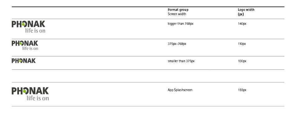
Logo size in digital tools
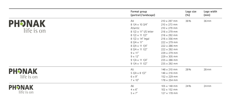
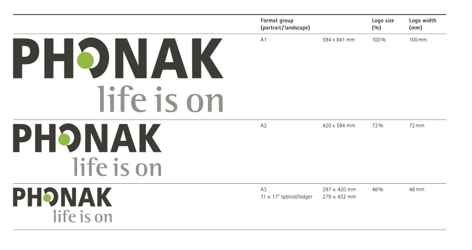
Logo size in print tools
DIN A4-A7
DIN A3
Don'ts
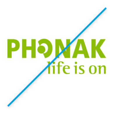
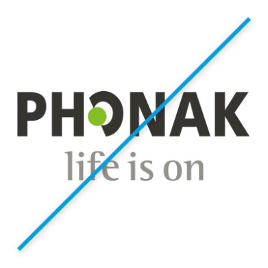
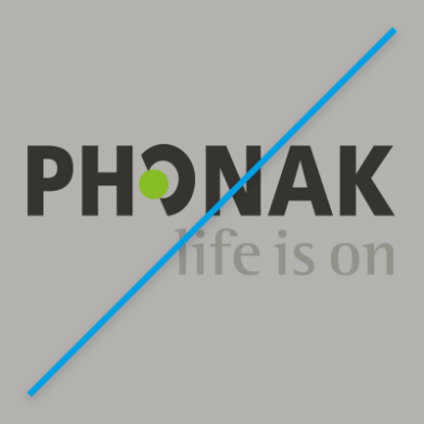
The Phonak logo with and without claim must be recognizable and legible in all cases. Color versions may not be created. Exceptions are negative versions – available on MAM. The logo can only have a picture background, provided that the composition of the picture is not disturbed and the logo is still legible.
Logos for initiatives, programs, departments, etc. The Phonak logo is our most valuable brand asset when it comes to recognition. That is why we must protect it and ensure that it remains unrivaled. The creation of symbols and logos must be agreed exclusively with Phonak Branding. Use without approval is not permitted.