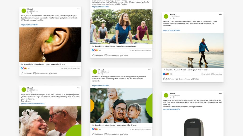
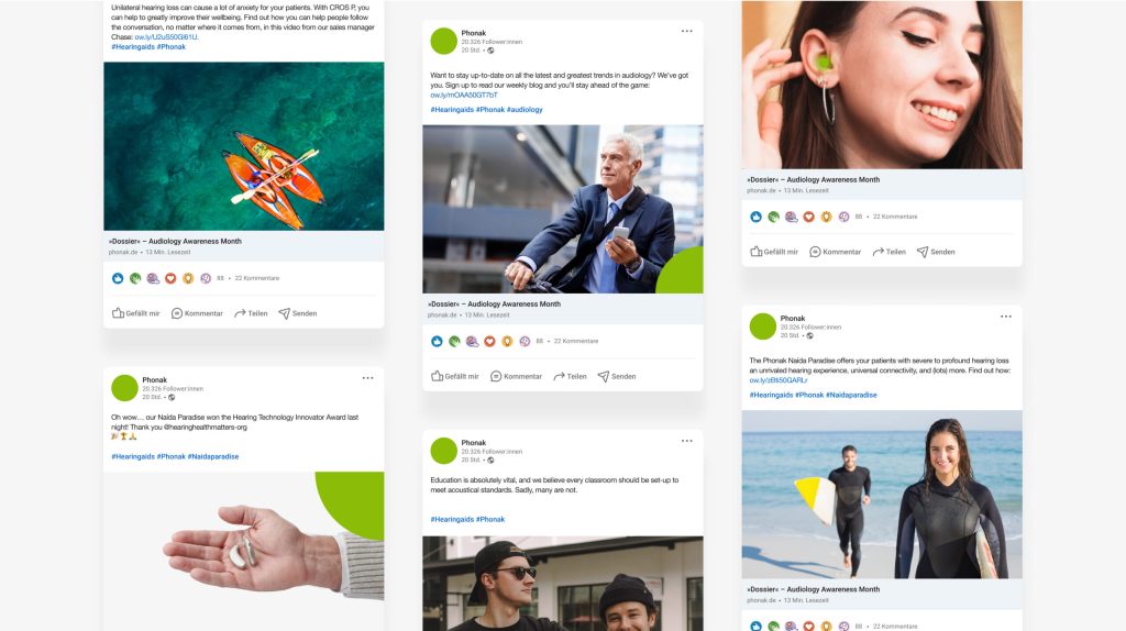
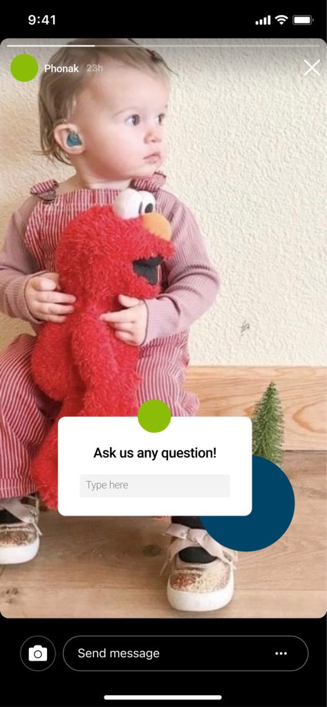
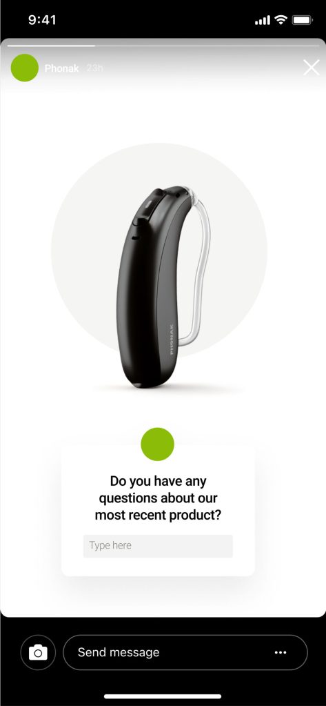
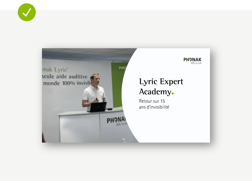
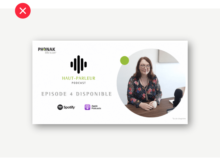
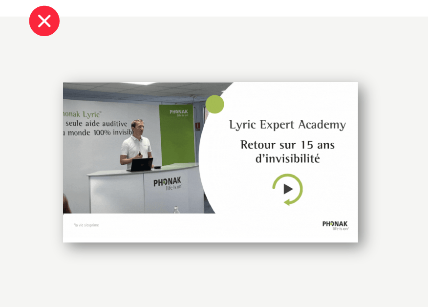
As a fast paced medium that covers very different forms of content categories, the visual treatment of social media channels and posts need to be highly flexible. This collection of guidelines will enable content creators to adapt the brand design to various situations, not being bound to strict rules but rather offering the possibilities to chose from a selection of principles.
Social media presence is essential nowadays – a strategic approach to the design and layout is how Phonak can make sure that followers engage with the brand. Creating content that attracts followers while stimulating brand awareness can be done when standing out with memorable graphics that makes the brand recognizable on different social media touchpoints.
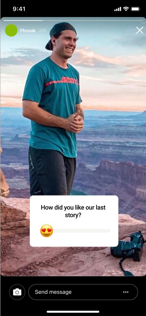
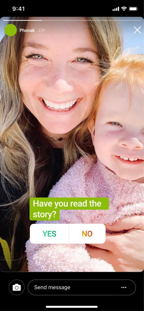
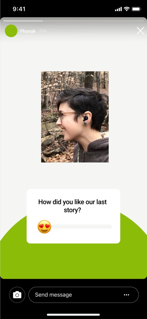
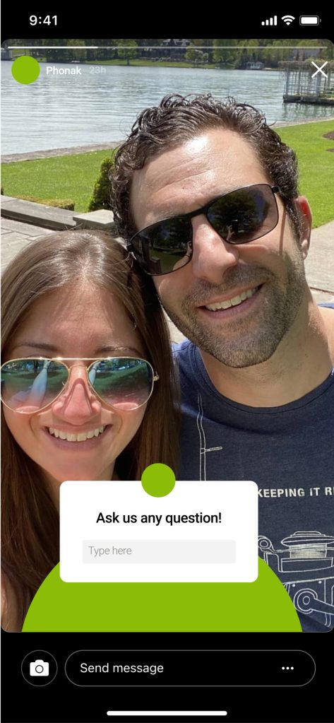
Vertical layouts
Use full images for emotional content
Use the cropping principle to set highlights or put emphasis on CTAs
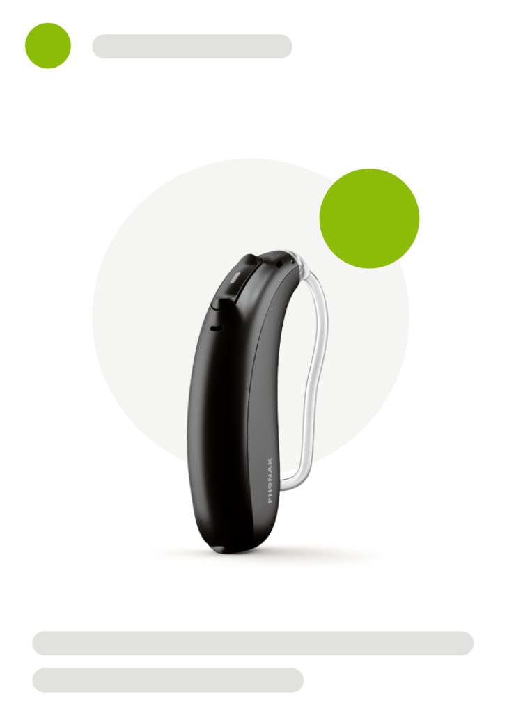
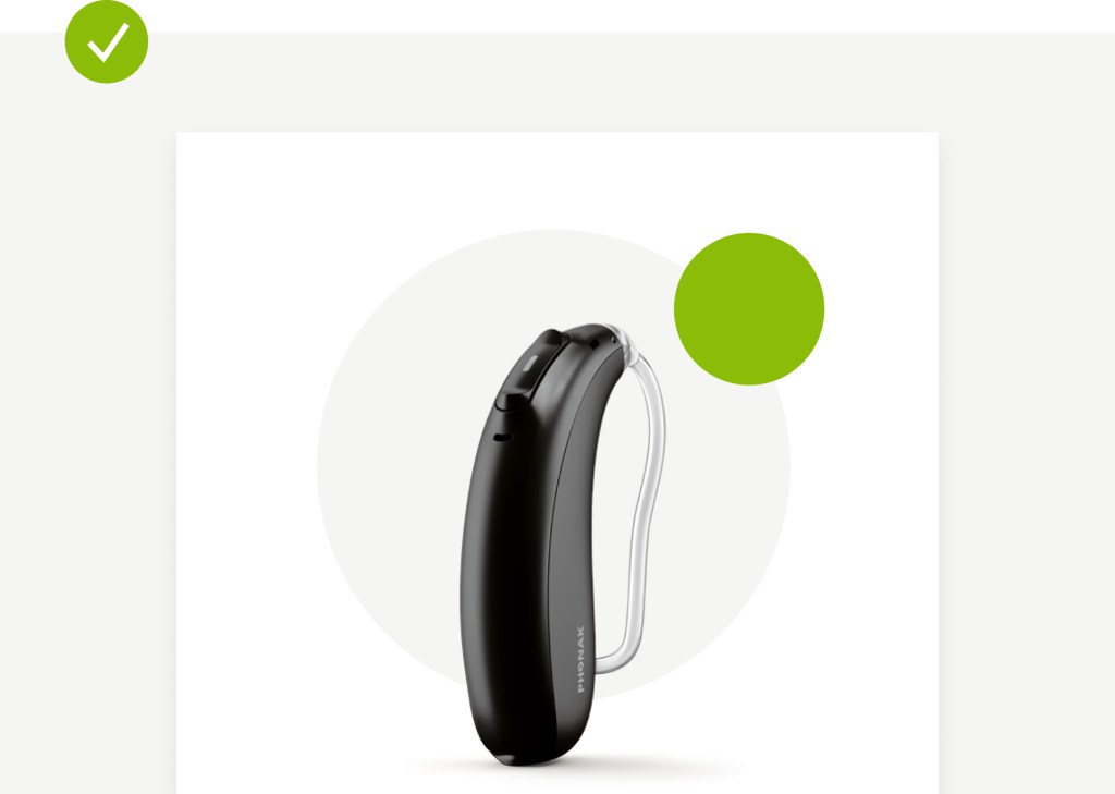
Higlight products with the layer principle
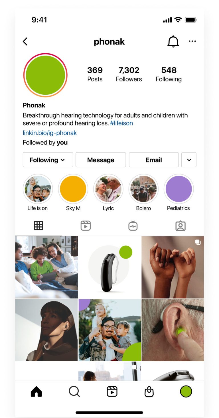
Use the Dot as an avatar on social media where possible.
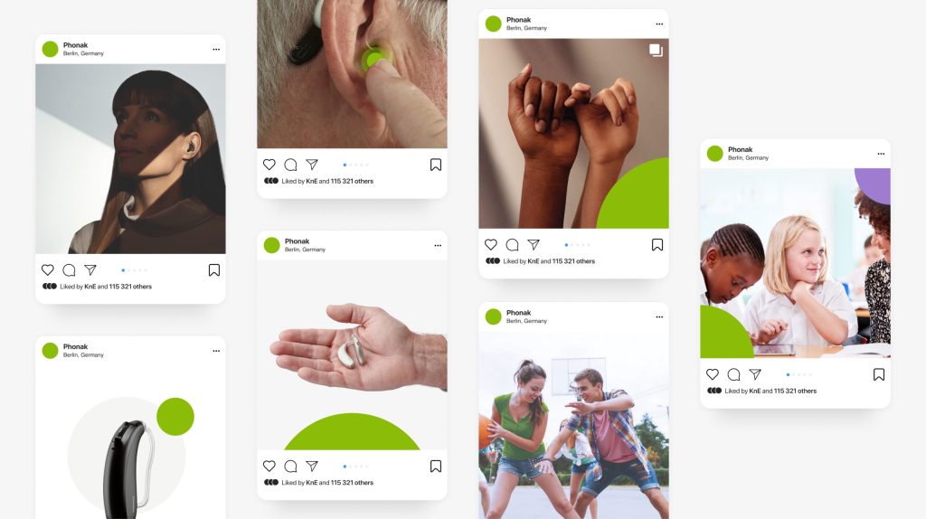
These are examples of applying the above principles and layout structures with actual content, images, and products. There is enough flexibility to adapt the layout based on the content we want to communicate.
Editorial
Product launch
Pediatrics
Story highlights specific to pediatrics can be emphasised with the secondary colors.
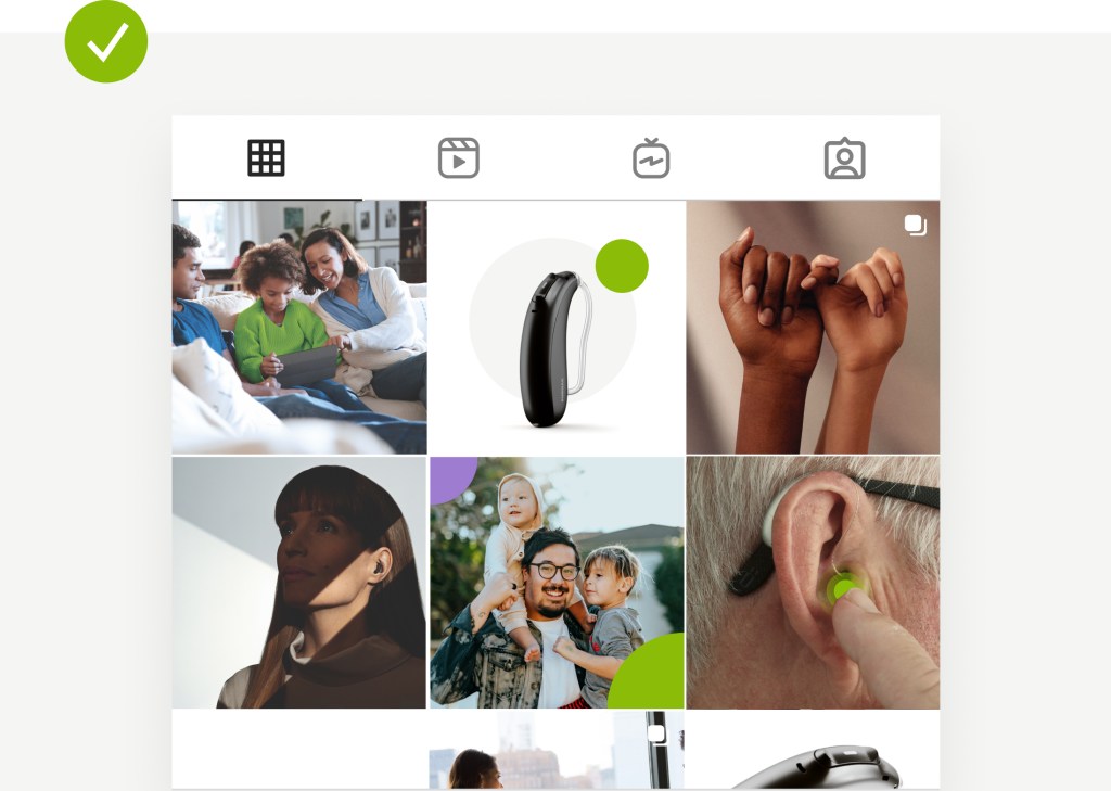
Content creation can also vary depending on the social media channel. While a post on LinkedIn can be more related to the company itself and technology news, posts on Instagram can be more emotional and authentic with a more informal tone of voice. These are some visual examples of how images can behave with the dot application, following the brand expression principles.
Examples product/marketing: tech announcement & information
For precise copy examples, see tone of voice for social media
Examples story telling: link to articles / video / blog on Phonak
For precise copy examples, see tone of voice for social media
Examples company: award win / press / wider audiology world
For precise copy examples, see tone of voice for social media
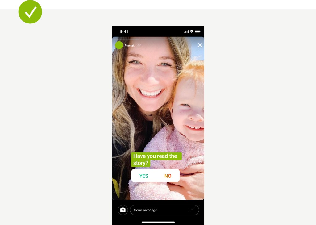
The green dot can be powerful in combination with Instagram’s build in features. Used as an avatar, it always expresses the brand in a subtle way. For example in the upper left corner or in the question feature for stories.
It is not neccessary to use the green dot everywhere and everytime. In a lot of cases, the green avatar speaks for itself.
The combination of a green and a white element is a simple method to communicate the brand with build in features in Instagram.
For content creators with access to basic graphical elements, the green dot can be used as a background element to highlight CTAs and other engagement features.
Best practices
Use the dot as a supporting visual element.
Use a varied selction of posts and content. Subtle use of brand expression principles creates a balanced and professional impression.
Keep stories and post simple and straight forward to get you users’ attention.
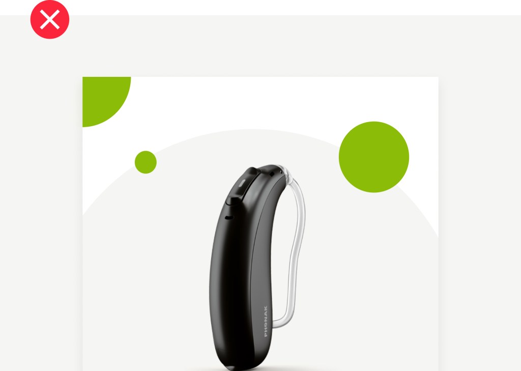
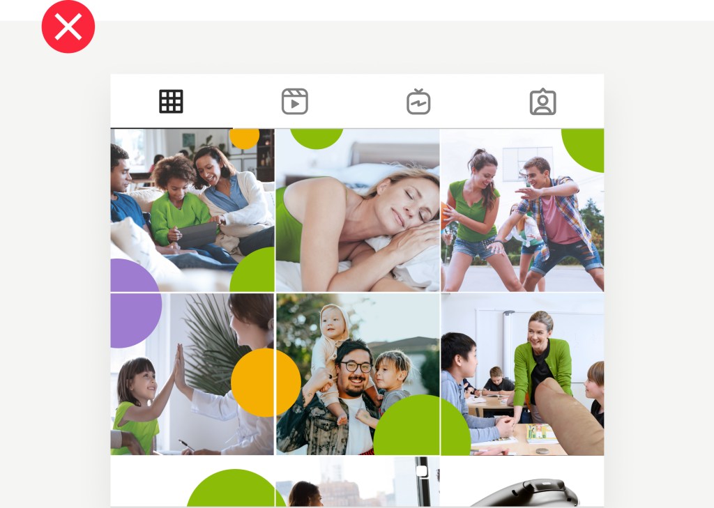
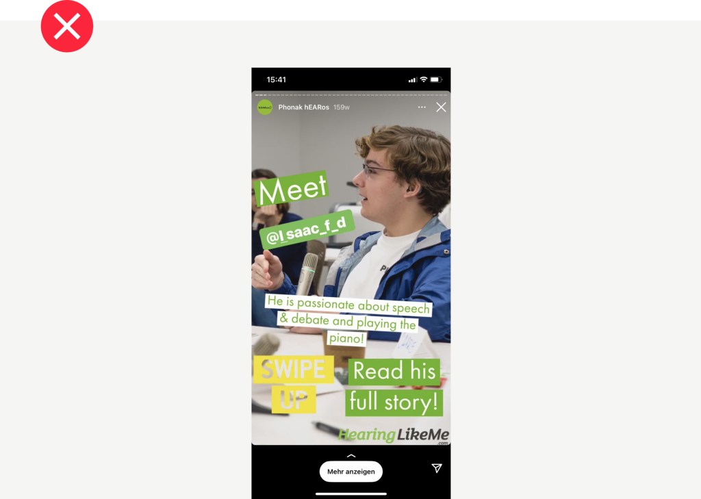
Avoid mixing dot principles and using more than one green dot.
Avoid redundant useage of imagery and excessive usage of the dot – it can feel too marketing heavy and unauthentic.
Don’t overload stories and posts with too much information.
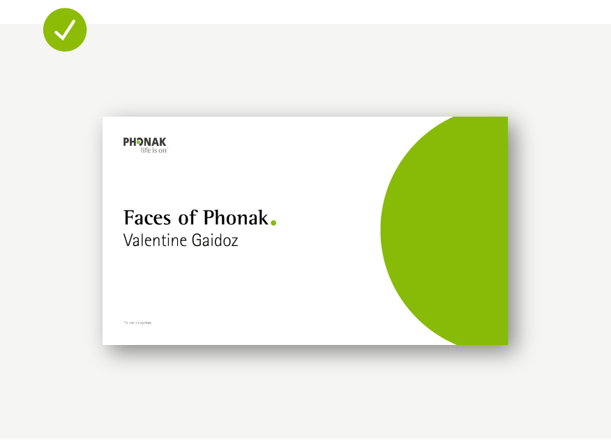
The green half dot must be used that its size overlaps the edges.
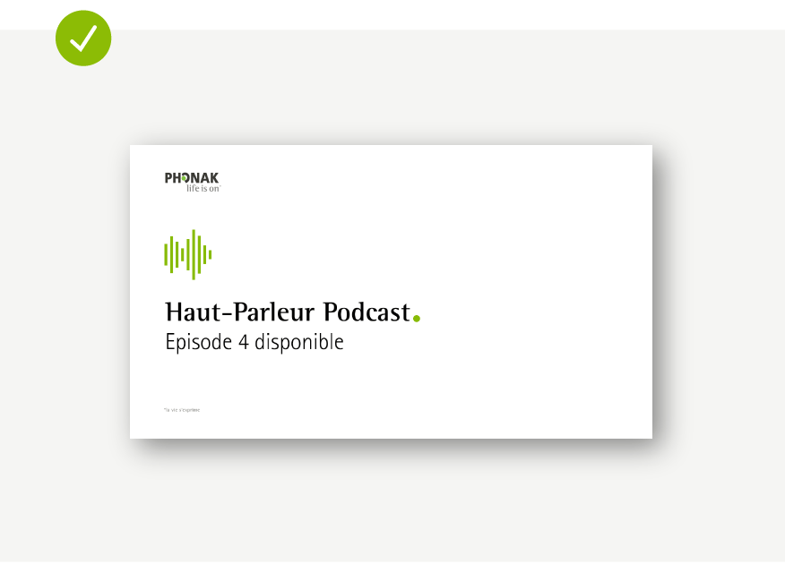
The text must comply with the Phonak typography guidelines.
The green dot must be positioned at a distance from the last letter of the sentence as defined in the brand guidelines. Brand expression
Only use the Phonak typeface only.
In addition,we don’t use ALL CAPS (exceptions: acronyms and product names or features.) Texts are only entered left-aligned and not centered.
Do not design logos (or icons) yourself. Phonak has a gallery that you can use for this purpose. MAM Gallery
No centered text.
Subtitles are not written with the Rotis Phonak Semi font. Please take a look at the typographic rules. Typography