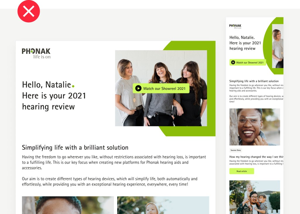
Newsletters are a useful tool to communicate a variety of topics and news from the Phonak world to their subscribers. They need to grab the reader’s attention with significant quality and limited content so that they are easy to scan to improve conversion and clickthrough rates from the subscriber.
Headers Cards Text Visual Examples
Headers
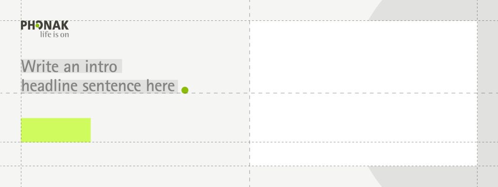
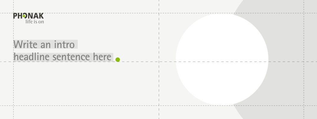
The structure of an email newsletter is quite simple, including an introduction giving a quick overview of the content that will be shown, making it visually attractive to catch the reader’s attention with the help of visual elements and a headline. The headers follow the layout principles shown through the guidelines:
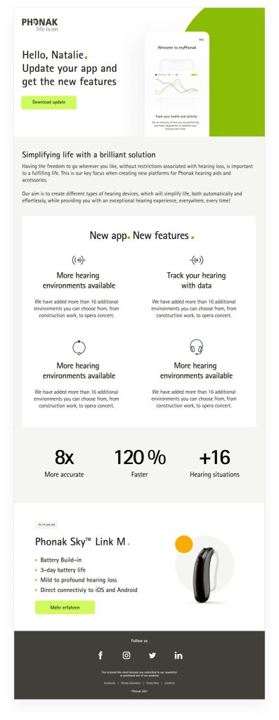
Header with an opening headline. An image or a visual element (e.g., phone screen) can be placed on top of the background dot.
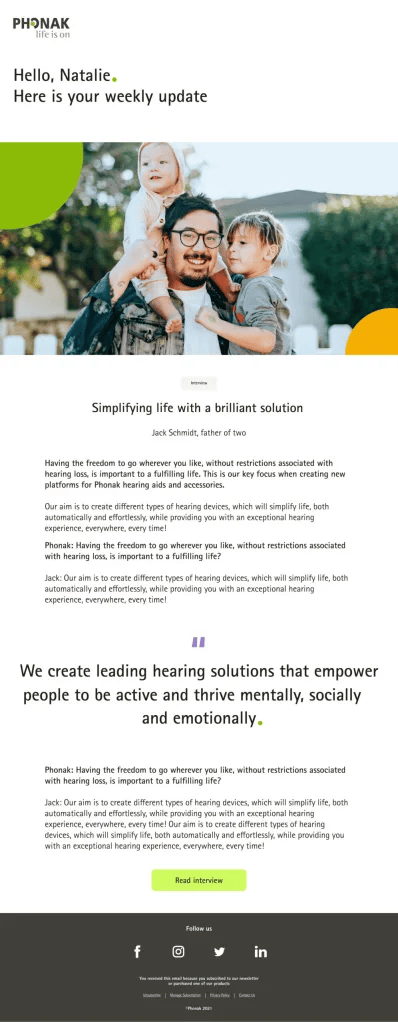
Variation with a dot image. The header CTA can be skipped if it’s not necessary.
Headers Cards Text Visual Examples
Cards
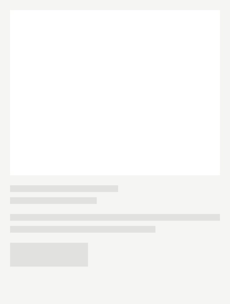
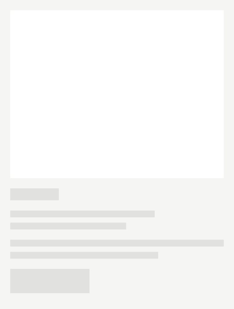
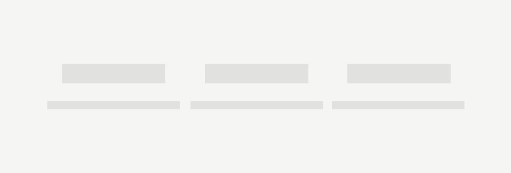
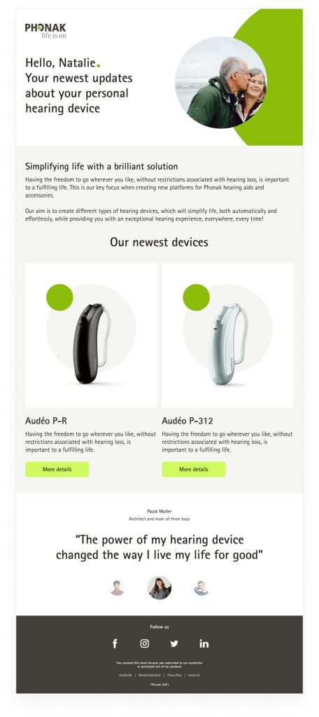
Cards are contained components or surfaces that display content and actions on a single topic. They should have relevant information as well as actionable items. The placement of elements, such as images, text, and CTAs, indicates reading hierarchy.
Cards can include a variety of media, including images, graphics, icons, and supporting text, commonly a summary or quick sneak peek of what is being teased.
An additional tag can be included in the card so that the reader can quickly access more content on the same topic. They can also include CTAs for actions and further reading.
Headers Cards Text Visual Examples
Text
Giving additional information through text is a helpful way to inform your reader, although it needs to be a limited amount of text not to overwhelm them and not extend the newsletter’s length.
Facts can be displayed playing with contrast, e.g. bigger headlines or numbers combined copy text
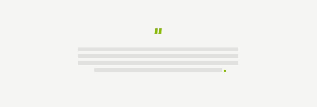
Centred text for prominent quotes
Cards can include a variety of media, including images, graphics, icons, and supporting text, commonly a summary or quick sneak peek of what is being teased.
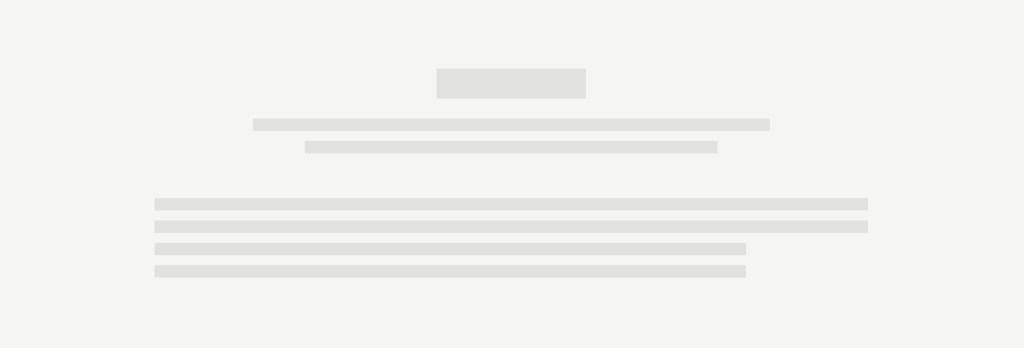
Centred headline or intro text, followed by copy text for highlights like features representation, data.
Headers Cards Text Visual Examples
Visual examples
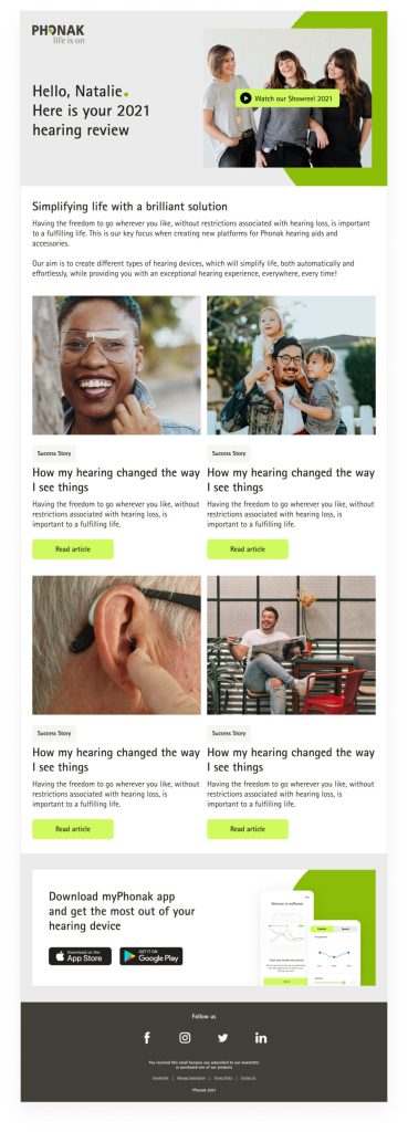
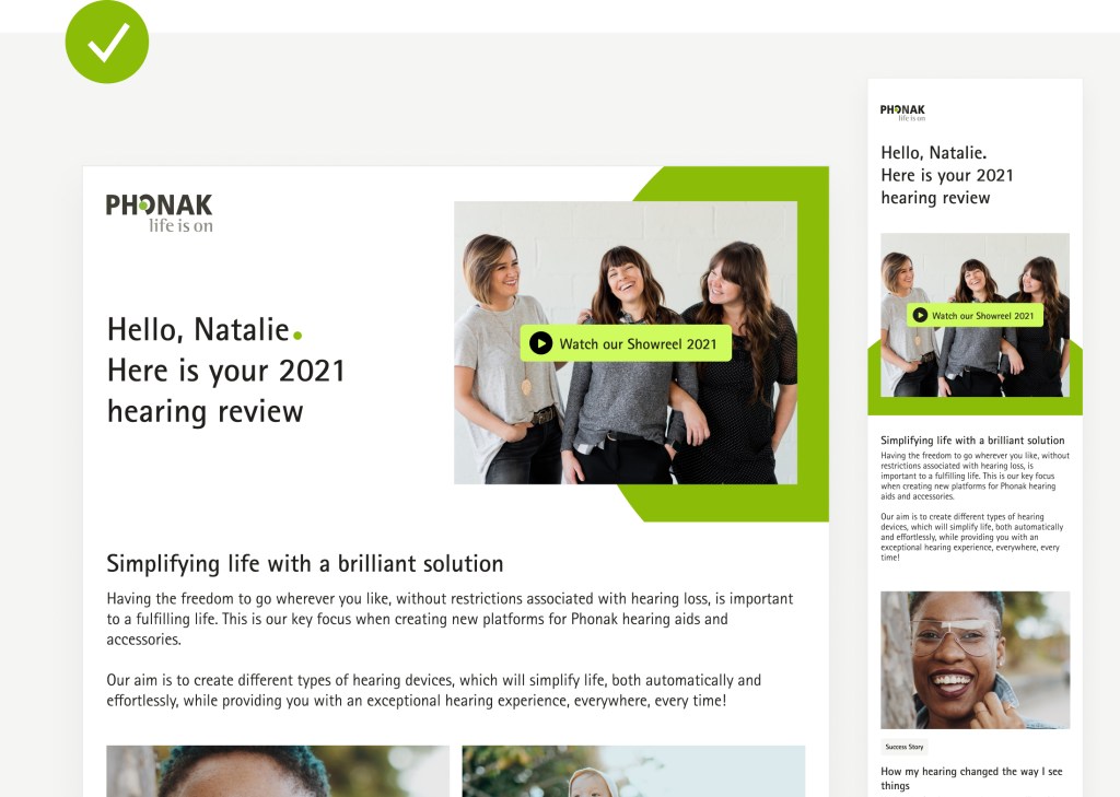
These are examples of how to apply the above principles and layout structures with actual content and images, and products. Components and elements should be rearranged or created based on the content the newsletter wants to communicate.
Adaptation to mobile
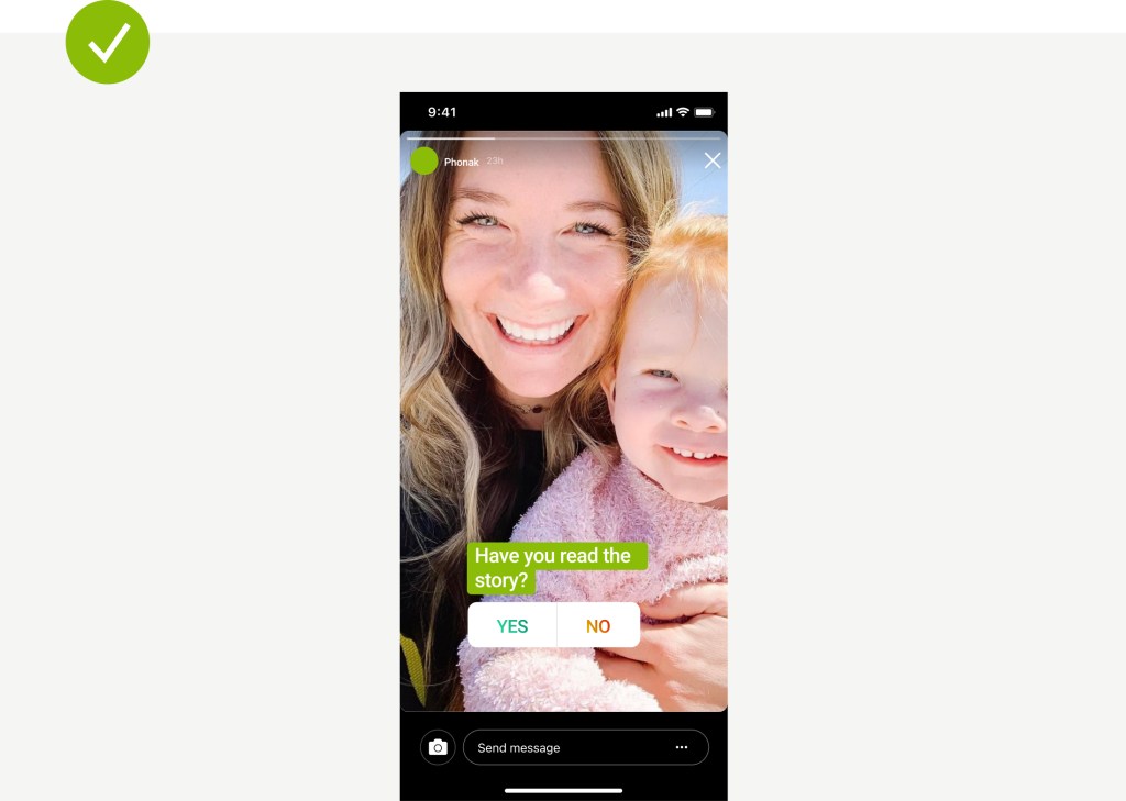
Most emails are opened on mobile devices; therefore, adapting and optimizing the campaigns or email newsletters as responsive is an excellent opportunity to engage with the readers and increase the number of subscribers who open, read, and click on the newsletter’s content.
Best practices
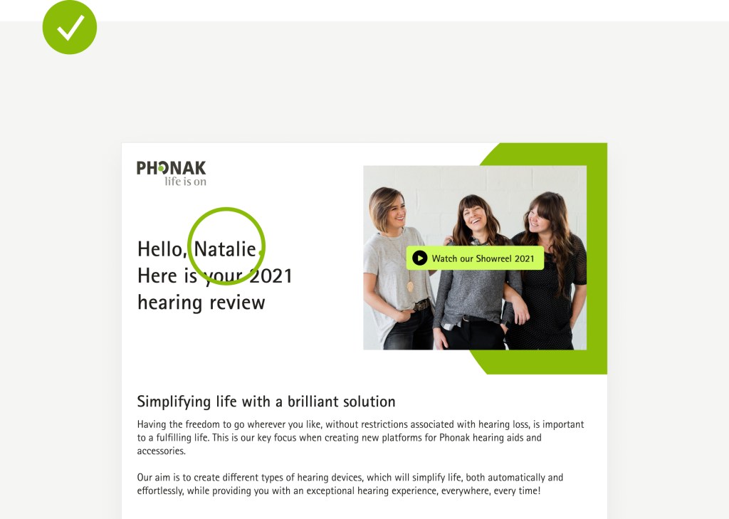
Displaylimited and valuable content thats invites users to read more.
Send targeted emails and keep content personalized to your target audience based on their preferences.
Adapt and optimize for different screen sizes
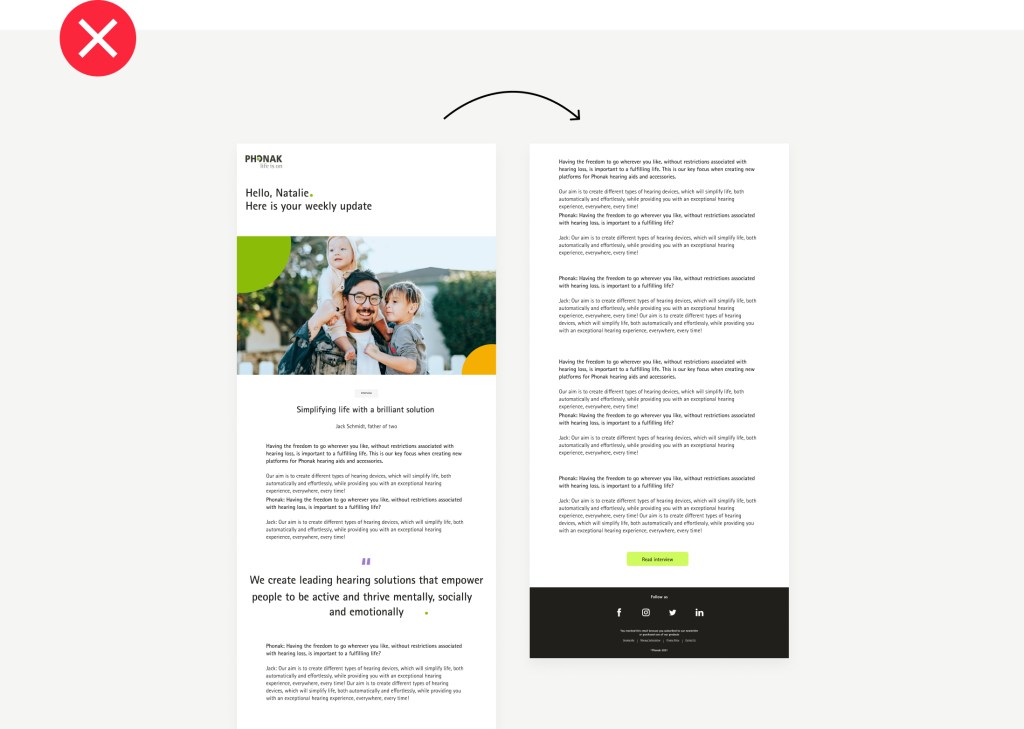
Avoid long newsletter that will miss the focus of the reader by having to scroll many times.
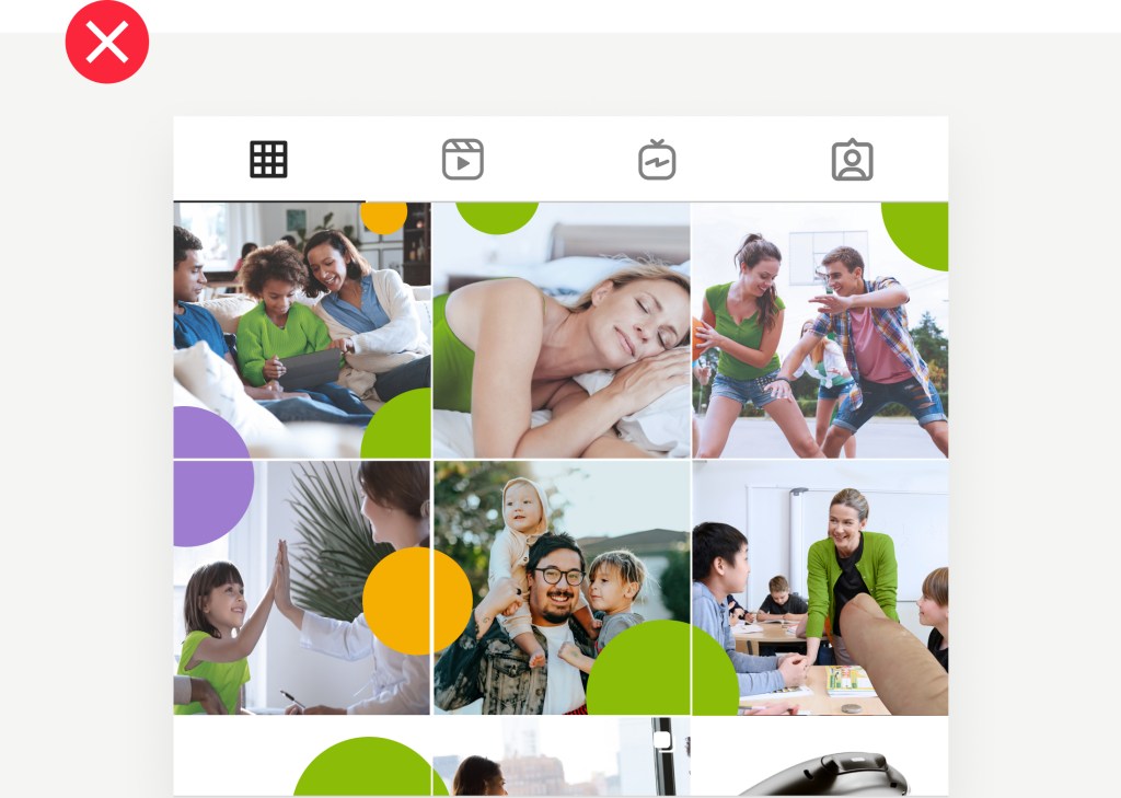
Avoid sending content that is not relevant to your subscriber, e.g., pediatric information to adults with no kids.
Avoid sending your emails without testing how it looks on different devices and screen sizes.