Applications
Powerpoint slides
Slides or presentations are used on a daily basis from different teams and individuals in the company. Memorable presentations are easy to digest for the audience and at the same time flexible in handling for the people setting them up.
Keeping the design of Title, Agenda and Divider as defined by the template, gives your presentation a branded framework. Your individually created content slides enhance your topic at its best and still reflects the Phonak look. Below you find the most important brand recommendations.
Cover
Dividers
Content slides
Visual examples
Corners
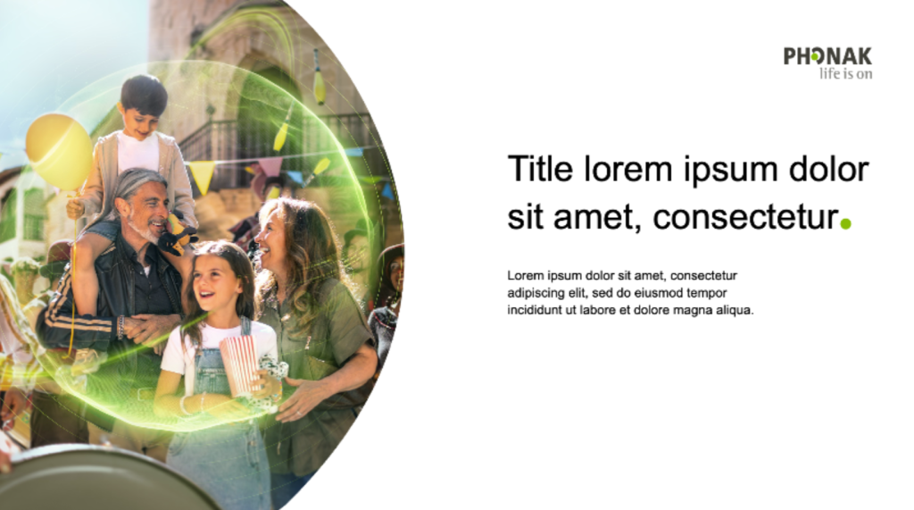
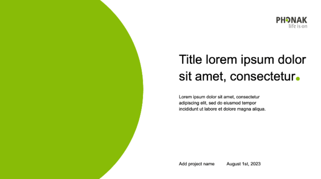
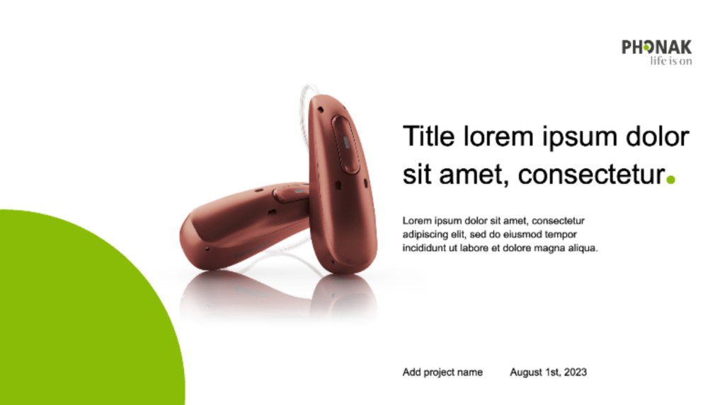
Covers
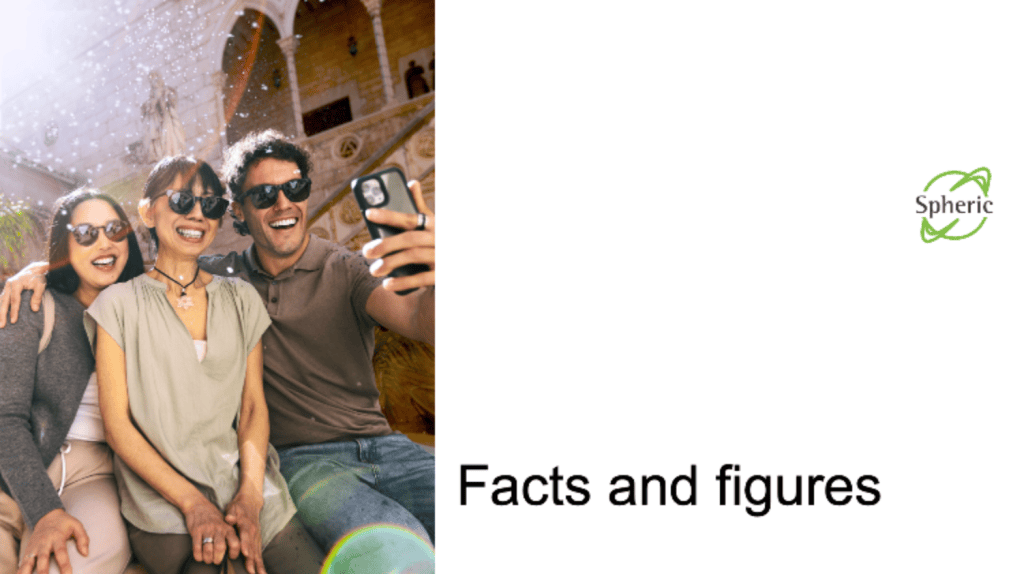
Covers are the starting point of the presentation, where overview information is displayed, such as headline, logo, intro text, and slide details like date and the overarching topic.
Cover
Dividers
Content slides
Visual examples
Corners
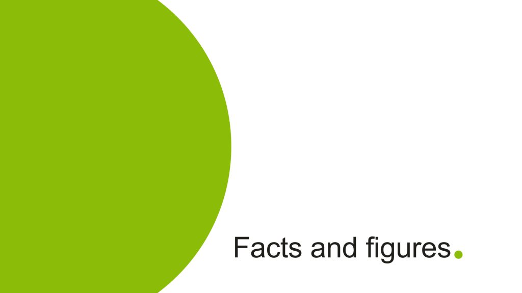
Content dividers
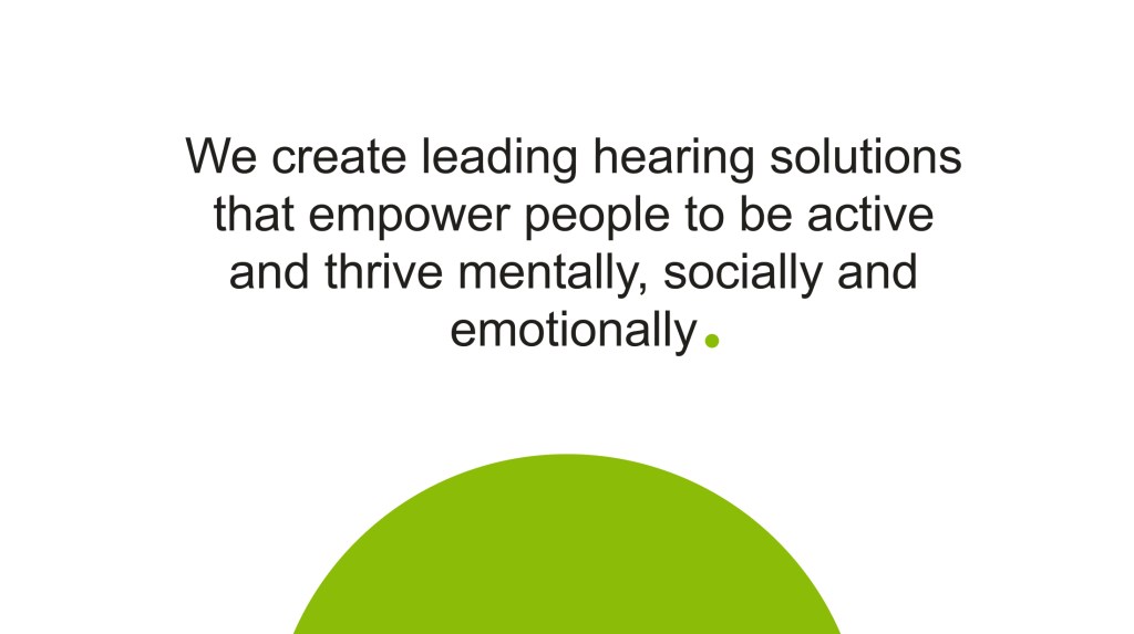
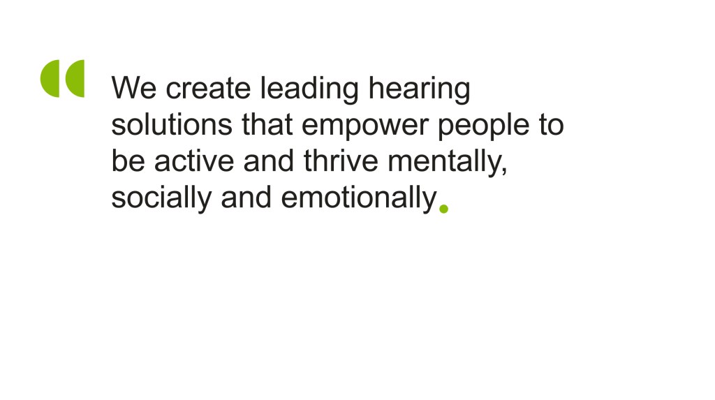
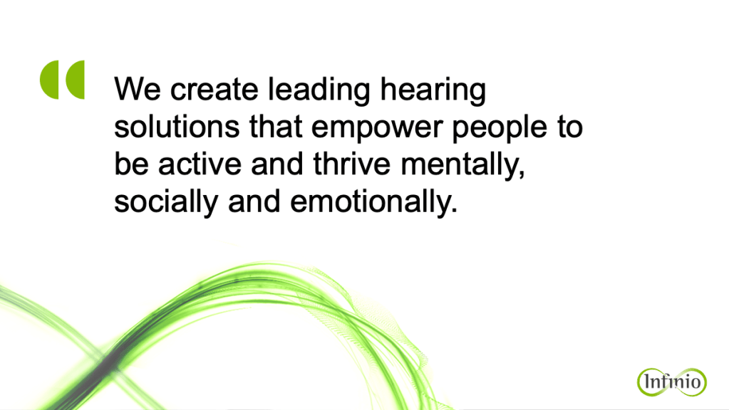
Dividers are ideal for making some specific information stand out, such as quotes, statements, or opening questions. They also help divide topics and chapters throughout the presentation.
Cover
Dividers
Content slides
Visual examples
Corners
Content slides
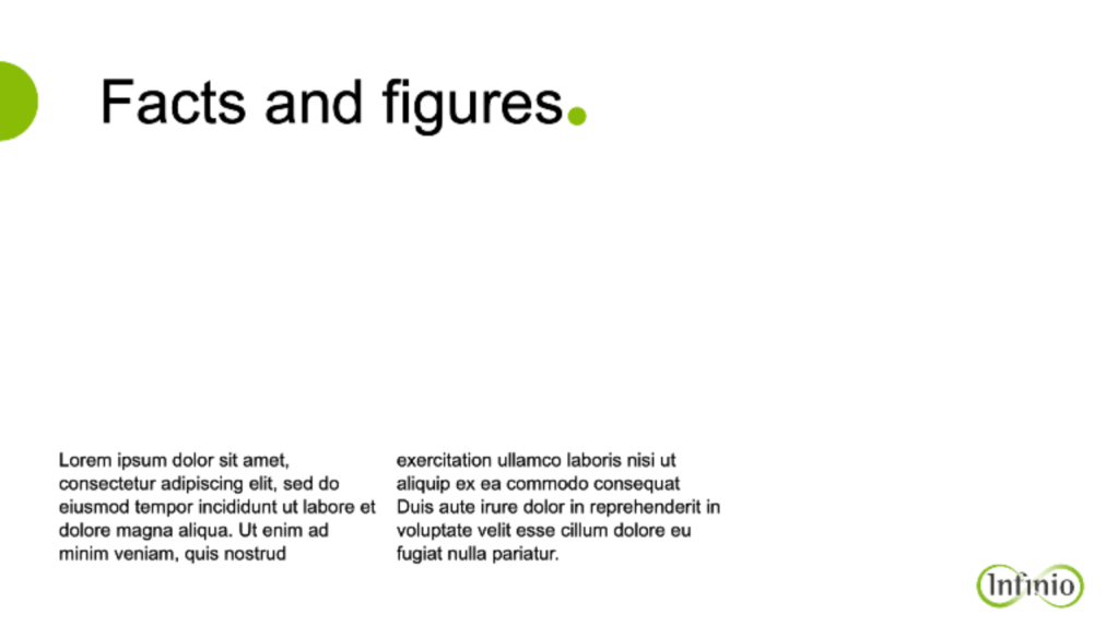
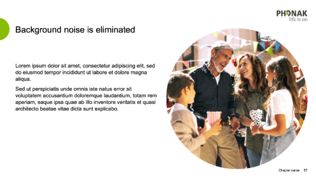
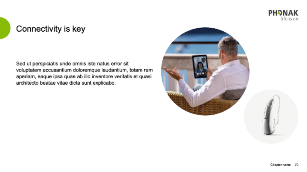
Content slides are the essence of each presentation: information, facts, data, images, and other important content that will support the information we want to bring across.
Writing principles
Add the dot element as a period only on big headlines of all covers, deviders, quotes and key statement sections as in the visual examples.
Avoid underlines and all caps, use boldface.
Only fixed Phonak terms are written with upper case letters (Phonak Belong, Wireless Communication Portfolio). Any other headlines are written with upper and lower case (The hearing solutions).
Please check the Phonak glossary for the correct spelling of Phonak-specific terms.
Please check the Phonak wording manual.
Quantity: Screen presentations always should show just a wrap up of the topic that you want to bring across. Use as less text as possible and compensate with strong visuals. It is then up to the presenter to communicate the main content verbally.
Font: Arial (for compatibility reason, do not use a different typeface)
Title: 26pt – Phonak graphite
Text: 20pt – black. We do not recommend to write smaller than 18p to guarantee a good reading for the audience
Inscriptions: 16 pt (e. g. for graphs and charts)
Sub text: 12 pt this however should only be used in exceptions
Sources: 8pt – Please include sources for scientific results and non branded images

Cover
Dividers
Content slides
Visual examples
Corners
Visual examples
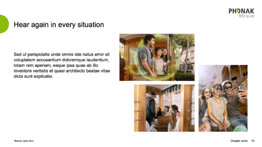
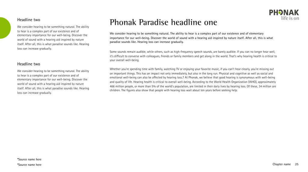
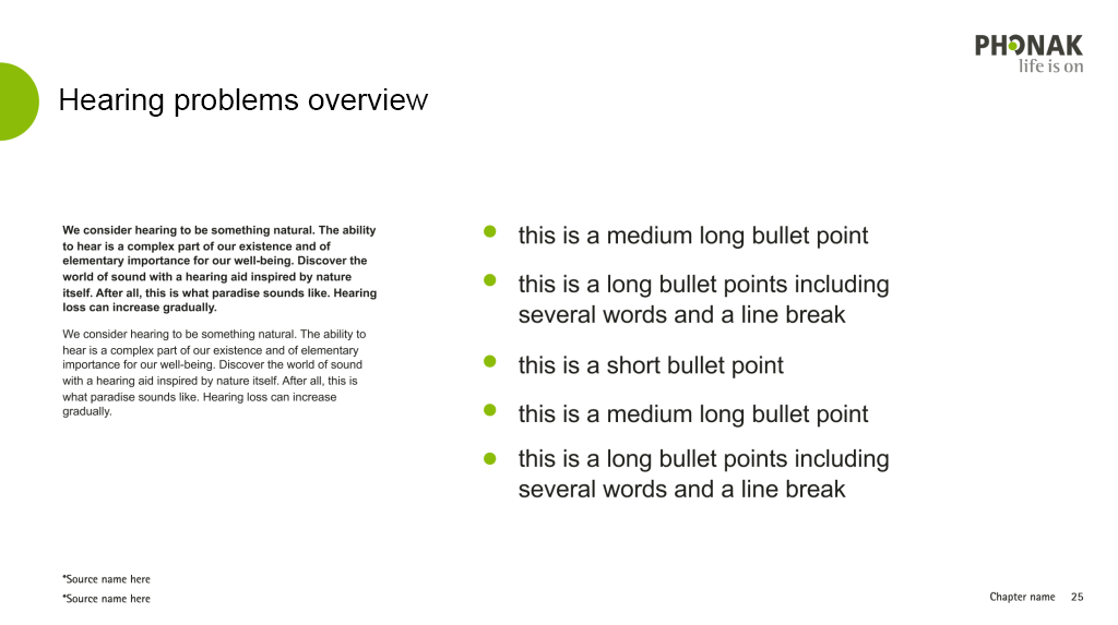
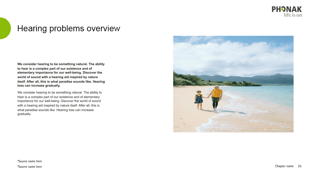
These are examples of applying the above principles and layout structures with actual content and images, and products. There is enough flexibility to adapt the composition based on the content we want to communicate.
Covers
Covers
Dividers
Dividers serve as introductions to new sections or set contextual accents such as quotes or key messages. Slides for pediatrics can be extended by additional secondary colored dots.
Content variations
Use of secondary colors
Secondary colors can be used for small highlights and functional categorization.
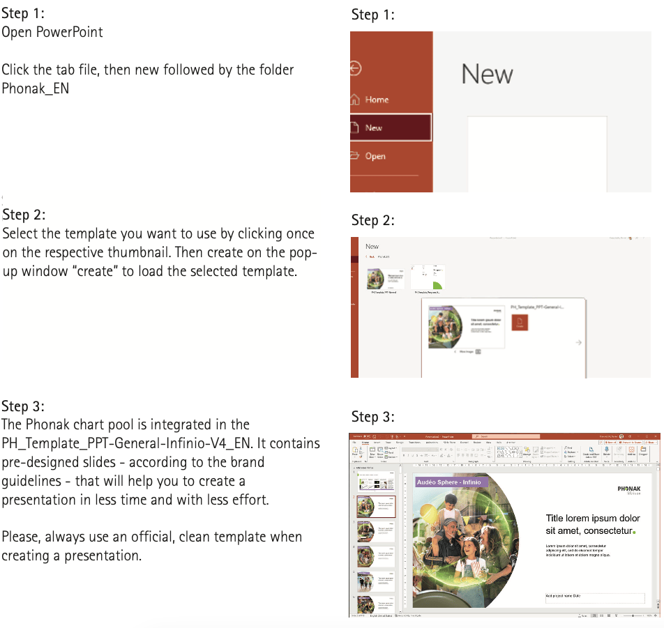
How to work with the most current template
For a consistent look & feel of all Phonak PowerPoint presentations, always start with a fresh template! Please note that this function is only available to the owners of an @phonak.com Email address:
Best practices
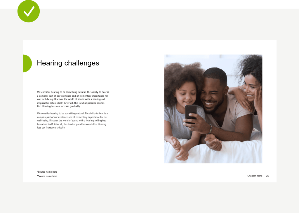
Content slides for pediatrics don’t need additional graphical elements.
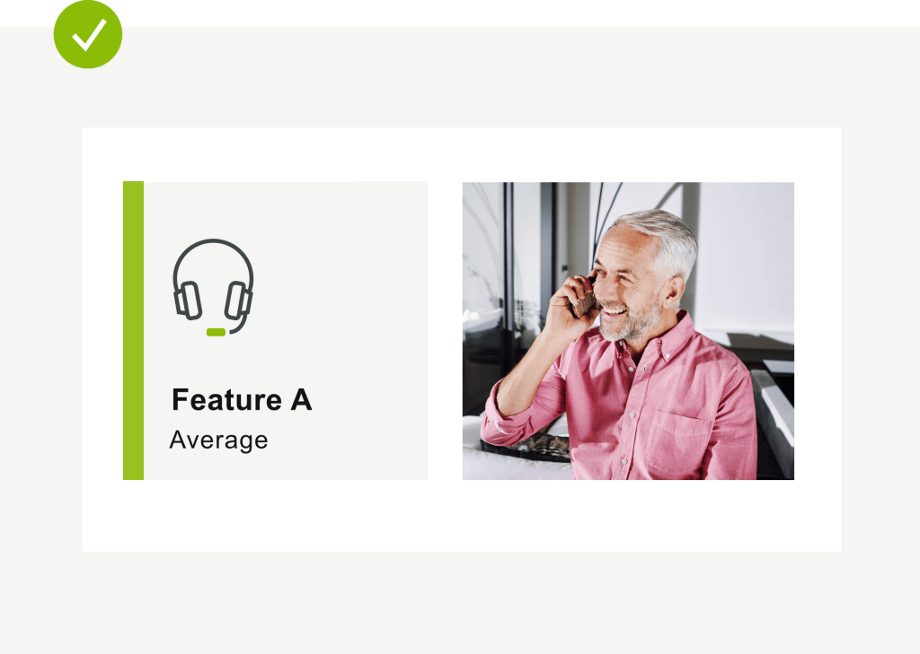
Stick with the rules for corner treatment on images and graphical elements.
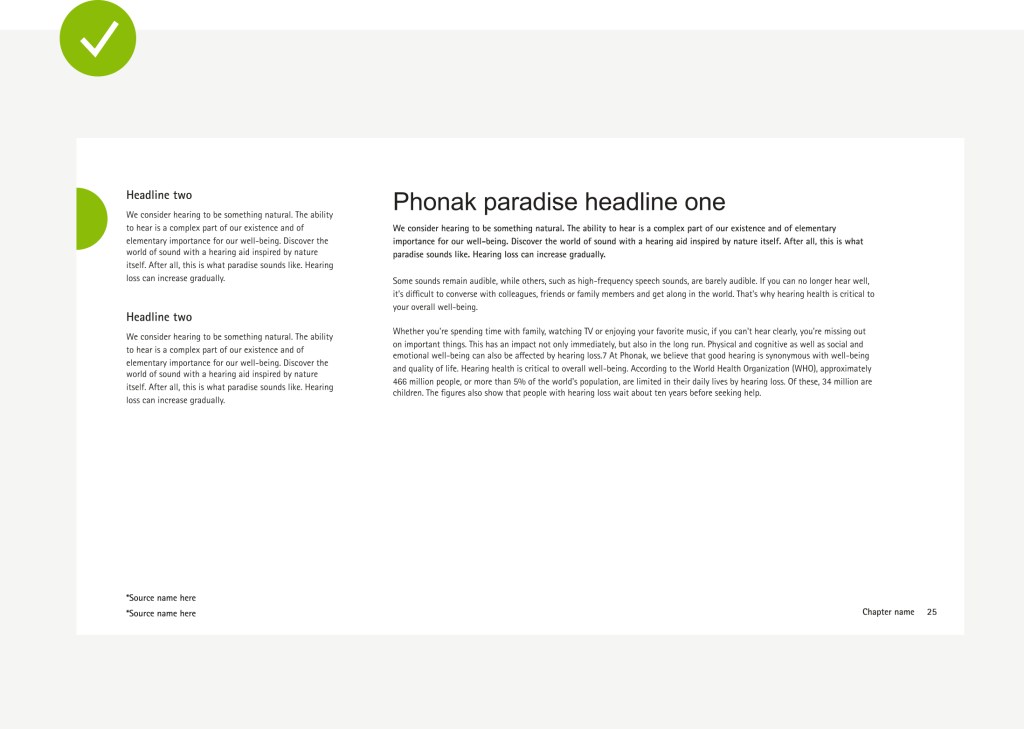
Keep in mind the white space area and grid on content slides.
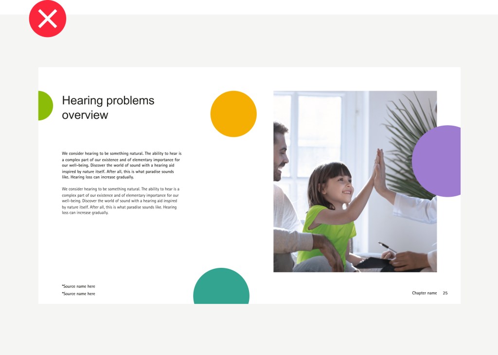
Don’t use the dot with the secondary colors for pediatric content. The PPT has one design and the green dot is only allowed.
No two line titles.
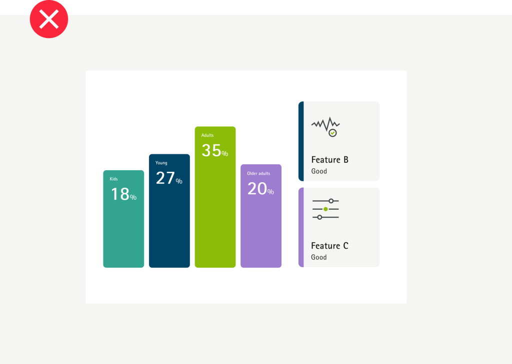
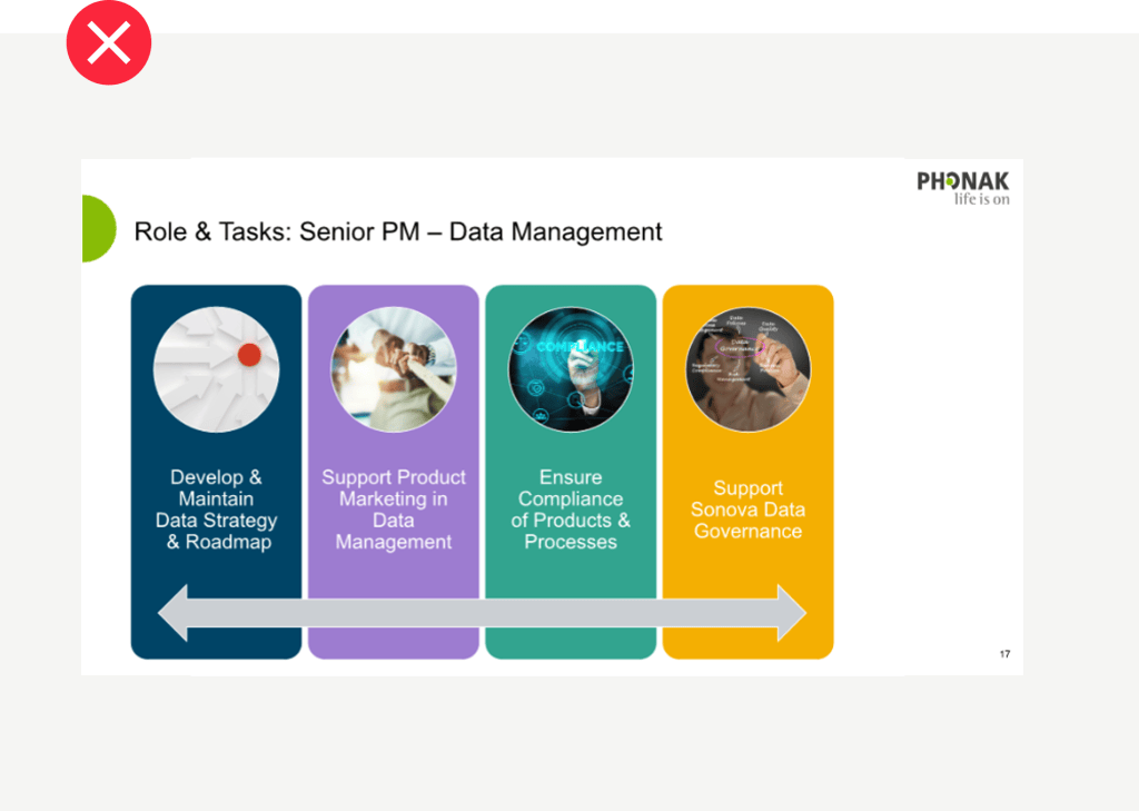
Do not use rounded corners (for PPT). They always should be straight 90°.
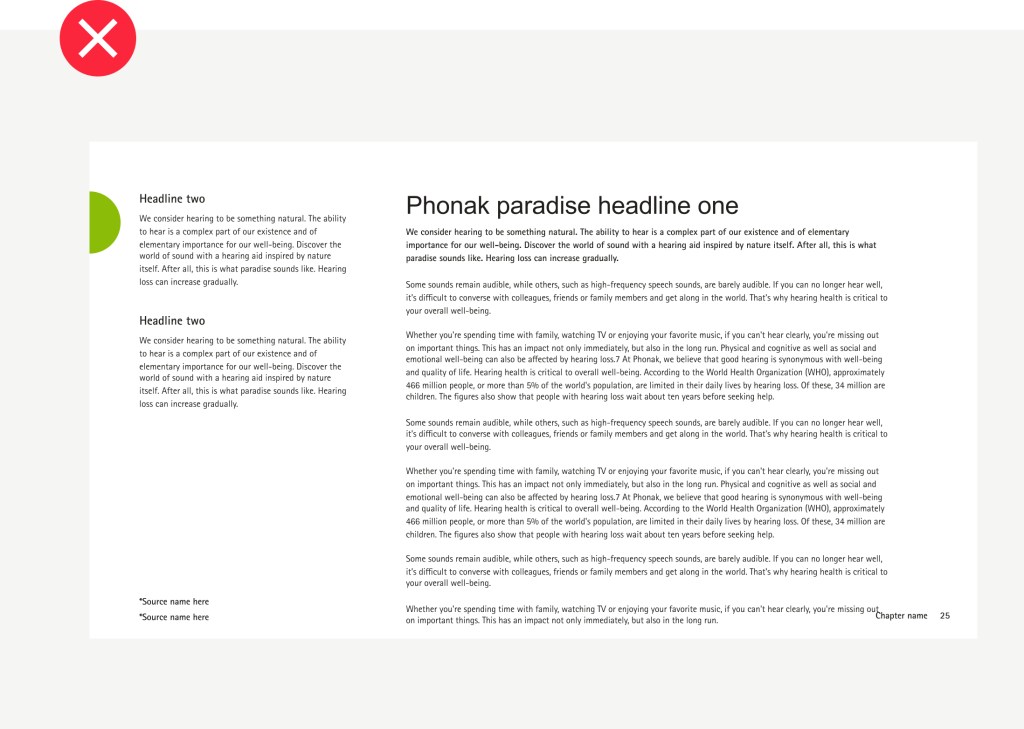
Do not overwhelm the slide with long texts that break the grid.
Stick to the color hierarchy for data visualization.
Do not change the background color
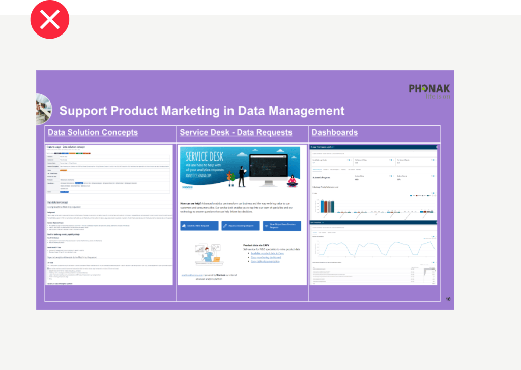
Do not put any elements into the half green dot (next to the title)
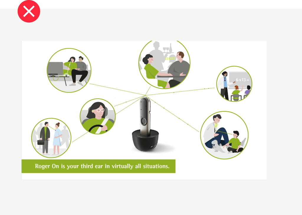
Do not use neither green strokes nor green outlines nor green text boxes.