We want to have brand recognition. We want people to think of Phonak when they see our colors. When it comes to user experience, UI and functional colors are key to provide a valuable, seameless and memorable experience.
Principles
Meaningful for brand expressions
Colors reflect our brand’s personality and values while conveying an emotional impact to the user through visual solutions, leading to a higher brand recognition across touchpoints.
Descriptive for consistency
The usage of colors and their purpose of improving the overall user experience. Colors’ intentions, whether for interaction or denotation, they should be clear and descriptive. The consistency and pattern of its usage lead to intuitive interactions and, at the same time, enhance navigation and call-to-actions from the user.
Purposeful for accessibility
Colors are not just for aesthetic reasons. They should support better readability of the information for the user as well as increase its usability. A color palette with the right contrast and balance supports better readability and accessibility to our users.
Primary Accent Neutrals Secondary Functional
Primary color
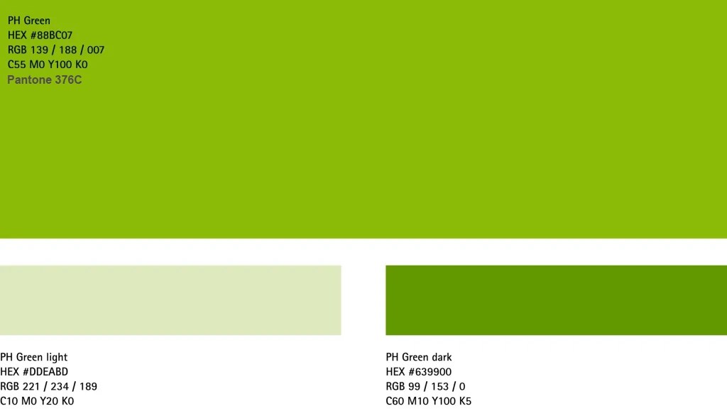
Colors are key visual elements of our corporate identity. The Phonak Green is our main corporate color.
To create contrast between UI elements, light or dark variants of the primary colors can be used. These can also be used to distinguish features within a component, such as a button’s icon in its circular container. Or they can be used in illustartion designs, if necessary.
Primary Accent for digital use Neutrals Secondary Functional
Accent color for interactive elements
Accent colors emphasize some UI elements such as buttons or progress bars or highlight important information. Accent colors usually have more brightness and saturation — such visual properties make UI elements attract the eye and encourage user interactions.
Apply to emphasize actions and highlighted information: call-to-action, floating buttons, progress bars, selection controls, sliders, playful elements, etc.
For hover effects we are using our primary color PH Green.
Using for Interactive elements
Contrast ratio 17.61 : 1 (AAA)
Color guidance
For websites and digital tools
The ideal model is a color ratio of 60-30-10, where 60% of all website design belongs to a dominant color, 30% of web space can be filled with the subdominant color(s), and an extra color (accent) should strengthen and emphasize the 10% of the interface. Additional secondary colors can be added if needed, keeping them all in 30% of usage throughout the interface.
Dominant color - Light #FFFFFF for wellness.
Brand expression - PH Green #88BCO7 for identity.
Accent color - PH Accent #CFFB5E for interactivity.
Primary Accent digital use Neutrals Secondary Functional
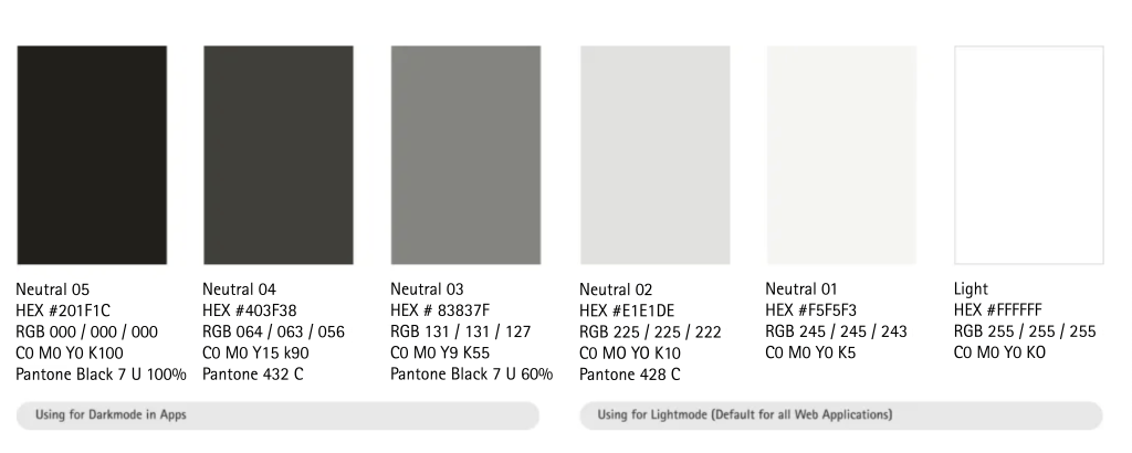
Neutral colors
Grey scale Neutral colors have a supportive role — these colors are usually made for text and background. Most often, neutrals are represented by grey tones
Primary Accent digital use Neutrals Secondary Functional
Secondary colors
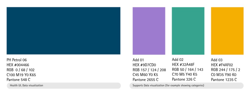
Secondary colors are complementary to our official colors, but are not recognizable identifiers for Phonak. They should be used sparingly.
User interface design needs to fulfill some requirements and standards to provide a good user experience. Our secondary color petrol as the main supporter for the Phonak green. When there is a need to be more specific we have the option to use the additional secondary colors. E.g. data visualisation, ux-functionalities.
Please see the rules how we use the secondary colors for data visualizations here
Secondary colors for pediatrics
The secondary colors also serve as a communication tool for the pediatrics product range. In this context, the four colors don’t have a specific hirarchy. However, they always need to be used in combination with Phonak green and always need to be less dominant than green.
The main difference to the overall use of the secondary colors is, that for pediatrics, the colors are also used within dots. For specific guidelines on how to use the dots for pediatrics, consult the sections “Brand Expression” and social media”.
Primary Accent digital use Neutrals Secondary Functional
Functional colors and UI tints
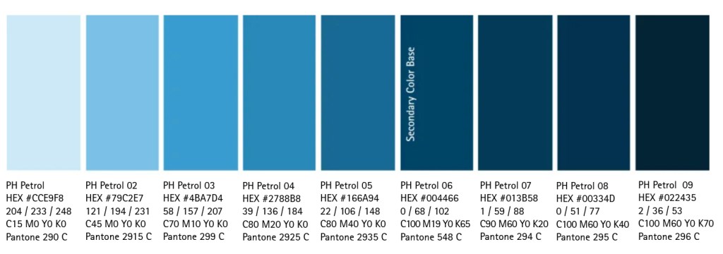
Tints for flexibility To give our designs more dynamics and flexibility for illustrations, data visualization, backgrounds (for health related topics) or dark mode UI we created these tints based on our secondary color. These colors should be used rarely and with a purpose only. e.g.: separating health content in an app. In best case, our primary colors will be used together with our tints.
Semantic colors for UI specific messages
Semantic colors are used for alert messages such as information or error. Those are often used to emphasize a specific state withint an UI element, such as an error on a form inputfield or an informative text on a modal pop-up.
PH Petrol 05 #166A94
UI Informative
Error #AE170F
Best practices
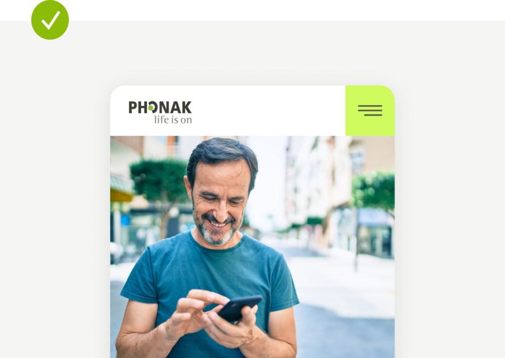
Use the accent color for interactive elements, such as the hamburger menu
Use light neutral colors for background elements
Text elements are best readable when placed in black on top of white elements
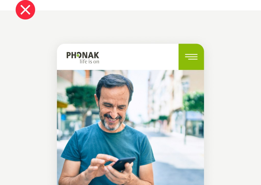
Avoid using the Phonak Green for interactive elements
Avoid dark backgrounds when they are not necessary
Avoid accesibility and readability issues by not using white text on green background
Applications
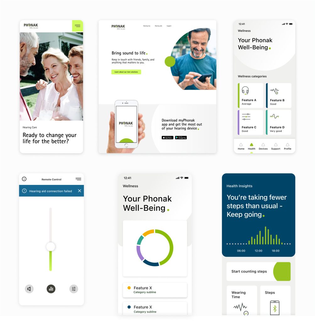
Examples for reference, Illustrative purposes only.
Key guidelines
01
Phonak is light and airy. Use dark backgrounds only when neccessary
02
Accent color describes active or interactive elements to the user