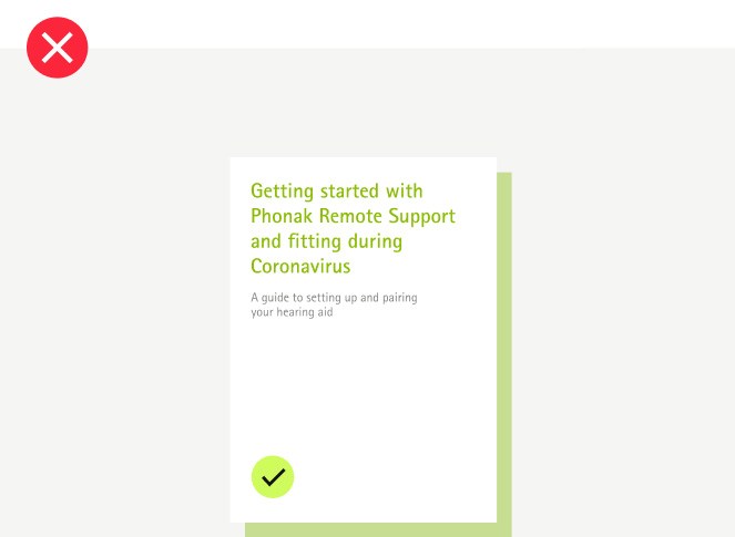
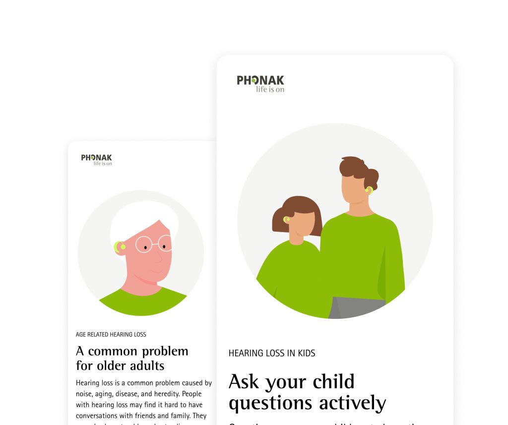
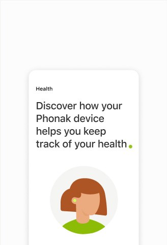
Illustrations are a visual interpretation of a concept or text. This can help the user understand, clarify or even extend the information provided by text or other elements. Custom and identifiable illustrations add and communicate personality to the Phonak brand.
Principles
Informative for clarity
Illustrations should support the users’ understanding of the content and communicate its concept promptly— just like icons, familiar metaphors that are understood and recognized internationally are used for users to identify the idea quicker.
Simple for readability
Too many details increase cognitive load. The right amount of details with a limited amount of thick enough strokes and sufficient space between multiple filled shapes makes it easier to read and strengthen its purpose.
Expressive for personality
The illustration style, whether its based on lines, shapes or tridimensional visuals, gives a taste of the brand expression to the user. Maintaining these stylistic rules and visual weight (fills, strokes’ thickness, corners, and shapes) gains consistency in the illustrations across pages.
Face Facial Expressions Body Spot Colors
Face
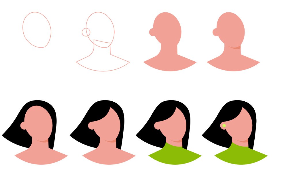
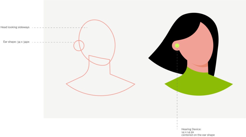
Face illustrations are based on the shape shown below. The face’s shape can slightly change to achieve different faces with variations in the forehead and the jaw weight. The shadow, colored in a darker tone underneath the main face shape, defines the jawline. Once the main structure is done, hair, clothes are added to define and include various genders and personalities. Subsequently, the Phonak hearing device is added to the accent color, which brings consistency and brand expression to the illustration set.
Face Facial Expressions Body Spot Colors
Facial expressions
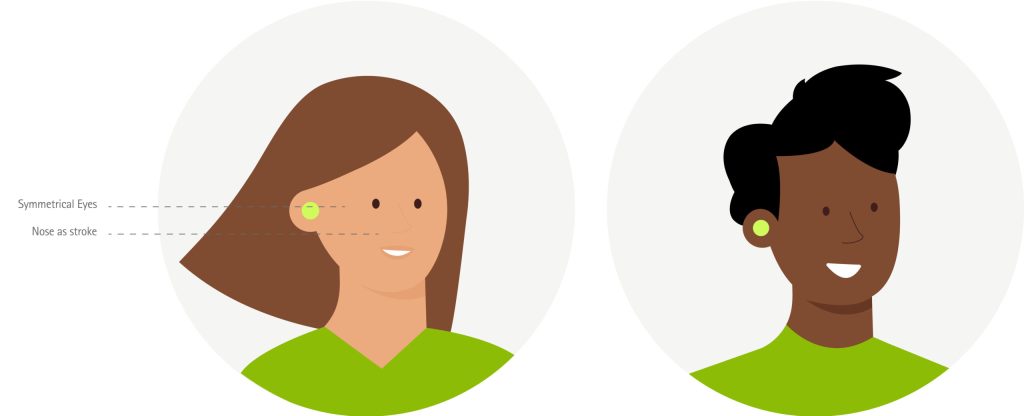
Facial expressions can help to communicate feelings and emotions such as angry and happy. They are complementary and they can be used if needed, keeping the same simple style, dots for the eyes and simple lines for other details like nose and mouth.
! Add them only if they have a particular feel in the context of the message or if the facial expression helps to emphasize a topic.
Face Facial Expressions Body Spot Colors
Body
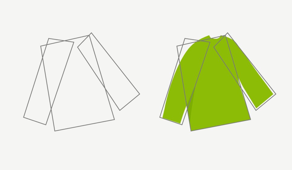
Simple bodies, a bit oversized for more personality, showing a light movement with the position of the legs and arms. There are no fine details like fingers on the hands or accessories. The main clothing piece is highlighted in Phonak green, while the rest keeps the neutral colors.
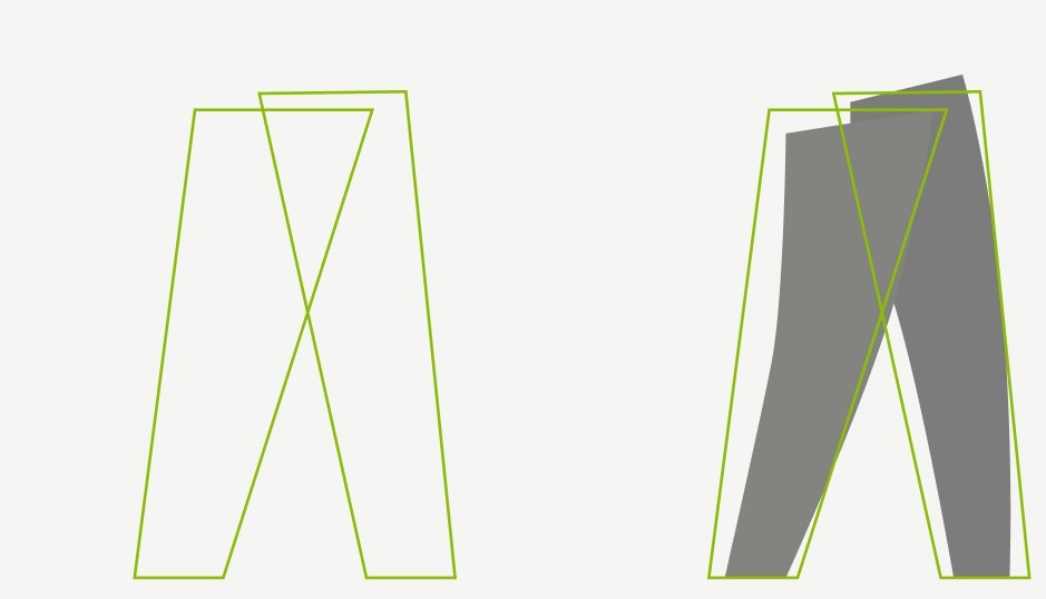
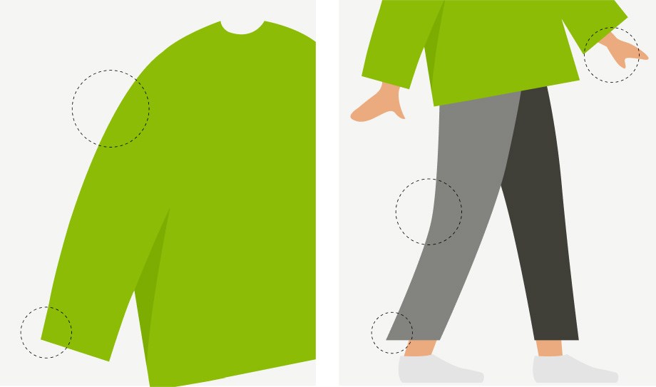
Upper body Clothes like pants and dresses are based on geometrical shapes and then shaped into more organic forms, giving the whole body an oversized style.
Lower body Same as T-shirts, pants are based on geometrical shapes and then shaped into more organic forms, giving the whole body an oversized style.
The small details The body illustration style follows smooth outlines with sharp corners. Hands are simple, only showing one finger separately.
Face Facial Expressions Body Spot Colors
Spot illustrations
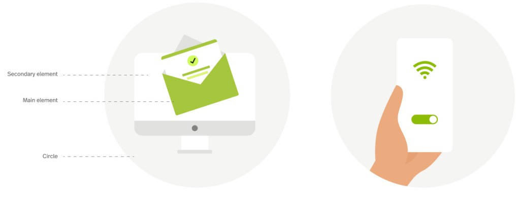
Sometimes we don’t necessarily need people on the illustrations, but rather the hearing aid, the connected device, or some other elements. In this case, they need to be as straightforward as possible without complicating the metaphor. Usually the structure of the spot illustrations consist of three elements:
Circle The circle, usually in light grey, caracterizes the illustrations with the phonak brand expression.
Secondary elements Usually these elements decorate the composition and use the neutral and the additional colors.
Main element The one where we want our user to focus on. This element should carry the Phonak Green and the accent color if necessary.
Face Facial Expressions Body Spot Colors
Illustration colors
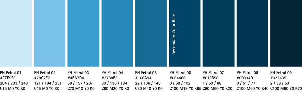
Main colors The main Phonak Green is used to communicate the brand identity and can be used on main elements of the illustrations and heroes, while the accent color highlights the hearing devices.
For general illustartions like the outfit of HCPs or our hero’s beloved ones, use colors from our neutral and functional palette.
The light and dark tints of our PH green are mostly supporting objects with a need of shadow
Accent green
Accent green should only be used for hearing devices and interactive elements
The accent green is a UI-Color only. The only exception is the usage for hearing aids/highlights in illustrations. This color has been chosen for screens, CMYK printing is not able to produce such a vibrant color. This is why we suggest to use the Pantone Color we defined specifically for the Accent Green. That way it will always stand out as it does on screens. If Pantone is not an option we defined a CMYK value as fall back, but this will be less shiny and bright.
Grey scale Neutral colors have a supportive role in illustrations for hair color. Also, neutral 02 & 01 are used on background and secondary elements.
Background elements, hair color, clothes
Functional colors Functional colors have a supportive role in illustrations — these colors are used on background and secondary elements, and they can be used for clothes as well.
Background elements, clothes for non hearing impaired illustrated people (HCPs, family members)
Extra Colors for skin and hair Additional skin and hair colors add a human touch and inclusivity to the brand’s illustrations. Should only be used on Illustrations!
Skin colors
Extra hair colors
Best Practices
Keep rounded corners, if applicable on the object, for a warm and friendly style
Keep details at a minimum and highlight the hearing aid when is present
Vary in skin and hair colors for more diversity and inclusivity
Don’t use the additional colors on main elements of the illustrations
Avoid too many additional decorative elements that are not necessary for understanding
Don’t make the illustration too literal. Try to use easy and familiar methaphors.
Applications
Examples for reference, Illustrative purposes only.
Illustrations paired with text
Illustrations on start page
Key Guidelines
01
Keep details at a minimum
02
Maintain colors’ proportion. Highlight with PH Green and Accent color
03
Applications define the handling of the layout: e.g. buttons are full-width on mobile