Data visualization is a form of communication that portrays dense and complex information in graphical form. With the usage of color we differentiate between different types of charts and functions. The resulting visuals are designed to make it easy to compare data and use it to tell a story.
Principles
Accuracy for clarity
Information is presented as clearly as possible. Reduction of all possible disturbing factors and focus on the essentials.
Flexible for scalability
Color rules and shaping of graphics can also be transferred to functionalities and ensure a consistent UX even for future requirements
Content sensitive for navigation
Information needs the right expression. Therefore, we use only the right form of presentation and color scheme.
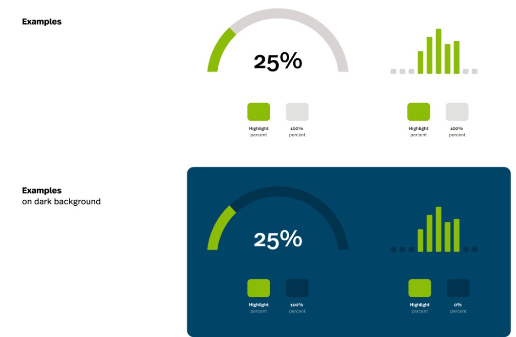
Color highlights: Data
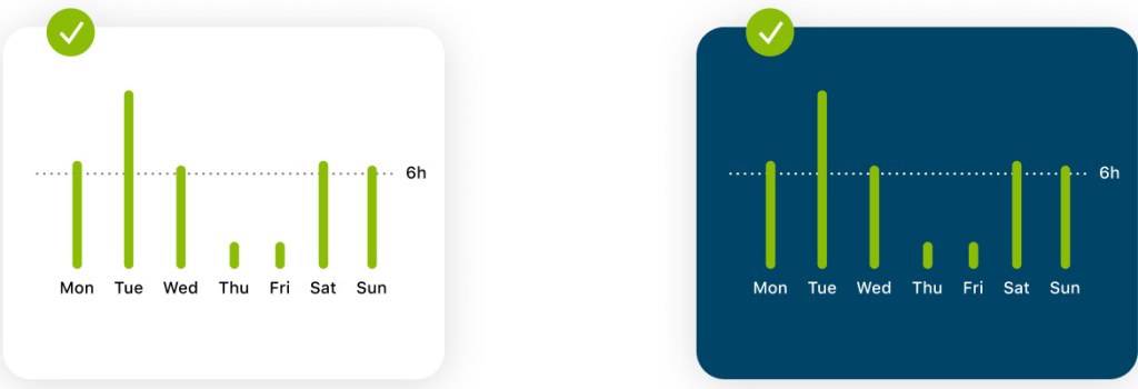
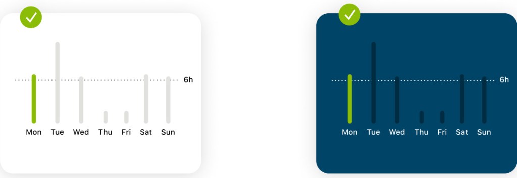
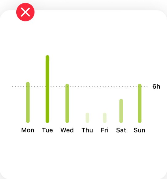
To highlight values that are not comparable to each other or are in a chronological order, only the primary color is used. As contrast color we use neutral colors.
Color highlights: Area of focus
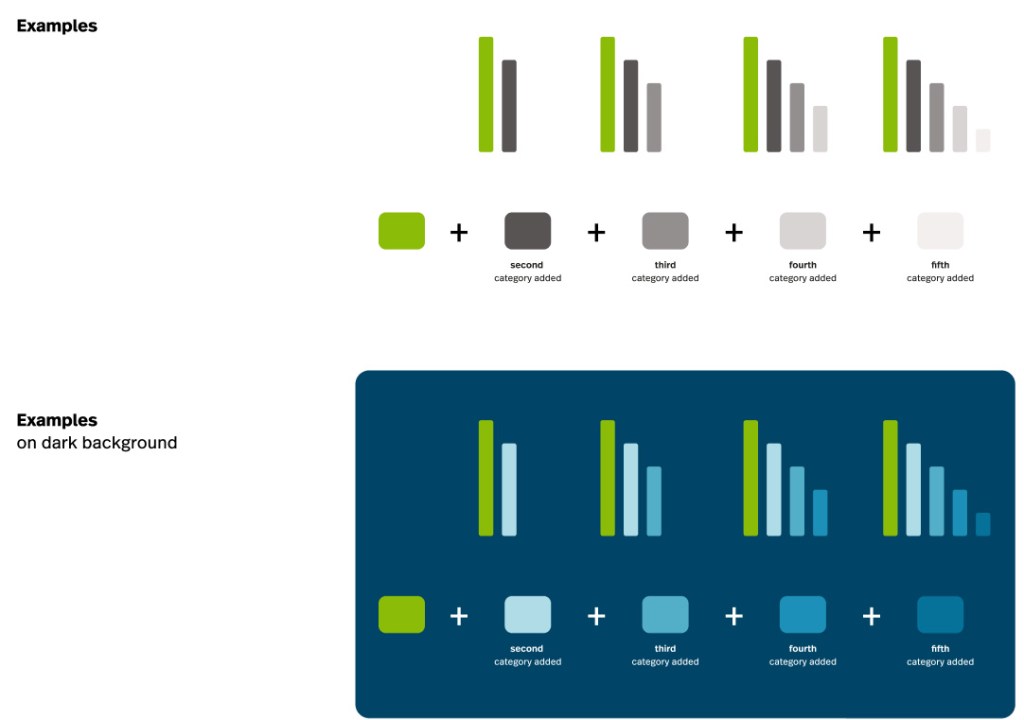
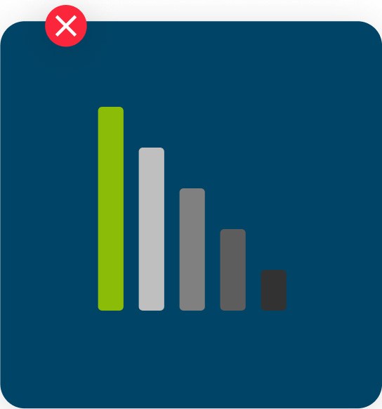
If we need to compare values, but want to highlight a value, this can be done using our primary color + our neutral palette
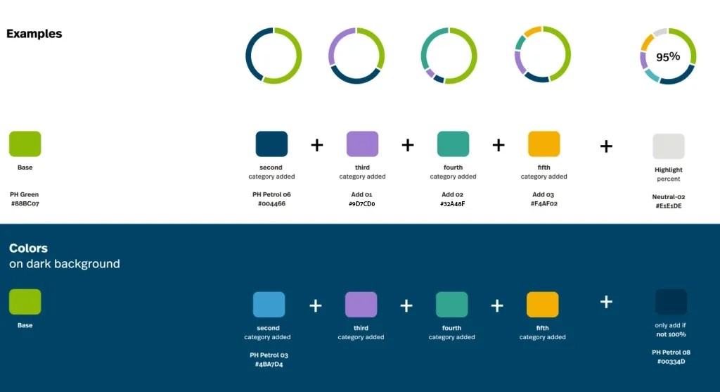
Color distinguishes: Categories
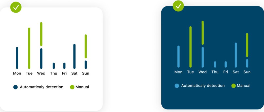
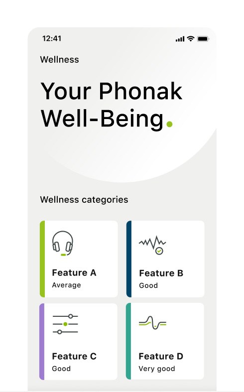
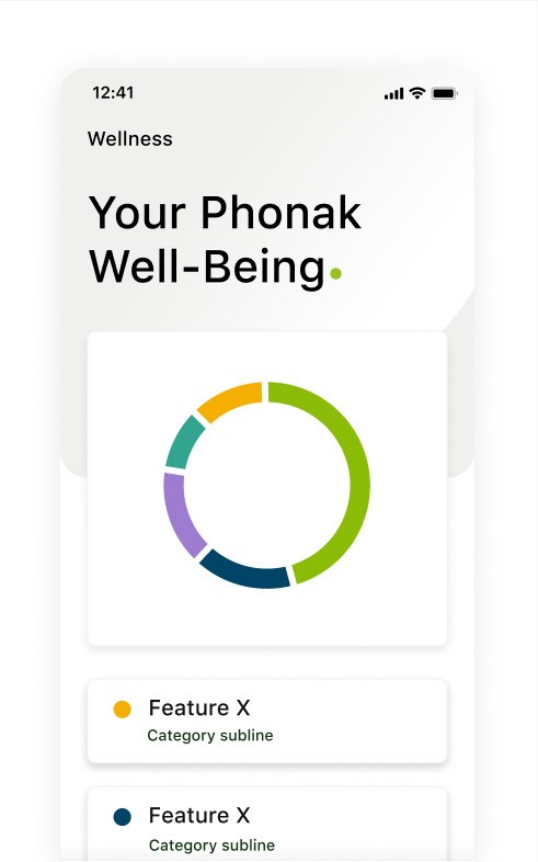
To distinguish categories (e.g. different hearing devices or app features), our secondary colors are used. These are always applied in the same order to create contrast, but also coherence. If our values do not add to 100% we add a neutral color.
Best practices
Showing average
The average will be displayed in neutral-03 and white in darkmode (in supported apps)
Highlight value
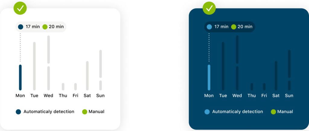
When one element is highlighted the deselected elements will be dehighlighted with our neutrals and dark-petrol (darkmode in apps)
Using categories
Categories can be applied in numerous graphs and functionalites. To keep consistent the color-order should always be the same.
Highlight categories
When active the category color is not changing its color. The deselcted categories will be dehighlighted by using our neutral-color and dark-petrol (only darkmode in apps)
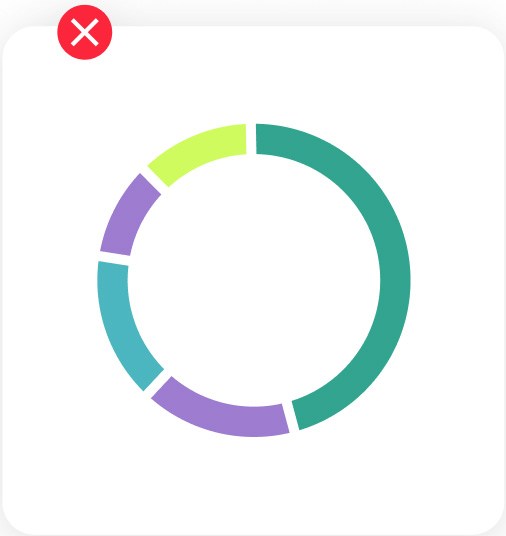
Always use the right category colors in the right order and never use a category color more than once in a diagramm.
Avoid using gray on petrol to keep coherence with the overal idea of the inverted mode
Do not use tints of green to symbolize or categories values. If necessary use the tints of the more contrasty secondary color petrol.
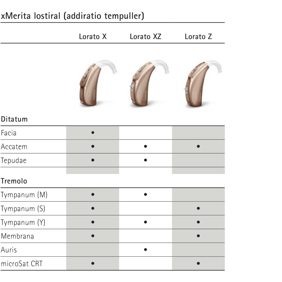
Tables
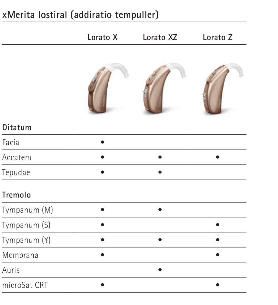
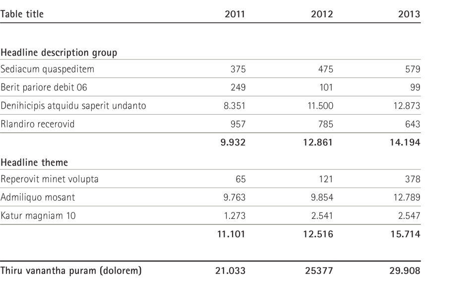
Phonak tables and diagrams are logical, clear and legible. Separation lines between units help to enhance readability. Highlight columns or rows with light background colors. Use background color and blank lines for structure. Background colors divide the table into sections. Use shades of grey to differentiate the columns.
Line styles:
1.25pt 0.75pt 0.25pt
Please use the typerface Rotis Sans Serif Light and/or Bold in 8pt.
Applications
Examples for reference, Illustrative purposes only.
Key guidelines
01
Think what you want to tell with color: Highlight, distinguish, representing content
02
You choose which value get’s the base color. Can be the biggest or smallest value.
03
Guidelines are not connected to specific charts or situations and should be used freely