! This section is under construction as we work on updating it. Please contact branding@phonak.com if you need the current valid specifications.
Digital typography usage
A consistent, clear and digital friendly usage of typography is key to provide an outstanding user and brand experience. Modularity and responsiveness are the driven forces that will make sure the product is optimized and excels across the whole digital experience.
Principles
Scaled for consistency
Defining and setting a limited amount of type scale values in terms of size, weight, spacing, and line-height for different text elements can provide consistency when applied properly throughout the interface. Defined styles must also be flexible, to adapt to different breakpoints of the page.
Readable for accessibility
Type formatting decisions such as size, tracking, and line-height of the different type styles defined in the scale for better screen readability. Minimum type size and sufficient contrast between text color, either large or small, and background color to ensure the legibility of the elements.
Guided for hierarchy
Hierarchy in the text helps users find and read information quicker. The most important text should draw attention from the users by emphasizing it with type color, size and weight.
Typography system Structure Typefaces Responsive
Typography system
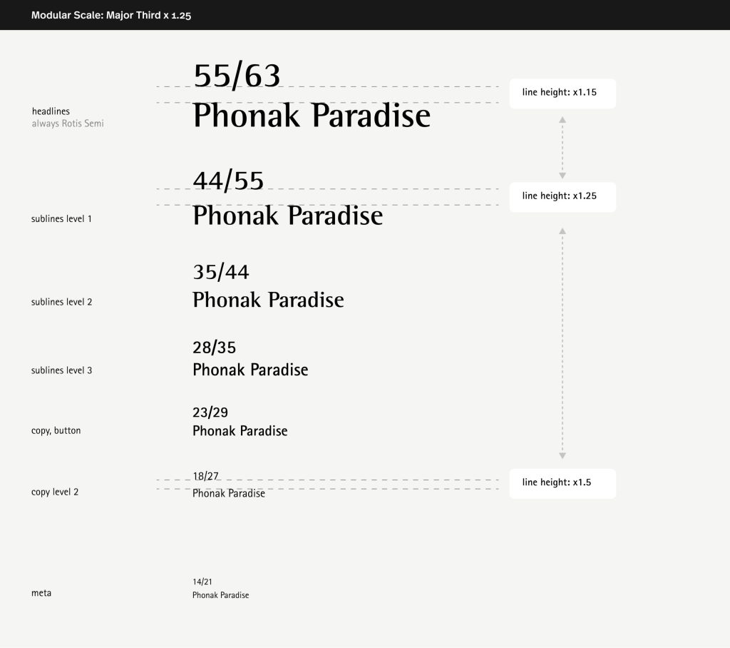
Modular Scale A modular type scale is a series of type sizes that relate to each other because they increase by the same ratio. You start with a base font size and multiply it by the selected ratio. Let’s look how different ratios affect the type size between levels in scale. The Major Third scale ratio is 1.25. So text styles should always scale by increasing by a 1.25 ratio. Regarding the line hight, the ratio changes according to the type size in order to keep a high readability ratio.
Please note that the font used in the example below is incorrect and will be updated soon.
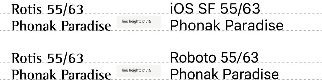
Modular scale with native typefaces The Major Third scale is versatile and works as well when using native typefaces like iOS-SF, or Android-Roboto. The same modular system should be then used once working on digital products requiring those specific typefaces, like an APP. The same ratio should be applied either for font size (x1.25) or fort line height. As specify above.
A modular scale brings order, harmony and meaning to your text sizes, code and in the end, your digital product.
Typography system Structure Typefaces Responsive
A clean structure of hierachies
By using a clear and hierarchic typographic system, the content will benefit of a high consistency and a strong readability across the different text styles. Less is better, and only the text styles needed should be used in order to maintain a clean structure. This is particularly important in digital products when it comes to page loading optimization.
Typography system Structure Typefaces Responsive
Typefaces.
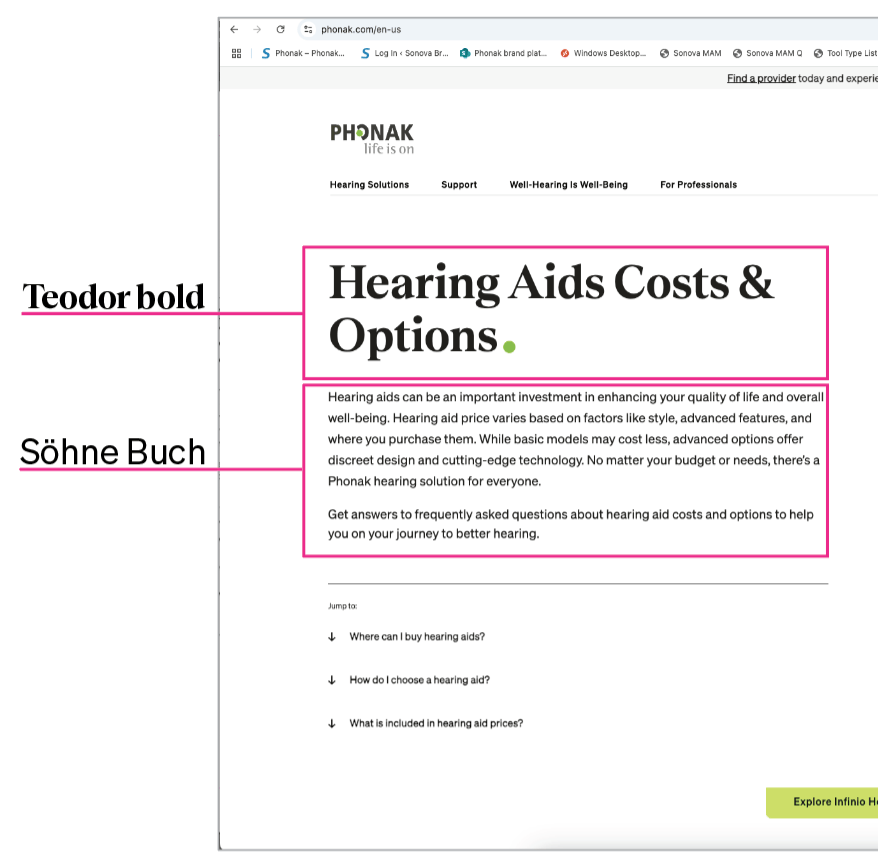
For reasons of readability and accessibility, we use a different font set for websites than our standard brand font (Rotis)
Typography system Structure Typefaces Responsive
A consistent use of the scale.
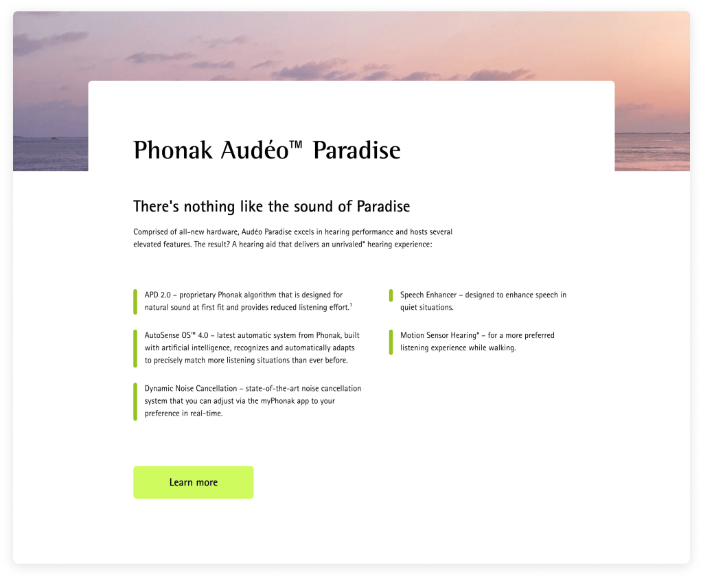
A consistent use of the defined scale is necessary in order to provide a good and seamless user experience across the digital product. The text styles should be adapted to the different breakpoints with consistency to adapt the experience to the different devices and viewports.
Best practices
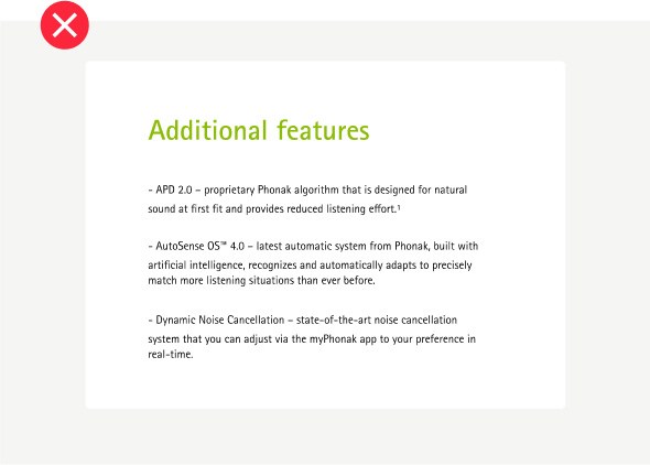
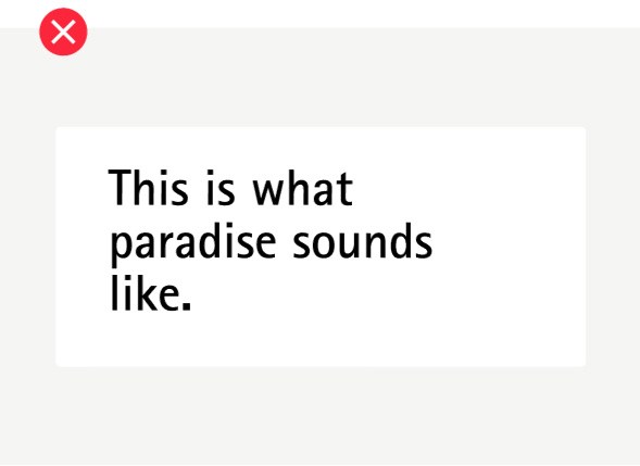
Keep the headlines in black, and if needed add the Phonak dot
Avoid using the Phonak green for headlines
Follow the modular scale system for a understandable hierarchy in the text
Headlines and sublines can be misunderstood if they are too similar in size
Keep the line-height provided for better readability
Avoid changing the line-height on sentences, which can lead to difficulty in reading
Key Guidelines
01
Use modular scale
02
Align line-height to a purpose
03
Use system font with the same specs throughout all pages