Applications
Infographics
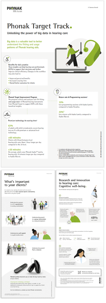
This application example explains how to set up an infographic by showing five principles. Your own infographic doesn’t have to look exactly the same, but should follow these principles. It also shows how elements such as boxes, shapes, graphs, percentages, lines, backgrounds and illustrations can be applied in an optimal way.
What makes an effective infographic?- Well designed, clearly structured
- A good story, easy to understand
- Shows content visually
Visuals
- Illustration and icons are a great support for visualizing content. Product images can be combined with icons to Highlight technical features. Use corporate images only if it sets the right tone for your message.
- Visualize percentages boldly. Also think about using our illustrations to visualize percentages in a different way. They can be adapted easily thanks to the open file in MAM.
Colors
- With the usage of color we differentiate between different types of charts and functions. The resulting visuals are designed to make it easy to compare data and use it to tell a story.
- Use white space
- Background color: 5% PH Graphite, HEX: f2f2f2
- Secondary colors can be used if the infographic contains data visualization which need a distinction. Secondary colors should not be dominant.
- To highlight values that are not comparable to each other or are in a chronological order, only the primary color is used. As contrast color we use neutral colors.
- To distinguish categories (e.g. different hearing devices or app features), our secondary colors are used.
Typography
- Don’t use too much text, but visualize content.
- Highlight key information by using the dot as Phonak’s brand expression. Avoid using colors for typography.
- Additional information can be placed as body copy in Rotis Sans Serif. If you need a Headline, make it bold.
Format
The format is flexible and depends on the channel, where the info-graphic will be shown.
What makes your design stand out?
Flow
- Content/story flows easily and logically
- It takes the eye on a predefined journey
Hierarchy
- Structured
- Highlight key information
Structure
- Unclutter content
- Don‘t use too much text
- Emphasis by using scale
- Less is more!