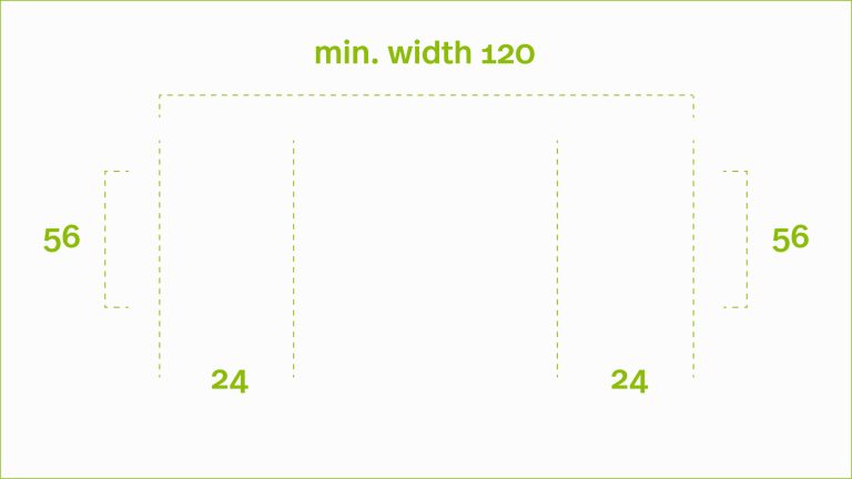
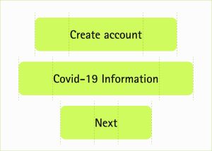
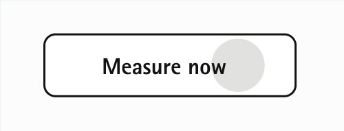
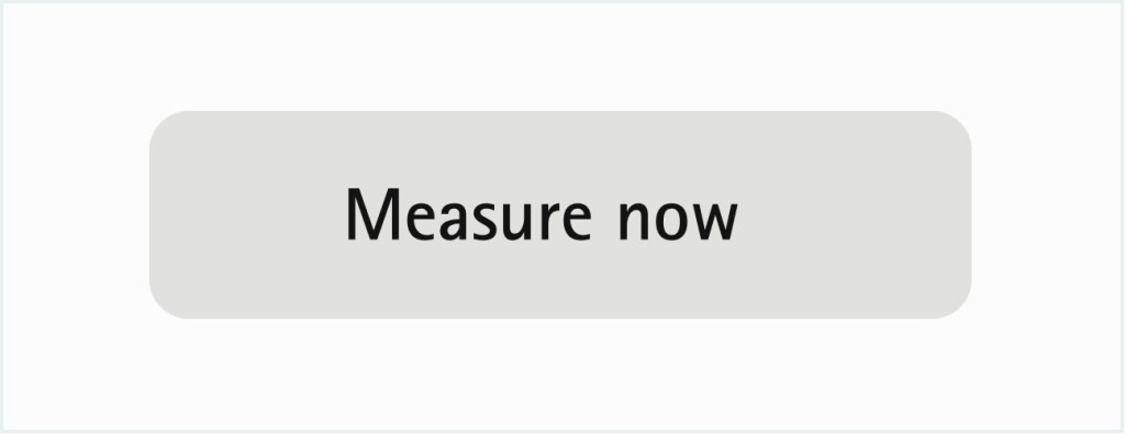
Semi-rounded corners give a more friendly, safe, and approachable look and feel while still keeping it severe and elegant. It is essential for balance in the users’ eyes to keep the same ratio between the text element and the button container (16px).
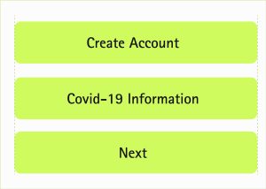
For desktop, buttons are flexible in width based on their inside text, while on mobile, the width stays fixed to the grid. This allows flexibility when longer texts inside buttons are needed, and therefore their layout is not corrupting.
Measure of the buttons here
Buttons on desktop are adaptable to the text element
Mobile buttons
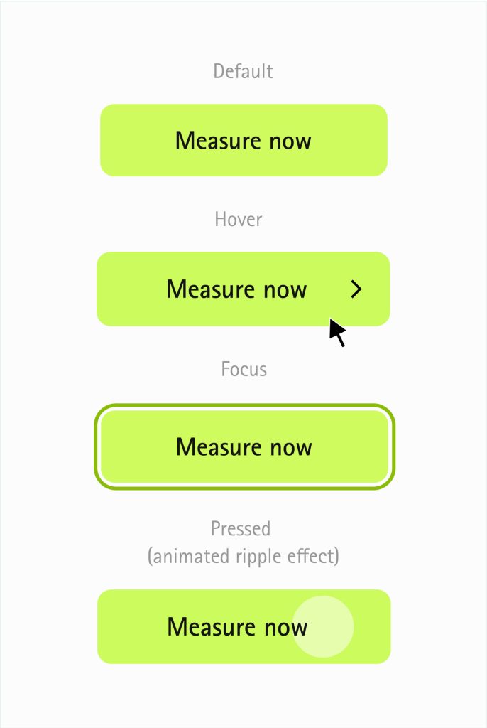
Buttons interaction design
Buttons interaction
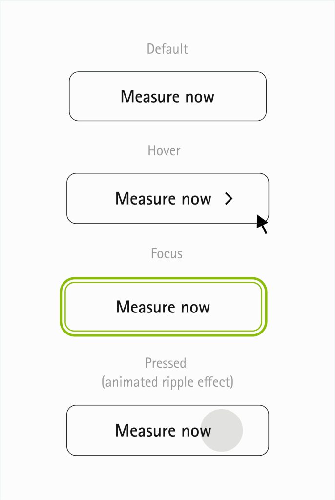
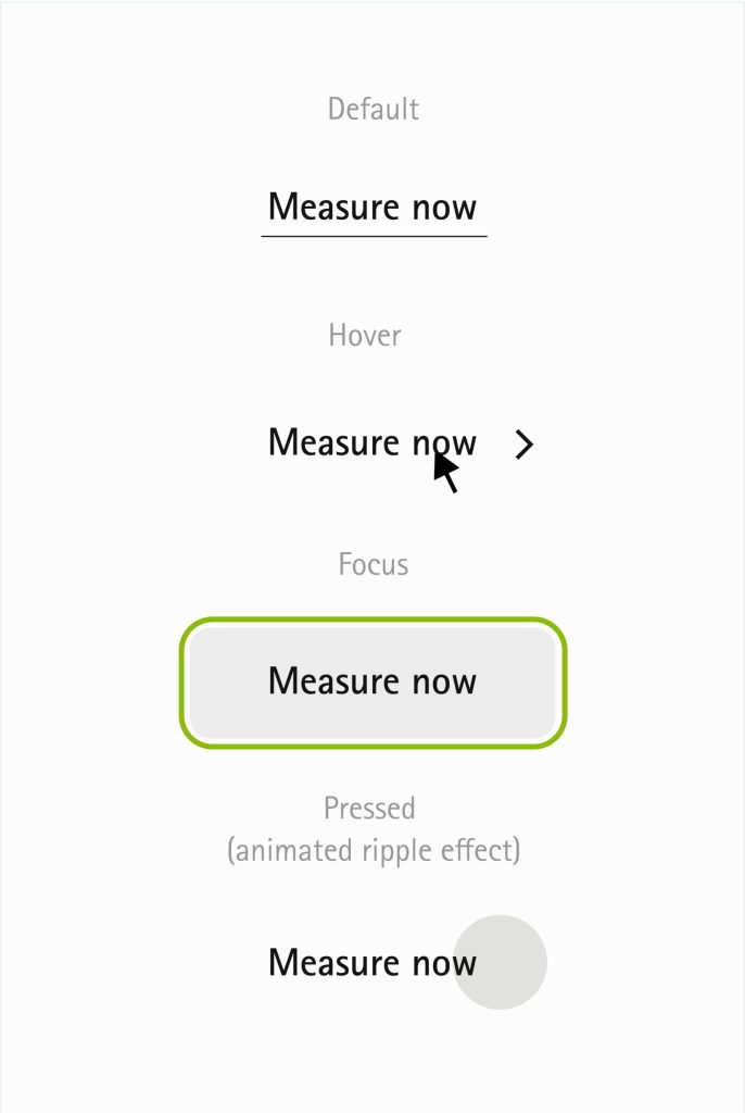
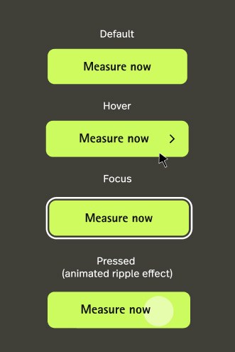
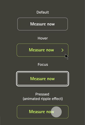
Buttons are single-click call-to-actions. They should be easy to find, their purpose needs to be clear, and they most importantly need to trigger the need from the user to click or tap on them. Various button types are depending on the emphasis we want to give to their primary action.
Contained button
Outlined button
Text button
Buttons Dark mode
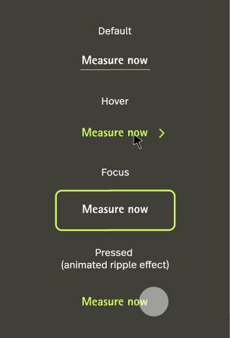
When using dark mode it’s important to keep the contrast as higher as possible. Using white as main color for outlined and text buttons keeps the contrast ratio at its higher value. Using the Accent color for hover states makes it more interactive and keeps a very high contrast.
Contained button
Outlined button
Text button
Ripple Effect Animation
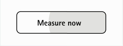
For pressed states we use an animation called ripple effect to show the user exactly that he pressed a button. Following you find a storyline which explains how this effect will adapt to a button.
On contained button
Default
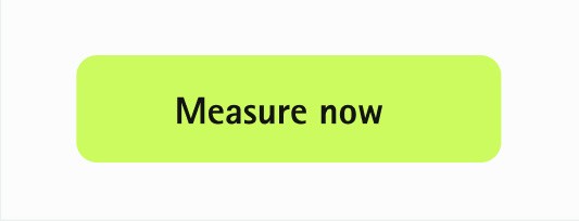
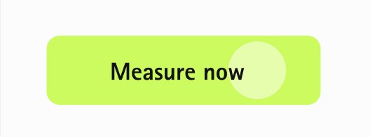
User clicked the button. At the position the user clicked a circle appears in 15% #fffff and gets bigger.
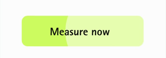
Circle animations from the center
Circle animations from the center
Back to Default by fading out the circle
On outlined button
Default
User clicked the button. At the position the user clicked a circle appears in Neutral-2 and gets bigger.
Circle animations from the center
Circle animations from the center
Back to Default by fading out the circle
On text button
Default
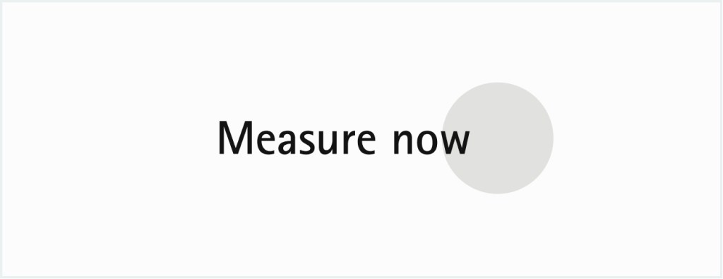
User clicked the button. At the position the user clicked a circle appears in Neutral-2 and gets bigger.
Circle animations from the center
Circle animations from the center
Back to Default by fading out the circle
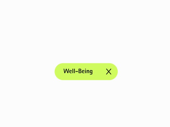
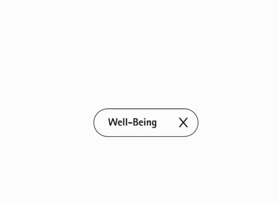
Specific buttons – Edge case ccenarios The most prominent way to show a button is in our rectangle form. If not possible or we need to include more dynamics in user-interaction there is the option of including another form: Pills
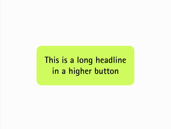
To support other languages a two-lined button is includedc
Two-lined button
Solid button
Outlined pills
Icons
This are system and navigation icons for digital use only. The blue line marks the protected space around the icon. Please note: The red alert color is limited to digital use only: #FF0031
Checkbox
Radiobutton
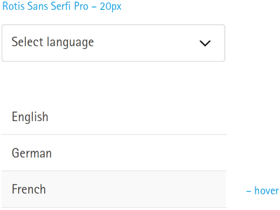
Dropdown
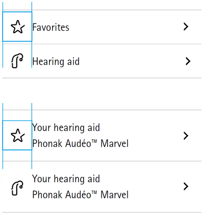
List
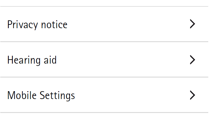
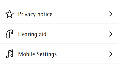
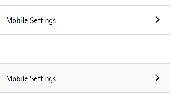
Find three options of list layout:
Standard list
List with icons
The light grey part shows inactivity or hover effect
Box
Use Phonak Green to highlight.
Slideshow
How to indicate the availability of more than one image.